Sunday, December 11, 2016

Final two drawings for Assignment 5

Last weekend, I worked extensively on trying to complete both of my final drawings for Assignment 5. I found that working on two different drawings of the exact same subject lead me to explore varying means of expression. What I found inspiring about working on two works simultaneously is that it aided me in being able to sustain my enthusiasm and energy for the piece I was working on. When I grew frustrated or tired of the way things were working out in the one piece, I would switch gears and work on the other. This meant that I kept tweaking my approach and did not allow the artwork to become tired. When I reached saturation point with the one, I would work on the other. The new challenges presented by the mere differences in artworks helped to refresh my approach and speak into my drawing process. Once I had cleared my head and worked in a slightly different manner on the other piece, I was able to return to the previous piece, trying what I had learnt and explored on the other drawing.

I also enjoyed working on a larger format than I have previously worked during this course. This afforded me a greater surface area in which to build and develop layers and textures.


Fig 2. Left-hand side of Drawing 1


Fig. 3. Left-hand side of Drawing 2.

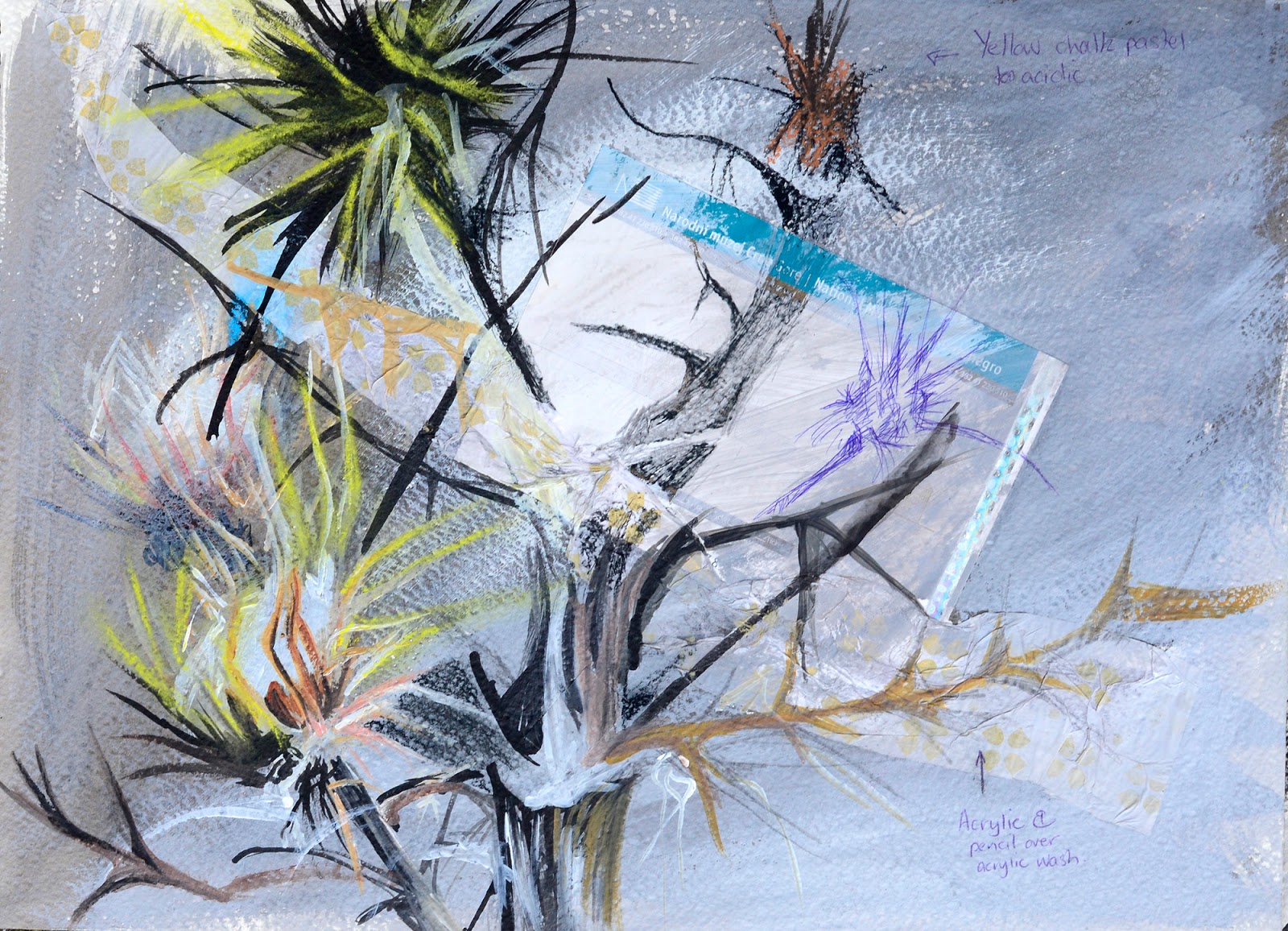
I started working in the negative space of the top left-hand corner of both of the drawings. I found that it was a lot easier to work on the lighter jungle green background of the first drawing, as opposed to the Lincoln green of the second drawing (fig. 1). What I tried to do in each drawing was to elude to there being many layers of vegetation beneath the leaves in the foreground. After working the areas, I purposefully applied layers of washes of ink of varying hues of green to help to unite the background and to make it less distracting. I deliberately started to work away from the natural hues of burnt amber and tan found in the photograph - trying to free the artwork from realism and to allow the colors to become exaggerated and more abstract (fig. 3). 

Once I had completed two-thirds of the top area of negative space, I started to work on the negative space in the lower two-thirds of the drawings. I found that the way in which I worked these two drawings was quite different. I had started working on the second drawing first. In this drawing there is a shape that I interpreted as a leaf shape, using lighter hues and shades of green to allow it to visually connect to the foreground leaves (fig.4). In the initial drawing, however, I decided to try to make this area less obvious and to draw it in as if it was part of the underlying vegetation (fig.5). The effect is that on the second drawing, the lighter leaf appears to frame the central leaf, emphasizing it; whereas, in the other drawing, the central leaf is held in check and position by the lighter background on the bottom right-hand side of the picture plane. The leaves in this drawing rest on what appears to be a crisscross of dried leaves or sticks.


Fig. 4. Bottom Left-hand Corner Drawing 2
Fig.5. Bottom left-hand corner drawing 1
When tackling the foreground leaves, I started on my initial drawing. I appreciated the fact that I had already laid down the bright yellow and mint green washes. What I did not anticipate was how hard it was going to be to work onto the maps in such a way that parts of the map could appear through the layers, but still appear buried in the drawing. Somehow when working in my sketchbook, this had seemed easier. I don't really know why, as I would have thought that the surface would not have been affected by the fact that the underlying paper had a different absorbency, but it seemed to be different.

I found that my application of acrylic paint often appeared cloddish and clumsy in my initial drawing. So, when I worked on the second drawing, I tried to work in lighter hues, with thinner layers, trying to preserve the underlying printed images more. I think that this was more effectively done in the second drawing.

Fig. 6. Foreshortening on drawing 1.
What I found difficult was creating the foreshortening effect of the two leaves that project towards the viewer. It was hard to make these leaves the focal point and to make the perspective convincing. In both drawings, I tried to emphasize the edge and the under surface of the spikey projection. In the initial drawing, I left the underside the light mint green hue (fig.6); whereas on the second drawing, I tried to darken the area (fig.7). I think this worked as the tonality of the leaves surrounding these projections were quite different from each other. The surrounding hues and tones in the initial drawing are darker, allowing the lighter underside to create a contrast; whereas the surrounding hues are lighter in the second drawing, allowing the darker underside to provide the necessary contrast.   

One of Marija Marsenic Vujovic's comments of my preliminary drawings was that she did not like my use of pure white and black. She explained that in nature one rarely sees pure white and black. By using them, I was deadening my artworks. She suggested that I ensure that I create my own blacks and add touches of hues to my whites to allow them to be less dominant. During the process of drawing in the white veins - the contrast of which first attracted me to these leaves - I struggled hard to emphasize these design elements, without making them too dominant. I often had to paint washes of ink over the lines to try to soften their stark contrast to the surrounding leaves. 


Fig. 7. Foreshortening on drawing 2
As I progressively moved across the picture plane, the right-hand side of each of my artworks remained relatively unworked. I had deliberately focused my work on the left-hand side as I wanted this to remain the dominant area of interest. The result of this was that I was at a bit of a loss as to what to do with the right-hand side. Should I work a lot more layers into these areas, or should I leave them relatively unresolved to ensure that I did not fall into the trap of becoming too illustrative - something that I had resolved not to do in this series of artworks?

My husband suggested that I try to turn the paintings upside down, or on their sides to gain a different perspective on them.

I found it so interesting how totally different the artworks felt when tipped 90 degrees counter-clockwise. (Turning them 180 degrees made me feel quite nauseous, so I changed it back to 90 degrees.) When turning them off their regular axis, I realized that I really liked the way in which I had worked the central top section of the background of the first drawing. This area had a lot more depth and layers than on the second drawing. My husband talked about cutting this section out of the original and sticking it on to the second drawing. By this stage I felt quite attached to both drawings and did not feel like sacrificing the one for the other. So, instead, I studied what I had done in the first drawing, and tried to emulate it better in the second drawing. I was satisfied with the increased sense of depth and increased layers.
Fig. 8. Right-hand corner final drawing 2

Before turning my drawings around, I discussed with my husband that I really liked the bright sea green in the top right-hand corner of the second drawing, but I did not know how to integrate it better with the rest of the drawing. By changing the axis of the drawings, I got a sense that the bottom right-hand corner of the second drawing (the top left-hand corner when turned 90 degrees counter-clockwise) would be better if it was more detailed and not the light hues that I had. As a result, I worked more forms into the area with increased layers to allow this section to balance the composition better. I also decided to work some more layers into the sea green corner, allowing the linear elements to become more absorbed into the background. I also used washes of this sea green in the bottom left-hand corner to provide a visual link across the composition. I was pleased that the brighter blue-greens of previous washes in the foreground leaves also linked with this accent color (fig.8).

Lastly, I liked the appearance of the leaf that juts into the negative space in the upper mid-section of the original drawing. So I studied this leaf and tried to emulate the way in which I had worked this leaf in the first drawing.

On completing these drawings, I asked my husband if he felt that the edges of the leaves were too well defined. I felt as if they appeared to sharp, creating too strong of a contrast. My husband disagreed as he reminded me that this was the appeal of these leaves; they are extremely prickly and sharp by contrast to the surrounding foliage. Keeping the edges crisp helped to emulate the emotive appeal of the thistle leaves.
Fig. 9. Final Drawing 1
Fig. 10. Final Drawing 2
In retrospect, I wish I had a photographic journal of all of the changes I made. I did not take photographs as the lighting in the room I am working in is very uneven. It has windows with shutters to the right of my work space, which cause the photographs to bleach out, and when the lights are on, the lighting is distorted by the orange glow of the old light fixtures. I did not want to remove the artworks for photographing, as it had been hard to get everything to stay where it needed to be in the first place. I do, however, feel that in future I would like to keep a photo-journal of my process to get a better sense of the impact of the changes I made along the way. I feel that this would help to inform later artworks.

I really struggled to take photographs that depict the luminosity of the rich greens I was able to create with the Bombay inks. Unfortunately, the photographs make this work appear to be more illustrative than it actually is, due to the way that the colors are slightly muted and less dramatic. I am grateful that my works will be seen in person, as I think that this will help assessors to get a better idea of what it is I achieved in this drawing.

Critique

This afternoon, I was able to talk to Mirjana Marsenic Vujovic about her latest exhibition in Gallery 106 in Amsterdam which opened 24 November, 2016. She described how uplifting it was to be able to be surrounded by artists who asked questions about her artworks and were interested in her work. She said that they showed a genuine interest in her technique and inspiration. She found it humbling and yet energizing at the same time.

What I find inspiring about her is that she has been able to establish herself as internationally exhibited artist, and yet hold down a full-time teaching career. What I also appreciate about her artwork is her cheerful palette. Her colors reflect the vibrant splendor of the colours of the Montenegrin Fall and Summer countryside. This can be seen in the colours she used in her exhibition selection "A Journey through: the Forces of Nature."

As she had critiqued my original sketches and given me pointers before the commencement of this project, I showed her my two drawings. She was very encouraging in her critique of my two drawings. She felt that both of them could stand on their own as artworks, however, she strongly recommended that they had more of an impact as a pair. She suggested submitting them both together to show the different approaches to the same subject and the exploration of the subject matter. I will need to discuss this with my tutor.

She went on to suggest that I could further explore this same subject, trying a different color scheme: perhaps oranges and browns. This would be very interesting to explore at a later date as I would imagine it would create a totally different effect.

After looking at pictures online of her recent exhibition in Amsterdam, I feel encouraged that I have been able to interpret her homeland in a manner which is also uplifting and almost lyrical in the cheerful colour palette I used. I know that some of this happened as part of my "happy accident" when my yellow ink spilled and needed to be used constructively.

Saturday, December 3, 2016

Large studies

It is always hard, after a week of working with 5 and 6-year-old children, in a core subject classroom, to get my mind back into art gear. Today I looked at the trace drawings of Sue Gilmore, whose drawing was selected for the Jerwood Drawing collection. (suegilmore3blog, 2015) Her drawings appear to be subtle in their soft layers, but I must admit that I find it hard to imagine how she goes about creating these charcoal explorations. Her forms are simple and yet at the same time enigmatically complex in their double exposure layers.

From her blogsite I was lead to the video of the residency of 
Katie Surridge - Observatory Artist in Residence. (KATIE SURRIDGE - Observatory Artist in Residence, 3 Sep 2015) Since commencing this course I have been intrigued by the notion of doing a residency. I found it interesting how Katie Surridge went about drawing inspiration from the environment of The Observatory, Lymington. I find her playfulness and inventive creativity quite inspirational. It leads me to wonder how I can include the bits and pieces that I pick up from my own environment into my artworks, allowing them to also speak of the environment which has inspired my pieces. I was particularly drawn to her use of the charring of oak strips to create sculptures. I love studying wood and the idea of modifying wood through charring, to create an artwork appeals to me.

Format

Over the past two weekends, I have worked on my two final large sketches for Assignment 5. They are on a larger format than my previous assignment submission, 73cm by 53cm. My friend and teaching colleague, Montenegrin artist, Mirjane Marsenić Vujović, suggested that I work simultaneously on two sketches. She explained that her drawing professor at Art School had recommended this approach to encourage her to be more playful and experimental in her approach to her drawings. I have found this approach to be very interesting.

I chose to work on a landscape format, as I wanted to create a connection between the subject matter and the greater panoramic landscape from which the dandelions originated.

I prepared a "studio" for myself in our spare bedroom by mounting two large sheets of cardboard against the wall and pinned my drawing paper to these sheets. This is the first time since commencing the course that I have worked on a vertical surface. At times this proved a challenge as I was often working with inks and watercolor, which tend to flow downwards creating streaming lines. I learnt that if you apply just the right amount of ink it will flow in accordance with the subtle layers of the inks which were previously applied. This often created interesting effects which increased the sense of weight on the lines drawn in.


Subject matter

I chose to continue my exploration of an area of dandelion leaves that my husband photographed while we were on the Panoramic Route hiking trail in the highlands overlooking Albania. This photograph was initially of a grasshopper on the leaves, but what appealed to me was rather the incredibly sharp contrasting design of the dandelion leaves against the surrounding foliage. Their color was saturated and fresh, flaunting a sense of proud survival in the rugged terrain of the rocky mountains. As I wrote in my brainstorm in my sketchbook, my feelings towards the thistles hark back to my underlying attachment to the rugged Scottish landscape. In the same way that the thistle displayed a joyfully defiant sense of survival despite the hardships, I like to imagine that my life has emulated some of these qualities. 

Media

Based on my preliminary studies in my textbook, and the fact that I had previously enjoyed working with a combination of Bombay inks, acrylics, watercolors, and graphic pencils of varying grades, I decided to continue to explore these media in my final works. For accent, I added touches of charcoal into the lines of folds of the leaves and rubbings of chalk pastel to alter the tonality of certain areas.

Color Palette

For these studies, I decided to create artworks based on a bright, rich harmonious color scheme. Inspired by some of the greens present in the dandelion leaves, I explored a full range of greens with touches of blue-green, bright yellow and rust browns. I tried to keep my color palette from becoming too muted and dull. At times this was hard to do as I was working with so many layers, which at times clouded one another out. What I found delightful about the paper I was working on was that I when I did not like what was developing, I could use water on the area, slowly lift off the offending pigments, and then build up fresh layers once again.

Focus

I used the grid copy technique to help me to get the proportions of the leaves correct. Because of the foreshortening of some of the leaves, I found this technique essential in getting the correct sense of the depth of field of the composition. It is interesting that although I tried to work very strictly according to the grid, both drawings turned out quite different. This is particularly noticeable when the drawings are turned 90 degrees counter-clockwise. In both cases. I tried to have the area where the two leaves crisscross each other, just above the midway line, about a fifth of the way from the left-hand edge, to be my focal point, although I wanted this focus to not be the dominant feature of the composition. 

Preparation of background

Although you can clearly see that the two artworks are of the same area of the vegetation, my interpretation of this varies considerably creating a very different appeal. Initially when I filled in my background colors for my first sketch, I chose a very bright cadmium green in large areas of the background. I decided to change this in my second drawing and opted for a dark cyan - lime green, with light fern green washes over the main plants in the foreground. Both lower right portions were in a light sea green. I thought that working on the darker background would prove to be easier and more conducive to a sense of deep space. Interestingly, this did not prove to be so. I had to work the surface of the second sketch a lot more than the first sketch in order to create a sense of deep space.

As part of the background, I stuck a large map of the Panoramic Route that we took which initially got me interested in drawing thistles. The position of each map on the two different artworks was slightly different. On the first one, I placed the map towards the left-hand side, whereas on the second drawing, I allowed it to be more centrally placed. In

I also stuck a layer of tissue paper down with the words Champion on it. This tissue paper came from the walking shoes I bought, which inadvertently enabled me to walk the paths that got me interested in the vegetation and flora of Montenegro. I positioned the tissue paper in differing positions, which also altered the dynamism of the pieces. In the first artwork, I placed the tissue paper at a diagonal from a central top position down towards the right hand corner. For the second drawing, I placed the tissue paper from the left hand bottom corner, extending upwards towards the centre.

This afternoon, December 3, 2016, I sought inspiration by reading the latest OCA Weekender article Favoring the Bold by Emma. (Emma, 2016) She discusses the manner in which children are able to approach the manipulation of their media in a bold manner which displays " idiosyncrasies of deliveries which seem to reveal essential structures of conception." (Emma, 2016) She points out that the categories by which children's art was assessed for the recent Texco Bank Art Competition are similar to the criteria used by the assessment team for undergraduate work.

Reading her article made me once again aware of the necessity to seek a bolder, more inventive approach to my drawings. I need to endeavor to ensure that my work maintains an innovative and fresh approach to my subject matter, and that the work does not become overworked and lacking in vitality.


Fig. 1. David Hockney. Garrowby Hill1998  
oil on canvas, 60x76 in.
I also spent some time looking, once again, at works of David Hockney. What appeals to me most about his work is the fact that he does not try to imitate colors exactly as he sees them. His colors in a sense becomes a dynamic part of the subject of his works. One image that I found particular delightful in the light of our recent travels in the countryside of Montenegro, is his painting Garrowby Hill. His striking color palette and unusual perspective give this painting a jovial, lilting sense of movement and excitement.

For each of the artworks, I started working the background in the top left-hand corner. It was interesting to see how the paper I was using responded quite differently to the paper of the sketchbook. This paper was less absorbent and allowed a greater time period in which you could work with the wet media. At times this was helpful, in that it allowed you to tweak the hues and tones slightly before they dried.

As I worked on these two larger works I kept alternating between the two and trying what I had gained from working on the one, on the other drawing to a slightly different effect. I found that the map had crinkled quite considerably on the second drawing. The glue had caused the paper to expand and dry with crinkles. At first I thought this might add to the drawing, but while working on it, it became a distraction and did not seem to add to the texture of the artwork. So, I got my emery board and tackled it with sandpaper to try to file the surface flat. This felt like a bold move, as I have never done this to an artwork before. I know that I would never have tried it if I had not had two drawings on the go at the same time. Somehow, having the second as a backup allowed me to be more courageous and bold in my experimentation than I would normally have allowed myself to be. I think that this has helped to free these artworks from a sheer copyist approach. What I found difficult was to know when to stop work on a surface, to allow the underneath layers to show through, and when to work many layers on top of the background.

Towards the end of my drawing session, I spilt a whole lot of my yellow Bombay ink onto one of the Panoramic Route maps that I was using as a drop cloth. Fortunately, the paper is not absorbent, so I quickly mopped up the ink with my large brush and brushed yellow strokes into areas which I thought might use yellow ink. I did not want to waste my yellow ink as I have no idea if I can replace it here in Montenegro. I applied yellow ink to both drawings in a very quick loose, almost haphazard fashion. This proved to be one of the "happy accidents" of this drawing project. As I worked on my pieces in later sessions, I delighted in the fact that I had these bright touches of yellow to give the drawing a lift and a splash of incidental color.

Works Cited

KATIE SURRIDGE - Observatory Artist in Residence
. 3 Sep 2015. [Film] Directed by Spud. s.l.: The Observatory.

suegilmore3blog, 2015.
Exhibition- Jerwood Drawing Prize 2015- talk and tour with Paul Thomas., s.l.: s.n.

Emma, 2016.
Favoring the Bold. [Online]
Available at:
https://weareoca.com/fine-art/favouring-the-bold
[Accessed 3 December 2016

Saturday, November 19, 2016

Sketchbook studies of dandelion leaves

For this sketch I once again stuck down a layer of tissue paper to the right- hand side of my page, and washed a background wash of lime green across the page. Using mixed media of inks, watercolor paints and pencils, charcoal pencils and acrylics, I applied layers into the background, trying to emulate the many layers visible in the negative space. I then worked the foreground, trying to strike a contrast by using lighter tones and more saturated colors in the foreground. I used quite a bit of pure white, straight from the tube, as well as black acrylic, which does have the effect of deadening the effect of the modelling. It also emphasizes the linearity of the crisp lines of the dandelions, making this a confusing and overpowering feature.

Figure 1. Initial full-page study
I decided that I wanted to increase the depth in the picture plane by using a different color and tonal value for my initial wash. For the background, I chose a teal blue, and for the foreground a light lime green. The effect of this is quite evident in the way the foreground projects more than the background. I also made the background full of numerous layers of shapes created with washes of watercolor paints, inks and acrylics, whereas the foreground was simpler in form and rather concentrated on hue and tonal differences.

After completing this sketch, I felt like I was slowly taking steps in the right direction. One though I had was to add some interest to the foreground by sticking down some maps of Montenegro as an additional layer of comment.


Figure 2. Second full-page study.

Dandelion plant studies

For these studies I washed a page in my watercolor sketchbook with a light yellow green. I created a grid of six boxes in which I hoped to work six different ways of working.

The first box was created using watercolors, inks and acrylics. I tried to create different washes of strokes to create a sense of depth. The overall effect created a surface fractured pattern, but not a convincing sense of depth.

In the second box, on the right hand side I left the original wash of yellow-green exposed and worked watercolor pencil on top of it. I tried to work the background in a slightly less defined manner. I also used chalk pastel in areas to create darker tones. In areas there is a greater sense of depth than in the previous box.

In the third top right hand box I used chalk pastels in the background to try to create an out of focus feel. I used an eraser to pick out the lighter leaves in the background. I think this effect could work, but the foreground leaves were not contrasting enough in definition and color.

For the bottom left hand box I tried to adopt a slightly looser interpretation of the background greenery. Then I left the original wash color unworked in areas of the foreground leaves to try to create a difference between the foreground and the background.

By the middle box I was getting tired and a bit lacking in ideas. I tried to create a more decorative and less realistic approach to the same section of leaves. I use water colors in washes to create the various hues.

For my final box I applied tissue paper with the word "opposite" printed on it and tried an 'opposite' approach. I kept my strokes gestural and loose.

Out of all of the studies, I preferred the depth and layered effect of the bottom left-hand corner sketch. I will try to develop this way of working in my next larger, full-page sketch.


Fig. 1 Small area studies.
My friend and colleague, Mirjana Maresenic Vujovic, commented on my use of neat black and white in these sketches. She feels that my use of these neat colors has the effect of flattening the images and deadening them. She suggested that I add tinges of other colors to my white before application and that I try to create my own blacks, to ensure that they are deep and strong in intensity.

Continued exploration of bark

As is my custom, I started my day by looking through The Weekender magazine published by WeAreOCA. I was really excited when I watched the video clip on the work of Georgina Emmett (Georgina Emmett, Painting 1 – Bryan Eccleshall , 2016). Here was a fellow student who was working with the negative shapes caused by the shadows of trees. I liked Bryan Eccleshall's comment that "the shadows cast by the objects are like objects themselves". (Georgina Emmett, Painting 1 – Bryan Eccleshall , 2016). What excites me is that she has managed to play with the stained glassed window effect of silhouetted trees against a deep vibrant background in a way which is rich a texturally invigorating. This gives me the courage to try to explore to a greater extent my own fascination with negative shape and the play between surface details and the intrinsic depth of the scene behind the foreground subject.

For this next sketchbook study, I laid down a dark brown and black ink wash  with intermittent scratched areas. I also prepared a page with crayon rubbings and ink washes created by rubbing a crayon against an squashed aluminum drink can. This created a textural surface which replicates the rough texture of the bark I was drawing. I then stuck this down to the left-hand side of the sketchbook page.

I chose a section of a piece of bark. I tried to push the way I worked this study to become more layered than in my previous studies, and to push more towards abstraction. What I found hard about working on top of the affixed paper which had the rubbings was to be able to integrate this paper so that it blended in with the working of the rest of the watercolor paper. I also found that the paper buckled a bit which at times did not work in with the form of the images I was working into its surface.

Fig. 1 Bark Study - mixed media.
Despite the fact that I tried hard to create a three dimensional effect with the modeling of form of the bark, my overall image seems a flatter than I had wanted. I held my picture from a distance and found that the forms were not totally convincing. My husband suggested that I needed to work on adjusting the lighting on the bark to emphasize the forms. I had thought that I had enough of a contrast from the lighting coming in from the window on the left, but as it is dark inside, I also had overhead lighting. I think this contributed to the feeling of flatness.

What I will need to work on is in getting an accurate sketch down first before working in areas. As I had not done this, my bark morphed as it went, which did cause areas of the study to lose its form and to distort beyond being able to understand its form.

As both of the previous studies were dark in overall form, I am going to try to do a study of the leaves of thistles concentrating on lightening my palette and also concentrating on working details into negative spaces. 

Saturday, November 5, 2016

Exploration of ideas for final assignment

Last weekend, I commenced my work period by completing a series of thumbnail sketches of the miniature cacti gardens we found in the highlands of Montenegro.


Fig. 1. Thumbnail sketches of mini succulent gardens.
I was trying to visualize how I would organize the placement of the succulents of the page. I then created a larger 10 inch by 14 inch sketch of an area of succulents. I used a grid to help get the proportions right. I experimented in different sections with varying media. By the end of me initial study period, I felt discouraged as the colors were too contrasting and I did not find that the photographs upon which I was basing my sketches allowed me the minute details that I really wanted to have captured in order to give me a rich visual record for exploration.


Fig. 2. Succulent study using varying media in sections. 

This lead me to believe that it would be better for me to revert to working with my original thistle idea. I washed the surface of the sketchbook with strokes of charcoal grey. I stuck a museum ticket pass as a connection to the history of this region, and some tissue paper onto the surface of the sketchbook. Next, I tried a zoomed in section of the stem and seeds of a thistle plant, experimenting with various media. What I did not like was how the acidic lemon used in the thistle tufts created a disturbing class with the predominantly blue greys of the rest of the thistles.


Fig. 3. Sketchbook study of section of thistles

At this stage, I decided to make my study more about the negative space in between the spines of the thistles, rather than the thistles themselves. I like the detail of the shapes of the negative spaces, but at this stage, I felt that this idea was too simplistic as I had done a similar exercise with my seven and eight-year-old class at my previous school (Fig.4.). So, instead, I reverted to studying the bark that I had collected and to allow my imagination to further develop these studies into a more abstract approach to the subject matter.


Fig. 4. Negative space study in sketchbook
To allow me to experiment, and circumvent a road block in my creativity, I decided to revert to an exercise at the beginning of the previous assignment whereby I had to complete a grid of studies of the folds of fabric. In this study, I gridded off my sketchbook page and complete small studies of areas of the bark in front of me using varying media. To ensure that the page was not white to start with, I created a creamy yellow wash over the entire surface. As I progressed with these studies I found that I was able to loosen up my approach to the bark and towards the right of the page, I started to create studies that were more vibrant in their use of layers and interpretation.

Fig. 5. Gridded studies of bark - sketchbook
For my next sketch, I created a dark, uneven blue wash over the entire surface of the page in my sketchbook, concentrating the wash where the surface would be predominantly dark in the shades. Using mixed media, I built up layers to create the texture of bark, drawing into the wet acrylic washes with drawing pencils. and working white water color pencil onto the predominantly dark surfaces in the shadows.

Fig. 6. Close up study of a piece of bark.
I think that this style of working has potential. I would like to experiment with warmer tones, instead of the blues as the wood I am working with is essentially warm in tone. This study looks more like a study of bones due to its hue range.

!7 November, 2016

I discussed this sketch with Montenegrin artist, Mirjana Maresenic Vujovic, and she particularly liked the fact that the original blue wash still peaks through the dark bachground. She pointed out how crucial this tiny splash of intense blue is to the balance of the whole composition. Her feeling is that this sketch has potential to be developed into a large, abstract study. 

Friday, October 21, 2016

Visit to Cetinje

Today I visited the Montenegrin Art Gallery in Cetinje with my colleague, a practicing artist, Mirjana Maresenic Vujovic (she was mentioned in a previous post). What was interesting to me was that although I could not recognize a single artist's name in the gallery, I could recognize the art movements that had influenced their work. As Montenegro has always been tiny - in fact it used to be a lot smaller than its current size - many aspiring artists would go to art institutes throughout Europe to get training. Artists were trained by well known European artists, such as Giacometti, Salvador Dali, and Cezanne.
Fig. 1. Miodrag Đurić. Untitled 1997.
Oil painting on linen.

One artist whose work consisted of drawing with paint, and whose work was particularly disturbing, was the work of Miodrag Đurić (1933–2010), also known as Dado. He was born in Cetinje, Montenegro (Yugoslavia) during a particularly troubled time in the history of this region. His mother died in 1944, where upon he went to live with his uncle, a painter, in "Ljubljana, Slovenia, a baroque city once in the Old Austro-Hungarian Empire." (Szidon, 2010) During his childhood he got to see the brutalities of war, observing bodies cut down in the streets of his home. He was also "deeply affected" by the suicide of his close friend, Bernard Requichot. (Szidon, 2010) These influences are evident in his works which glorify the grotesque, goulish and sinister subjects.

In many ways his work seems to show a similar repulsion to the confines of "beautiful" art, reflecting many of the sentiments of Surrealism and Dadaism. According to Montenegrin artist, Mirjana Maresenic Vujovic, he is considered as a Conceptual artist. His website indicates that he was anti establishment, helping to form an Anti Museum in Cetinje. Ironically, his enormous canvases inhabit a large portion of the Montenegrin Art Gallery, with a collection of some of the random objects he painted displayed on what was most likely a work surface of his. His images are brutalistic in their abstraction and distortion of the human figure. Grotesque monsters inhabit his enormous canvases, with gruesome guts and gore spilling from their innards. His work reminds me of the entrails and drippings we would see festooning Voudoun altars and religious sites in Benin. His images leave me wanting to know more about his psyche and the influences that impacted his use of imagery.

As Mirjana Maresenic Vujovic explained to my husband and I yesterday, true art is born out of a person's experiences and what truly moves them. It is disturbing to wonder at what horrors he saw in his lifetime that moved him to portray such violence and distortion in his artworks. What was interesting to me was how he could use a palette of predominantly pastel hues of baby blues and violets, and yet render them violent through his crowded, compositions and the gruesome depiction of disemboweled forms. In some ways I think this provided the shocking contradiction he was seeking.

What I do like about his artworks is the way he models forms and the draws on top of these molded forms to create dynamic movement.

Fig. 2. Miodrag Đurić. Guardians III, 2013. 
While researching about Miodrag Đurić I discovered the work of Croatian artist, Matko Vekic. As part of his exhibition Magnetic Burden of Time, 2011-2013 he created studies of dogs in oil and varnish on canvas at a large scale of  220 X 165 cm. (Vekic, 2014 - 2015) What I find appealing about these artworks is the way that he created so many layers of achromatic colors, with a contrast between the geometric designs in the background. These background shapes are a mimicry of shapes found within the dogs. For example, the dogs legs and paws when simplified form the shapes found on the tiles of the floor. Their ears are triangular in shape providing a visual link to the triangular shapes in the background. Like Miodrag Đurić he reworks linear detail on top of tonal regions. Once again, I wish I could see the real artworks, but what I can view online is quite inspirational. It gives me some ideas of how I can invigorate the surfaces of studies of bark.  

Fig. 3. Patrica Farrar
I stumbled across an artwork that I saved many years ago while teaching in Kazakhstan by Patrica Farrar. ( Fig. 3) This tree stump is well studied with many layers building up its surface. I particularly like the way in which she uses the dribbles of the ink to create organic lines of the branches. I also like the way she has combined shades of dark brown in the background with darker shades of brown and black forming the focus of the stumps root system. What is also effective is the contrast between thick and thin angular lines. The finer filigree of lines set off a contrast with the bolder paths of black ink which for the central areas of the root system. Unfortunately I cannot give this artist any further credit as I cannot find any further information about them on the internet.

I think what I appreciated the most about visiting the museum was how it served as a springboard for my exploration of related artists. It was also fascinating to see the artists who served to mold the foundations of Vujovic's artwork.


Illustrations

Figure 1. Đurić, M., 1997. Untitled 1997. [Art].

Figure 2. Vekic, M., 2011-2013.
Guardians III. [Art].

Figure 3. Patrica Farrar. [Art].

Works Cited
Szidon, P., 2010. Dado - Biographical Time-line. [Online]
Available at: http://www.dado.virtual.museum
[Accessed 22 October 2016].

Vekic, M., 2014 - 2015.
Matko Vekic - Jihad. [Online]
Available at: http://www.matko-vekic.com/cycle/2014-2015/
[Accessed 22 October 2016].

Wikipedia, 2016.
Dado (painter). [Online]
Available at: https://en.wikipedia.org/wiki/Dado_(painter)
[Accessed 21 October 2016].