Monday, December 7, 2015

Letter to my tutor, Clare Wilson, in response to my assessment of Assignment 2

Hi Clare,

Thank you so much for your prompt response. It is interesting how you describe my style as being illustrative, this was a major criticism I received when studying for my Art teaching qualifications back some 25 or so years ago. Ever since then I have wanted to break out of this tendency of mine, so if you have any suggestions I would appreciate it. I really enjoy the activities that are explained in Drawing Projects by Mick Maslen and Jack Southern and Expressive Drawing by Steve Aimone, but, unfortunately,don't have time to explore these thoroughly when trying to meet the time crunch of already being behind schedule in my projects.

I appreciate your honest appraisal. When photographing sections of my final piece for reporting in my blog, my husband and I discovered how much more powerful my composition of the moths could have been if I had focused in on only one moth. The small close-up section really spoke more of the fragility of death than my full composition.

I do agree that the background of the rainbow lizard became too frenetic and distracting, and that the overall effect of the sink did not pull together completely. Would you agree that I can just push on and not worry about reworking these drawings - as I am concerned about finishing on schedule. If I have time towards the end, which at this stage looks doubtful - I could go back and redo or revisit these drawings, but I don't feel like I have the time to do so now.

Once again, thank you for your honest and yet gently worded critique. I appreciate it tremendously.

Kind regards,
Debbie

Saturday, December 5, 2015

Part 2 Final Assignment

My understanding of the brief: 
Create a finely observed drawing of either a “still life, animal study or interior – or a combination of any or all of these” which shows “some of the skills and knowledge gained” throughout the course (Khatir, 2014).

As I thoroughly enjoyed working on the animal studies section of this unit, I decided to focus on an animal study. I find the diversity of textures and the possibilities for using mixed media, in an animal study very appealing.

Since coming to Benin, I have been drawn to the many small creatures that scuttle about the pathways. I also often find the bodies of the various moths that inhabit this area very interesting. Their fuzzy textures and delicate details intrigue me. Over the past few weeks, I have collected a number of moths I have found in our stairwell. Ever since I started this collection, I have wanted to draw them. I presume that these are actually moths as they were found after dark, but on studying it further on the internet, I am not so sure. Any case, I decided that they would make a suitable subject for my final assignment.

As their colors were subtle and reminded me a lot of the colors of my perfume bottles, I experimented with varying arrangements of perfume bottles and my two best looking moths. The connection between the two subject matters also seemed appropriate as moths have such a brief mating period that they rely on their pheromones to help attract a mate. Studies have shown that humans are likewise attracted to the particularly qualities of a scent of another person. Perfumes add a further layer of enhancement to the already present olfactory messages.

Initially, my idea was to have the bottles fill the picture plane with the moths at their base, however, as I played with composition ideas using my husband’s camera, I discovered that it was far more intriguing and creative to have the moths fill the picture plane with the bottles serving as an abstract backdrop. Without zooming in, the pictures appeared more like a strange advertisement for perfume – an association I did not wish to make. Using the two very dead moths as the focus of attention, however, created a more puzzling image. People don’t usually spend hours depicting dead moths. My friend even found the idea of my desire to draw them rather creepy. This in some ways added to the appeal of the subject. We are surrounded by the cycle of life, death and decay, why not take notice of it and in a sense celebrate it.


Contact Sheet 1 Showing Composition Experiments
  
Contact Sheet 2 Showing Final Compositional Choices

Photograph of Final Composition Choice
I eventually discovered a composition I liked with the two moths set one behind the other, and the perfume bottles creating an abstract wall behind them. The reflections on the table were also captivating, as they added to the sense of mystery and almost a sense of foreboding in the shadows. As the moths are small and a lot of their detail is lost when looking at them through my multi-focal lenses, I had my husband help to take some close-up views, focussing on the wings, and then on the feet. This enabled me to study the texture in finer detail. I used the actually moths to help keep my perspective and coloring related to what they look like to the naked eye.

I decided to stay with an A3 format for this work, as I will eventually have to post it from Benin for submission, so the smaller size is more appropriate. However, I also thought that the fine details of the moths needed an intricately executed study.


 Usually I start with the main subject and then have to try to come up with a background. This time around, I tried to have the background in mind from the start. I decided also to start with the bottles in the top panel of the drawing so that I would not be working on freshly worked surfaces. I explored how to indicate the writing on the perfume bottle in reverse by using tracing paper and various sketchbook studies. I used watercolor pencils and aquarelle fine markers for the bottles. I liked the complexity of the reflections and the way two simple bottles could create an interesting abstract effect. 


Aqaurela pencils, crayons and marker experimentation - Sketchbook
Signage practice from Sketchbook
Close-up of Perfume Bottles

Background moth detail
After working on the bottles, I concentrated on the moth in the background. My guess is that it might be a Coryndon's Polyptychus. Once again, I used watercolor pencils, aquarelle fine markers and a range of drawing pencils. It was quite sad to note how the bottom eye of this moth had been poked in. I think my depiction of this adds to the evocative feel of the drawing.

The next stage was to experiment with the textures of the wings. After having collaged textures into my indoor studies, I had a desire to create layers of texture in the wings to replicate the extremely complex textures of the wings of the moth. I tried a variety of surfaces and effects, but eventually settled for using my circular, woven reed mat to create an orange rubbing with watercolor crayons. I then washed this with brown Bombay ink. For the lighter yellow areas of the wings, I used yellow Crayola crayon over the back of a ribbed palm leaf. I then washed a diluted wash of yellow over a page for the back wing, and the concentrated yellow Bombay ink of the front wing.

Frottage and Reflections Practice - Sketchbook

Wings Texture Practice - Sketchbook

I experimented with paper tearing versus paper cutting. I decided that on the wing, tearing the paper created a more natural fuzzy transition between the dark brown zone and the yellow zone, whereas the hard edge of the cut paper was more suitable for the edge contours of the wing form.

Once applied onto the artwork, I worked the wing further using watercolor crayons, concentrated liquid watercolor paints, and washes of Bombay ink and watercolor. I was particularly pleased with the layered effect I was able to create using the collaged papers and mixed media. The orange touches of the rubbing add a pleasing layer to the texture.


I then went on to work the lower wing. This proved to be a bit more challenging as the ribbed edges created by the rubbing did not follow the curves of the wing completely. At the time, I decided that the lines approximated the ribs in the wings near enough. However, when adding the final touches, I reflected that it would have probably been better rather to ignore the rubbings where they did not follow the contours properly. I decided to only attach the lower wing once I had worked on the initial body layers.
 
Wing before collaging it in place

Because the moth has lots of fine hairs that project into the negative space, I decide to complete the rest of the background before working the head, abdomen, and legs of the moth. I practiced the intense deep purply- black shape of the shadow on the table in my sketchbook. I eventually worked out the shade that situated the drawing best and applied it in a swathe across the entire shape of the shadow. I also worked this color into the shadow under the moth in the background. Where I ran into a problem was that when applied to a large area, the pigment ink I was using did not dry completely – in fact it took days to dry completely. As I was working with a time-crunch and had a small window of two days to complete this assignment, before life became frenetic once again, I had to keep on working, but it was difficult to not get the ink smudged.

I went on and completed the rest of the background using watercolor pencils and watercolor crayons. The reflections from the bottles left a lot of areas tinted with turquoise and light blues, which contrasted quite nicely with the oranges of the moth in the foreground. The deep purply-black also contrasted well with the yellows in the drawing.

My final challenge was the moth in the foreground. The foreshortening on the legs and mouth area proved to be quite challenging. I was pleased to have photographs to work with to help me to analyze these areas. I love the way you can see its long curled up tongue. I laid down varying zones of shaded yellow ink to form the base of the body, legs, and head of the moth. I then worked watercolor pencils, aquarelle markers, watercolor crayons, Bombay ink details, and concentrated liquid watercolor paint onto this portion to imitate the complex, fine feathering of the surfaces. I tried to leave the feathering of the white relatively thick to add to the layering effect of the textures. I then used crayons on the deep shadow around the moths to indicate the reflections visible in the table’s surface. My husband particularly liked the eerie feeling that these slight suggestions of form add to the overall mood of the artwork.


At this stage, I thought I was finished, photographed my progress, and packed up my supplies. However, after living with the drawing a while, I came to realize that the forms around the thorax and wing area were very disproportional. This bugged me, and I tried to analyze what had gone wrong. I realized that I had interpreted an area as being part of the wing, when in fact it was part of the reflections in the background. I also realized that the wing tucks up in folds at its base, and does not appear flat, as I was portraying it. The shadow I had drawn of where the wing meets the abdomen was also wrongly shaped, adding to the general contortion of the form.


Initial drawing before alterations

As I had run out of available time to rework parts of my drawing, I had to leave it on hold a few days.
Today, I studied the areas that were frustrating me and tried to figure out how I could rework it without having to totally start from scratch on a separate page and then collage it on. As anything glued in the heat and humidity of this Benin buckles and crinkles, I did not want to have to stick yet another layer onto my existing layers. I realized that I needed to lighten in the strip immediately beneath the lower wing and the abdomen, adding blue to it to make it look like the reflections found in the background. I was able to do this fairly successfully. I then reworked the abdomen area with layers of liquid watercolor paint to alter the marker lines I had previously drawn in. I then added some dark brown and black to the lowest section of the wing, and strengthened the shadows of each ridge of the wing. I added some more fluffy lines to the highly textured areas around the confluence of the wing and abdomen.


Final Drawing


When viewing the two photographs of my initial drawing and the final drawing side by side in Photoshop, I think that the thin sliver of bluey background seen through the gap between the wing and the abdomen helps to direct one's eye to the head of the moth in the foreground. So, these slight changes might well have helped to tighten up the composition.


Assessment Criteria
 
Demonstrations of technical and visual skill

For this artwork, I chose to use A3 size white paper with a mixture of media: watercolor pencils, markers, liquid paints, and crayons, Bombay inks, drawing pencils and oil pastels. I feel that I have been able to use a variety of hues, tones, and tints to suggest the forms of the composition. I think that I have made good use of contrast to add interest to the drawing. My final touches were to add further contrast to the foreground wing, making it less flat looking.

My drawing shows an awareness of the varying textures found in this composition. I think I have successfully portrayed the wispy hairiness of the feathers on the moths, in contrast to the glassy reflective surfaces of the bottles and the tabletop.

I have also tried to play with the composition slightly. There is a tension between the head of the moth in the foreground, which gets the main attention due to the directional forces of the lines of the wings, the large dark shadow underscoring it, and the larger more centrally placed head of the background moth. In many ways you want to settle on looking at the background moth, but as it is cutoff by the foreground moth, your eye continues to move down towards the head of the foreground moth.


Quality of Outcome

I have endeavored to apply the knowledge I have gained over the course of this unit of study. I have never used collage in a drawing before. I enjoyed the layered effect it created to have crayon rubbings applied with ink overlays. This is certainly a new technique for me since commencing this unit. 

As many of the projects had you experimenting with color, I have also gained a better feel for working with color. I think that the predominantly harmonious yellow through turquoise color scheme, with its neutral base of browns and creams, creates a warm subtle mix of hues, contrasted by the purple undertones of the shadows.

Demonstration of creativity

I feel that the subject matter is certainly different: it is not your usual pretty arrangement of flowers or fruit, or for that matter a traditional animal study. I think that I have contrasted the very dead-looking moths with the abstract created by the perfume bottles, creating an intriguing juxtaposition.

Context Reflection

In retrospect, the ridges of my rubbing should not have dictated the shape of the lines of the lower wing. If I were to do this drawing again, I would have changed this one area.

There are areas where I feel that my proportions in particularly the wings and areas of the abdomen of the foreground moth could have been more realistically portrayed. It is hard to get the balance between expression and realism. If I had had more time to work on this assignment, and not been so far over the two-month period allocated for the completion of units, I think that my work could have benefitted from more preliminary practice studies and sketches.

However, overall, I know that I have been stretched during this unit; especially in the area of working with proportions, perspective, and foreshortening. The unit required a vast range of projects and was very time consuming, but I know that I have gained mixed media skills and have heightened my awareness of structural forms and lines, increasing my ability to portray and interpret my subject matter.
 
Work Cited

 Khatir, L., 2014. Drawing 1. Barnsley: Open College of the Arts.

Friday, December 4, 2015

Part 2 Project 6 Exercise 3 Tonal Study


Preliminary sketch - Sketchbook

Although I started this study a few weeks ago, I ended up in only finishing it today. I had initially started drawing it while the sun was setting one Saturday. The light streaming through the window created stark contrasts in light and shadow. However, as during the week I usually return home too late to be able to continue drawing under these conditions, I tried simulating the lighting using a standing lamp. This worked, but it meant that I now had to draw at night-time. As I am a teacher spending my evenings preparing lessons, there are not very many evenings available for me to draw.

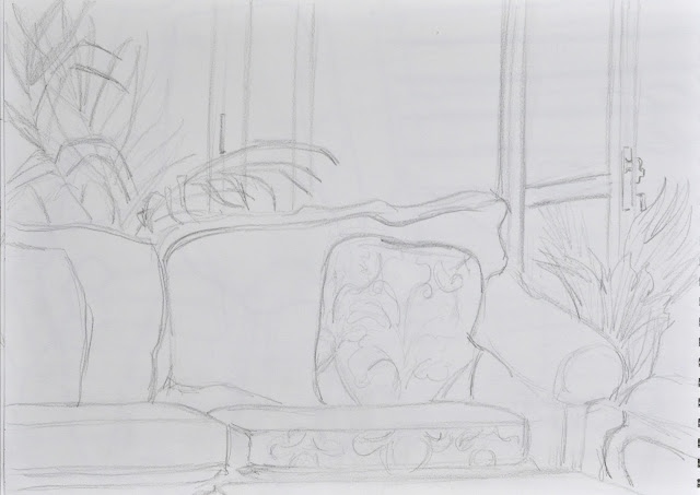
In the end, I shelved the completion of this project and I worked on the Mixed Media project during the following weekend, completing it during the Thanksgiving long weekend. I knew this project would involve a lot of concentrated time. The result was that I returned to this project only this evening. The interesting thing was that because I spent a lot of time studying this same corner chair arrangement, when working on the Mixed Media project, when I returned to this project I felt rather dissatisfied with my perspective on the chair. It is amazing how much my perception of the chair and its foreshortening dynamics had changed over the interim period, due to the many studies I had made of this interior corner.

The view I opted for was drawn with me sitting on top of my dressing table looking down on the scene. It is amazing how difficult I found the perspective of the chair viewed from this position. It really challenged me. I started out with a preliminary sketch in my sketchbook (see picture above). In retrospect, I really like this sketch. It seems to have a fresh spontaneity to it, which in some ways is lacking in my final work.

I started drawing the sketch up large on size A2 paper. This was rather awkward to work with sitting atop my dressing table. I was almost at the halfway mark when I ended up in having to shift gears to the next project. The delay between the commencement of the project and its completion meant that it was hard to get back into the same drawing style I had used to commence the work.

The media I used was a range of vine and processed charcoals, with white conte and white chalk pencil for details. I found that the different grades of charcoal I have collected gave varying effects. I also used charcoal dipped in oil to create the more intense dark of the wooden chest of drawers and the chair legs.

A major feature of this corner is the diversity of patterns and textures presented in one small area. I decided to try to make this the main emphasis of this piece. I experimented with varying ways of manipulating the charcoals to emulate the surfaces being described.

I changed the shoes mid-project from my more clumpy practical walking sandals to more elegant wedge-heeled sandals to give the impression of someone having kicked off the impracticalities of life for a period of brief relaxation.

The predominantly busy darker three-quarters of the composition is balanced by the white are of the wall on the top right hand corner and the stabilizing dark strip of the cupboard. The patterned swath of the quilt slung over the chair adds a slight sense of movement to the piece. Your eye is draw to its dark strip and patterned details, but then is also attracted to the details of the sandals, moves up to the basket, and then closes the rotation via the shadows on the wall, to once again rest on the quilt.  I find this eye movement, along with the busy textures of the chair fabric, ribbed leafy palm and African print curtains, add to a giddying sense of disquiet. The awkward lines of the tiles, also add to this strange dynamic.

Although I did not try to create an emotive piece, I think it speaks of a disquiet found in spots which are supposed to provide a sense of tranquility and peace. It ended up in being quite a revelatory study that went beyond mere tonal depictions. What I also find fascinating is how this piece feels as if it was viewed through a wide-angled camera lens, whereas this is not the situation. It reminds me of an article I read some years ago of some of the work of David Hockney, where he deliberately tries to included a multiple viewpoint into his compositions, showing that the eyes can see more than just what the traditional techniques of perspective portray.
Corner of Disquiet


Saturday, November 28, 2015

Part 2 Project 6 Exercise 5 Mixed Media

While working on the charcoal and conté drawing of my favorite corner chair, I decided to explore this interior setup further by developing it into my next mixed media project. As I am not experienced at collage work, when preparing myself for this exploratory mixed media composition, I looked at some of the work of Cameroonian artist Ginette Daleu (Fig.1). She gains much of her inspiration from the contrasting textures she finds in her urban environment and the “assortment of found objects” she incorporates into her collages. (Lecaille, 2014) I decided to try to explore the textures found in this enclave, along with the sharp lighting which falls across the chair, casting descriptive shadows across the entire area.

Fig. 1. Architextures Urbaines (2010). Ginette Daleu.


I decided to use the thickest paper I have to ensure that I could use collage. As it turned out, this paper stock proved to be awful: it expands radically when paint is applied and contracts noticably with glue. I was not to know this until I was almost finished my first section.

I did not fancy working too small, as I wanted to explore the surfaces of my subjects, so I divided the A2 sheet into two landscape-formatted sections. I drew the same interior corner from two slightly different angles. I drew the green chair scene whilst sitting on a mattress on the floor, and the blue scene was drawn from the corner of my bed. The slight difference in viewpoint particularly altered the appearance of the wing-backed chair. 


Initial sketch
What I love about this chair is that it nestles in the corner nook in our bedroom, in a spot where it catches the late afternoon sun. It is a cosy little spot, where I often curl up to read my Kindle. I decided to try to create this sense of warmth in my initial study. I also wanted to incorporate the quilt which drapes over this chair. This quilt was made for my daughter last year when she was hospitalized with a collapsed lung. Since we battled for six weeks to get her lung back to full capacity, this quilte now has nostalgic memories for me. As our apartment is on the third floor, we get to watch the changing skyline. For this reason, I chose a skyscape from a magazine to stick into the window of the lower portion.

Running with the ideas of Ginette Daleu, I decided to try to emulate varying textures in this diptych. I would have enjoyed incorporating even more found textures, but as I do not have canvas to work with, and was trying to stay with drawing related media, I decided rather to suggest textures through rubbings. As the scene has very rough crude bars on the windows, I wanted to create paper to emulate them. I used watercolor black crayons with a wash of brown ink to create an intense dark brown which was definitely textural in appearance. I used this paper to create the window frames, bars, and the wooden structure of the chair legs. I created a different rubbing using a straw mat to create circular patterns to adhere to the wing-backed chair upholstery. I used brown crayon with an ink wash to create this effect. Once the chair was stuck in place, I used oil pastels to suggest the shadows and light falling on the chair, and to emphasize its form. I also used oil pastels for the curtains behind the chair.


Sketchbook textural experiments.
The area where I experienced the most trouble was the wall under the window. As I have almost finished my white watercolor paint, I used some acrylic paint to augment the mix. This immediately curdled the mixture slightly, giving the surface a slightly rough texture. The biggest problem, however, was that I did not realize that it would be very difficult to use mixed media on top of the acrylic paint. When it came to painting the fern, I eventually had to mix wood glue into the ink and watercolor mix in order to make the paint adhere to the surface. As I don’t have other colors in acrylic, this was my best solution to this problem.

I found the floor quite hard to regulate the color. This time around, I used white wall­­­­­­ paint to add into the watercolor paints. Although the paint mixedd all right, in this hot, dry climate, the paint dries very quickly, making it hard to blend shades to create smooth transitions in hue and tone.

I enjoyed painting the cupboard. For this surface, I used watercolor crayons which I then blended with Bombay inks. The surface was easy to control with a paintbrush and created a rich, shiny mahogany which emulated the cupboard well.

For the basket, I used two different crayon rubbings covered with differing washes of watercolor. I did not want to overstate the basket, so left out a lot of the details of the weave work.

I experimented with applying glued paper towel in my sketchbook. I tried to add color to the paper towel but for the most part the results just looked messy. In the end, I found that the plain paper towel applied with lots of glue made an interesting drape effect. It does not really look like a quilt, but rather like a crocheted shawl. I really like the way the color of the chair shows through the applied paper towel, so left it the way it was.


Lower section of Quiet Closet Diptych.
As the brief suggested experimenting further, I decided to change the scene from being based around warm colors to being rather cool and stark in appearance. As we are facing yet another placement, somewhere in the world, I decided to use a map of flight paths to varying destinations in the window. I used strips from the Tower of London to fill in the standing lamp shaft and its base. This time around, I avoided using acrylic on the walls. For the one wall, I applied a section from our organization's newspaper. I treated this wall with colored chalks, applying oil pastel to bring out the light highlights. I used blue tones to paint in the palm, as well as for the tiles on the floor. I wanted to emphasize the starkness of the light on the floor, so drew in the tile lines with crayon before painting. This left most of the lines visible, but hardly noticeable.
Sketchbook experiments #2
To create a different atmosphere in the chair I used just two differently toned papers I created using rubbings. I tried to emphasize the harsh lighting falling across the chair, creating the definite highlights and shadows. The chair legs I simplified into a single cutout shape, which I cut from a watercolor crayon and ink rubbing.

I tried to unify the diptych slightly by doing similar window treatments, the same colors in the curtains, and the same technique of painting in the cupboard. Obviously, the actual subject matter also serves to unify the two artworks. I also suggested a drape hanging over the chair in the top picture, but I tried to understate it by just creating it from a papercut. This helps to provide a center of interest in the lower section. This helps to balance the artwork as the yellows and oranges in the top panel tend to draw your attention due to their stark contrast with the blue of the the rest of the artwork. So, I think having more textural appeal in the bottom section helps to unify it further.


Upper section of Quiet Closet Diptych
It is interesting how the artworks, when photographed seperately, have a totally dfferent atmospheric feeling to when you view them as I created them, together. I called this artwork Quiet Closet, as this is the area where I often closet myself to quiet my racing thoughts.

Quiet Closet Diptych
Although I thoroughly enjoyed experimenting with various materials, I think that in future I will need to use cardstock, as the surface crinkled horribly. This was disappointing as the exercise took a long time to execute and the final result is not quite what I was expecting.

Works Cited

Daleu, G., 2010. Achitextures Urbaines (2010). [Art].

Lecaille, E., 2014. Ginette Daleu, Une Artiste Au Feu Sacre. Intense Art Magazine (IAM), Autumn/Winter(#01), pp. 38, 39.

Sunday, November 8, 2015

Part 2 Project 6 At Home Exercise 4 Line and Wash

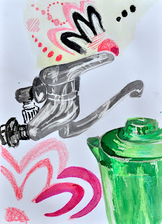
As I liked the viewpoint of my kitchen sink taken from sitting on top of the stove, I decided to use this vantage point for this exercise. As it so happened, the power in our house went out on the particular day I did the drawings; I had an extended period of drawing available to me.

I started with a crayon continuous line drawing which had quite a lot of freedom to it. I then moved on to drawing the scene in oil pastel, and finally with ink and brush. I found that the warm-up exercises did help me to analyse the compositional lines. They also gave me the idea that it was probably wise to start the drawing with items closer to my viewpoint, such as the tap, in order to figure out the placement of the items in the background, rather than with the green jug, as I had been doing.


Oil pastel continuous line study
Crayon contour line study
Ink and brush contour line study
I decided to emphasize the lime green on the jug, with its complementary color contrast of fuschia, found in the curtain patterns. Our water piping is rather obnoxiously crude, being in a bright green, which I changed slightly to have a similar shade to the jug. I also changed the color of the hand wash on the windowsill from turquoise to the same green shades. This helped to create a triangular visual link spanning the composition.
Sketchbook trials

I enjoyed working on the green jug and the tap as I used crayon resist to highlight the reflective quality of the surfaces. I used washes of watercolor paint and Bombay ink over the crayon to create the layered effects of the reflections. Initially, I used watercolor crayons to create the patterns in the fabric, but they ended up in looking too scruffy and ill-defined. I then brushed over the designs with Bombay ink and was pleased with the overall result.

One area I might go back and work is the area of the sink. I think if I colored the sink in cream – the same as the curtain, it might help the foreground to gain a bit more definition.


I think the directional forces created by the dark windowsill and window frame, the shadows along the sink, and the vertical dark strip created by the cover of the electrical cabling help to hold the focus of the composition on the back right-hand corner. I did not intend for the green jug to be slightly cut-off at the right-hand side of the picture plane, but I think it works as it means that your eye is lead back into the artwork, instead of coming to rest on it as a restive focal point. The pink on the bottle cap and slight reflections on the surface of the tap spout, also create a triangular movement within the central area of the composition.

I added some oil pastel shading as my final touches to emphasize the shadows and to help to visually link some of the disparate sections, such as the back tiling and the details on the tap.
Final mixed media study of kitchen sink

Research Point

I studied the various works of Philip Pearstein. As my next project is working an interior scene in tones, I found his charcoal study of shoes and a scarf draped over a stool suited the brief with its strong contrasts (see fig.1). (Anon., 2014) He has created a sense of rhythm in the placement of his two stool, one behind the other, which are then further emphasized by a dark column behind the last stool. The focal point of this artwork seems to be the white scarf which drapes next to what appears to be a woolen cap, nestled on a medium dark coat. The diagonal of the one section of the light scarf is repeated in the placement of a light colored book on the stool behind.

The viewpoint adds to the directness of this piece as we are viewing it from an oblique angle above the stool. Hence, we can see the spread of the clothing items on the stool, as well as the insides of the dark shiny shoes at the base, but we still see the paneling of the 'cupboard' as being vertically orientated. The orientation of the lines on the floor tiling, the angle of the right hand stretch of the scarf, the right shoe and the book all guide your eye to the less noticeable form of the trashcan in the top left hand corner. As this is a rather dead and uninteresting area, this creates a visual tension, causing the viewer to return to viewing the clothing items draped on the stool.

Fig. 1. Philip Pearlstein
While perusing the internet, I stumbled upon the intriguing installation work of Henrique Oliveira. Oliveira studies the interior of a specific site and then reinterprets the space. In the case of Xilonoma Chamusquius, 2010, he envisioned a wooden tumor bursting forth from the white surface of the studio walls. “Oliveira's twisted and coiled intestinal loops erupt from the wall like a malignant tumor.” (Smithsonian National Museum of African Art, 2011) This work was not in line with my interior studies, but I felt it to be quite compelling how he reinterprets interior spaces.

Looking through my artbook, Expressive Drawing by Steven Aimone, I found a colored pencil drawing called Kairos, 2005, by Pat Williams (fig.2). The discussion in Expressive Drawing points out that the picture plane is divided into three spaces which lock together in the corner. Within each of the three spaces, there is “one modified oval – the window on the upper left, the doorway to the right, and the cropped tabletop at the bottom.” (Aimone, 2009) Aimone goes on to point out that in each of the three spaces, a visual link is created in the placement of daisies and daisy petals which “take you on a delightful rhythmic movement that threads its way through the space.” (Aimone, 2009) I must admit that I found this artwork to be intriguing, but had not seen the underlying structure to its composition. I researched it further to find out that it was the study for a tapestry, which won the American Tapestry Alliance Award of Excellence in 2014. The idea behind the tapestry is that Kairos, which in Greek means “God’s time”, is qualitative and is a “moment of an undetermined period of time in which “something” special happens”. (Williams, 2014) This is presumably why the doors and windows appear to be going through a time warp, while the cat merely sits by without any indication of anxiety.


Fig 2. Kairos (2005). Pat Williams.
Another artist I encountered in Expressive Drawing was Mary Teichman. The artwork Aimone analyzes is Sewing Machine, 1979. He points out how strategically she placed her focal point in the upper-right quadrant, the area emphasized by the “weight of the dark value” of the three spherical shapes. The entire quadrant is then in turn “framed and supported by the large area of darkness underneath.” (Aimone, 2009) The eye is then directed by the horizontal placement of the body of the sewing machine towards the left, where the curtains drag your eye to follow the repetitive vertical lines which eventually meet a slight diagonal which slides our eye down towards the bottom of the artwork. Your eye gradually gluides over the pile of belongings towards the dark upright of the single column of the table’s base. This is really a well-executed drawing with an incredible amount of visual interest and clever application of tonal values to enhance the rhythmic movement of the eye across the picture plane. Unfortunately, I was not able to find this image on the internet.

Works Cited

Aimone, S., 2009. In: D. Morgenthal, ed. Expressive Drawing. New York: Lark Crafts , p. 207.

Aimone, S., 2009. Look at this Mary Treichman. In: D. Morgenthal, ed. Expressive Drawing. New York: Lark Crafts, pp. 184, 185.

Anon., 2014. Phillip Pearstein. [Online]
Available at: http://philippearlstein.com/
[Accessed 8 November 2015].

Smithsonian National Museum of African Art, 2011. Henrique Oliveira. [Online]
Available at: http://africa.si.edu/exhibits/dialogue2/oliveira.html
[Accessed 8 November 2015].

Williams, P., 2014. Both Kairos and Sniffing win the American Tapestry Alliance Award of Excellence in 2014.. [Online]
Available at: http://www.patwilli.com/
[Accessed 8 November 2015].
 

Part 2 Project 6 Exercise 2 Composition - an interior

For these interior sketches, I decided to take the corner of my kitchen near the sink. At the time of drawing, it had a collection of water bottles, a jug, wooden bowl of bananas and an assortment of other vertically orientated containers.

I started out with a view taken from sitting on a cushion on the floor. I used a landscape-orientated format with the help of a viewfinder to orientate my lines and the boundaries of my chosen view. I found the linear perspective of the cupboard quite hard to get correct at this angle. What I did not like was that the large majority of the sketch was taken up with the lines of the cupboards and very little of the objects on the counter.

View from the floor.
From the same viewpoint, I shifted my viewfinder so that the sketch focused on the objects themselves. The problem with this approach was that in the end the sketch resembled a still life and not really an interior study.

Zoom in of view from the floor.
As a result of this development, for my third drawing, I placed my cushion on the stovetop and perched up there so that I was looking along the top of the draining board and double-sink, towards the arrangement of containers. This view allowed me to see more within my viewfinder, meaning that it became more of an interior scene, than a still life study. Once again, the perspective was rather interesting to get right, but allowed for a sense of deep space because of the objects which were up close versus those that were higher up the picture plane and resultantly seen as further away. I used a portrait format to enable me to get the impression of the length of the sink and counter.


I fancied climbing even higher and sitting on top of the fridge, but as I was alone at home, I did not think it too wise. Instead, I stood on a chair in front of the fridge. I liked the angle of the perspective, and the landscape format worked fairly well in this case. However, I felt that it would be hard to draw standing on a chair for any length of time, with an A2 or A1 size piece of paper.


View drawn while standing on a chair.


Sunday, November 1, 2015

Part 2 Project 6 Exercise 1 Quick Sketches around the house

One of the first things I encountered was that when studying geometric forms like tables, bookcases etc., none of the lines looked straight. I struggled with this in my drawings until I realized that I had forgotten that I wear multi-focal glasses. Because of the curvature of the lenses, it was making everything appear curved. Even when I traded them in for regular shortsighted glasses, I have viginetting occuring on the periphery of my vision. Your mind gets used to this in normal everyday life, but when trying to do an accurately depicted drawing, it really plays with the perspective.

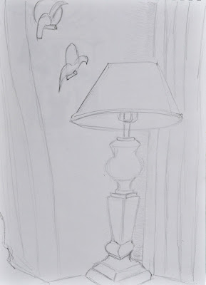
As our house is a rather small apartment, I found that I would start with an item in my viewing frame, start drawing it, but within a few strokes, I would have totally honed in on that item. This meant that the picture became more about the lamp and table, for example, and not about the corner of the room. It was only after a few different views and many attempts that I started to be able to take in more of the corner with my sketch.


I struggled to get my perspective looking correct. To help me, I read through a few articles on the internet that discussed various types of perspective. I found some helpful tips on Drawing + Hand (The Coraline Theme, 2013). I watched a number of tutorials posted on Drawing and Illustration (WonderHowTo.com, 2010) and studied some architectural drawings by a Kiev designer (2-B-2 Architecture, 2015). I particularly like the various drawings on this site. The detail of the restaurant interior design helped to soften the look of the drawing from being your typical interior design blue print.

Using some of the tips I gained from the online search, I tried to strengthen the perspective on my following sketches. I find two-point perspective particularly difficult as invariably the two points of your perspective in an interior shot are extending right off of your page. So, you don’t have an easy mathematical reference point. You have to try to imagine where the two points are. The dresser with the mirror leaning on top of it was particularly hard to draw as the dresser and the mirror interacted with one another and yet had differing angles. I was looking down on it too, which was adding to the three-point perspective feeling
.
 

Our dining room chairs are particularly hard to draw as they have these weird curly designs at the top of them and their backs have a curve. When two or more chairs are seen together at varying angles, it is extremely hard to get the designs at the top of the chairs to look in perspective. The mirror was also not wide enough to include all that was actually reflected in it. This dresser, with all of its reflections could make a challenging drawing, but would require me to get the perspective to look completely authentic.


Drawing around our apartment made me realize how complex our furniture is. It is not our choice of furniture as it is what came with our housing arrangement in Cotonou, but it certainly is a challenge to draw.


The item that was the most complex to sketch was the display cabinet. I decided to draw it from close-up as we have a large diningroom table which would otherwise obscure my view. What I realized while drawing this cabinet was that the is a conflict that happens between drawing using eye-balled perspective and proportions, and trying to get the angles right using two-point perspective. Using two-point perspective techniques helped me to work out the angles of the shelves and cupboard edges etc., but halfway through I realized that my cabinet was probably not quite tall enough in my drawing. This meant that the middle shelf should have been viewed from slightly below the middled glass shelf, whereas in my drawing, in order to get the proportions to look right, I had to draw it from slightly above. What was also interesting was how complex the reflections in the mirror and side panels are. The leaves of the palm seemed to be reflected in numerous panes across its surface.
 
Works Cited
2-B-2 Architecture, 2015. Sketchbook. [Online]
Available at: http://www.coroflot.com/bondarenko/Sketchbook
[Accessed 30 October 2015].

The Coraline Theme, 2013. Sketching to Generate Ideas. [Online]
Available at: http://sippdrawing.com/category/perspective-drawing/
[Accessed 30 October 2015].

WonderHowTo.com, 2010. How to Draw a building and stairwell with complex levels. [Online]
Available at: http://drawing.wonderhowto.com/how-to/draw-building-and-stairwell-with-complex-levels-375211/
[Accessed 30 October 2015].


Thursday, October 29, 2015

Part 2 Project 5 Exercise 3 Live animals

Final artwork

Ostriches, 2012. Craig Johnston.
As I have no access to live animals, I decided to draw two ostriches my husband photographed while we were at a conference in Thailand. Ostriches are extremely opinionated and determined creatures. Yet, their quirkiness makes them delightful. I wanted to try to show their arrogance and indignation in this artwork. 

As many of my latest artworks have been extremely time-consuming and detail orientated, I tried to maintain a more spontaneous spirit in this exercise by setting the kitchen timer. I started with one hour, but then added another hour. I finally gave up and allowed myself the luxury of finishing the drawing without the time pressure. However, just by setting a time frame, I was able to put down tonal areas in a more expressive and gestural manner. I chose to work on a sheet of A2 green desktop paper – the type that many businesses would have as their work mat on their desk. I remember my grandfather always having a holder on his desk that had these green sheets slipped into it. This paper had previously been coated with acrylic white paint, so although painted had a slightly rough textural appeal to it. As ostriches are predominantly varying tones of grey, I set this as one of the medium grey tones.

After sketching the basic composition in place, I quickly established the main hues in the background. I used watercolor crayons and construction color crayons, with washes of Bombay ink. I absolutely love the effect of using the two types of crayons together. The one acts as a resist and the other blends with water in a slightly unpredictable manner.


Laying down initial tonal regions
Once the background was established, I started working on the bird in the background. I used white crayon to establish the areas where I did not want the ink washes to settle. I then alternately used the watercolor crayons and the construction paper crayons to establish varying tonal hues. The details on the beak and eyes were more carefully drawn to focus the attention on these areas. I then thoroughly enjoyed using white oil pastel to add the finishing touches of the fluffy feathers on the neck and head.

It was a bit more daunting working on the second male ostrich as he did not have as much of a tonal range as the previous bird. I found that I had to add just touches of color, e.g. the tinges of blue and orange, to add some interest to what could have been a boring surface. Once again, I used wax resist techniques to create layers of tone and to provide an interesting surface texture. I like the contrast between the texture of the crayon shading and the smooth application of washes of color. I think I was able to capture the expression of the second ostrich using finer water-soluble crayon lines applied with a thin brush. I enjoyed adding the finishing touches of fluffy feathers along the eyelid and around the silhouette of the bird.
Detail of eye showing washes of color which make up the tonal variations.
 
I think I have been able to achieve the brief of creating an artwork which is loose, with unfinished lines, but captures the nature of the animals portrayed. I could imagine this being used as an illustration in a child’s picture book. I have often desired to be able to have this type of style, so it was great to have the chance to explore how one would create an artwork of this nature. 

I realize that the proportions of the ostrich in the background are a little off. The top of the head is a little too small for the lower section and the eye could be larger with a smaller white reflection. This is something to be more aware of next time I paint a pair of animals.