Thursday, October 29, 2015

Part 2 Project 5 Exercise 3 Live animals

Final artwork

Ostriches, 2012. Craig Johnston.
As I have no access to live animals, I decided to draw two ostriches my husband photographed while we were at a conference in Thailand. Ostriches are extremely opinionated and determined creatures. Yet, their quirkiness makes them delightful. I wanted to try to show their arrogance and indignation in this artwork. 

As many of my latest artworks have been extremely time-consuming and detail orientated, I tried to maintain a more spontaneous spirit in this exercise by setting the kitchen timer. I started with one hour, but then added another hour. I finally gave up and allowed myself the luxury of finishing the drawing without the time pressure. However, just by setting a time frame, I was able to put down tonal areas in a more expressive and gestural manner. I chose to work on a sheet of A2 green desktop paper – the type that many businesses would have as their work mat on their desk. I remember my grandfather always having a holder on his desk that had these green sheets slipped into it. This paper had previously been coated with acrylic white paint, so although painted had a slightly rough textural appeal to it. As ostriches are predominantly varying tones of grey, I set this as one of the medium grey tones.

After sketching the basic composition in place, I quickly established the main hues in the background. I used watercolor crayons and construction color crayons, with washes of Bombay ink. I absolutely love the effect of using the two types of crayons together. The one acts as a resist and the other blends with water in a slightly unpredictable manner.


Laying down initial tonal regions
Once the background was established, I started working on the bird in the background. I used white crayon to establish the areas where I did not want the ink washes to settle. I then alternately used the watercolor crayons and the construction paper crayons to establish varying tonal hues. The details on the beak and eyes were more carefully drawn to focus the attention on these areas. I then thoroughly enjoyed using white oil pastel to add the finishing touches of the fluffy feathers on the neck and head.

It was a bit more daunting working on the second male ostrich as he did not have as much of a tonal range as the previous bird. I found that I had to add just touches of color, e.g. the tinges of blue and orange, to add some interest to what could have been a boring surface. Once again, I used wax resist techniques to create layers of tone and to provide an interesting surface texture. I like the contrast between the texture of the crayon shading and the smooth application of washes of color. I think I was able to capture the expression of the second ostrich using finer water-soluble crayon lines applied with a thin brush. I enjoyed adding the finishing touches of fluffy feathers along the eyelid and around the silhouette of the bird.
Detail of eye showing washes of color which make up the tonal variations.
 
I think I have been able to achieve the brief of creating an artwork which is loose, with unfinished lines, but captures the nature of the animals portrayed. I could imagine this being used as an illustration in a child’s picture book. I have often desired to be able to have this type of style, so it was great to have the chance to explore how one would create an artwork of this nature. 

I realize that the proportions of the ostrich in the background are a little off. The top of the head is a little too small for the lower section and the eye could be larger with a smaller white reflection. This is something to be more aware of next time I paint a pair of animals.

Part 2 Project 5 Exercise 4 Using Source Material


West African rainbow lizard.
Photographed by Craig Johnston. 2014
As we are daily greeted by the bobbing heads of twitchy lizards, I decided to select a photograph of a western African rainbow lizard my husband took while last year. These lizards are exquisite during mating season as they put on their starkly colorful courting jackets.

I decided to use watercolor crayons, construction paper crayons, and oil pastels on a thick grade blue/grey paper stock. As I worked, this exercise seemed to develop a life of its own. I started out intending that this piece fulfill the requirements for Exercise 3, however, I became so absorbed in the incredible detail of the scales, patterns, and textures on the rainbow lizard that I felt it did not fit the requirements of Exercise 3. I then decided that I would modify it to suite the criteria of Exercise 4 by throwing some source material images into the background of the rainbow lizard. This proved to be quite a challenge.


I read and reread the brief for Exercise 4 a number of times. I must admit that it was very difficult to imagine how to proceed, as the wording of the exercise is very vague. I looked at several of my fellow students’ works for this exercise, and did not feel that they had fully come to understand what the brief intended. This left me feeling a bit directionless. I spent a long time searching for any images related to lizards that I could incorporate in the background. I discovered that cats, elephants, cows, horses, and dogs are fairly well analyzed and drawn as anatomical studies – but not the lowly lizard. I suppose not many veterinarians take the time to perform surgery on a lizard. Most of the drawings were extremely simplistic and schematized. One drawing I found on a blog site for Scientific American, though highly schematized, did help me to be more analytical of the bone structure of the feet and jaw structure. (Scientific American, n.d.) Another labelled diagram of the Skeletal System was found on an individual’s blog site. (Anon., 2015)

These drawings reminded me of the day my son, who was only about six at the time, was bitten under the chin by a large, elderly iguana. Its teeth were razor sharp and would not release their grip on his tender skin, whilst the gnarled fingers clawed at his face. My husband had to pry them open with brute force, ending up with his own set of lacerations, which required him to need a tetanus vaccination.

I eventually found a photograph of a skeleton of a lizard from a very interesting angle, one which I thought worked quite well with the rainbow lizard I had drawn. (Flickr, 2013) I have not displayed this image as it falls under the all rights reserved copyright. I decided that for my drawing I would flip the image so that the head pointed towards the right and throw it behind my rainbow lizard. I used the color of the paper as one of the midrange tones for this skeletal study. I had to interpret the skeleton, as my photograph was small.


Preliminary stage of drawing
Once the skeleton was in place, I had to decide how to treat the left-hand side panel. In the original photograph, this was an out of focus area. I decided to draw a palm reed into this area. This seemed to work well. Then came the difficult task of trying to figure out the rest of the background! After working with artworks where the background is already figured out before starting the artwork, I realized that by working in reverse, the project takes on a life of its own; but it is also is a bit like grabbing a lizard by its tail.

Succulent leaves.
Photographed by Craig Johnston. 2013.
For this task, I used a photograph of what I had already drawn and then in Photoshop placed a cutout of my subject onto various photographs in the background to choose a suitable background.
I eventually settled on the succulent leaves as they had almost a skeletal look to them, reminiscent of the foreground. Their spines created a visual link to the foreground. I decided to place sand in the foreground between the rainbow lizard’s feet. 


Succulent and sand background added to final drawing

The sand between the lizard’s feet was rather course and did not hold the picture together enough. So I experimented and tried painting over it with my tea, which had grown cold. The effect was exactly what I had intended! 
Conceptualization of final artwork
using Photoshop blur tool on foliage.
On completing the drawing, my husband and I felt that the background was too detailed and stark for the foreground. It tends to detract from the detail of the rainbow lizard and the skeleton. I photographed the drawing and then using Photoshop to see what it would look like if the background was blurred somewhat to soften its lines. I think that this will work. It will be a case of getting up the nerve to tackle my drawing once again – running the risk of ruining literally two days worth of work. I will have to see if I get the courage to do so!


Works Cited

Anon., 2015. teopostcarli51's soup. [Online]
Available at: http://people.eku.edu/ritchisong/554images/Sinornithosaurus_skull.gif
[Accessed 27 October 2015].

Anon., n.d. Anatomy of Animals. [Online]
Available at: http://universe-review.ca/I10-82-lizard.jpg
[Accessed 28 October 2015].

cgchannel.com, 2010. New Training DVD - Introduction to Animal Anatomy. [Online]
Available at: http://www.cgchannel.com/2010/05/new-training-dvd-introduction-to-animal-anatomy/
[Accessed 28 October 2015].

Flickr, 2013. Frilled Lizard Skeleton. [Online]
Available at: https://www.flickr.com/photos/biologis/6655423483/
[Accessed 28 October 2015].

Naish, D., 2010. Tetrapod Zoology. [Online]
Available at: http://scienceblogs.com/tetrapodzoology/wp-content/blogs.dir/471/files/2012/05/i-4a798e3958072590cd20db021dbf2bfc-T-Ford-Zilla-hands-feet-Nov-2010.jpg
[Accessed 27 October 2015].

Scientific American, n.d. [Online]
Available at: http://blogs.scientificamerican.com/tetrapod-zoology/files/2012/07/Huehuecuetzpalli-ReptileEvolution.com-David-Peters-July-2012-tiny.jpg
[Accessed 28 October 2015].

WikiArt, n.d. Anatomical studies of the shoulder. [Online]
Available at: http://uploads4.wikiart.org/images/leonardo-da-vinci/anatomical-studies-of-the-shoulder.jpg
[Accessed 27 October 2015].

Tuesday, October 27, 2015

Part 2 Project 5 Exercise 2 Tonal study of bones and shells

A few years ago, I had a wonderful selection of bones. Our school was located on the outskirts of Almaty in farmlands. Whenever we held a community cleanup, my students would come running to me with an assortment of awfully odorous skulls and back bones. I would then boil them up in bleach and try to eradicate some of the stench. They would then form the subject of numerous studies.

Unfortunately, those days are gone, and I now sit in a city apartment with no access to bones. However, I do have two trusty shells! So, once again I took to studying the same shell that featured in a previous drawing. I placed it on an interesting matting of driftwood palm bark. Well, that is what I think it is. I found it one of our walks outside of Cotonou. Its intricate designs make a very intriguing background. Ever since picking it up, I have fancied drawing as it has such delightful design qualities to it.

For this drawing, I used a woodless medium grain charcoal pencil, a white fine art pastel pencil, and a number 5 extra hard Cretacolor pencil. I ensured that it was side lit - initially from the window, then from a side lamp, and then once again from the window. This took way longer than the two hours a constant light suggested by the course outline. This project took probably a good eight hours. Once it had sucked me in, there was no letting go. I became thoroughly absorbed!

I found trying to balance up the attention to patterns and the overarching tonality of the form of the shell, as well as the lattice matt, difficult to get right. Both items had exquisite surface detail, but to understand their form I had to try to overlay highlights and shadows to bring these out. I found that I became lost in the details of the matting. At times I had to use artistic license to span areas where I had run out of structures or had included too many. I think the balance I achieved between the empty negative space and the business of the two subjects works.
 
Spartacus shell on driftwood palm bark
 

Monday, October 26, 2015

Part 2 Project 5 Exercise 1 Animal line study

I actually started the preliminary studies for this exercise in late July while I was staying with family. As we do not have pets and any other available animal subjects where we live in Cotonou, Benin, I thought it would be wise to do these sketches while I had live subjects to work with.

It is amazing how active a sleeping animal is. For my studies of the Labradors, the German Shepherd and the cat, I picked moments when they were less mobile. To my astonishment, this did not mean that they would remain in one position for any length of time. They would move position every three or four minutes, meaning that my sketches had to remain gestural in nature. Occasionally they would return to a pose similar to a previous pose, but usually at a different angle, meaning that from my viewpoint, anyway, it was a different pose.

I did, however, really enjoy trying to get to gist of the poses and body forms represented. It was a restful and contemplative few hours of sketching.

This is one of my favorite sketches. Unfortunately, the ink from the following page seeped through leaving blotches. I particularly liked the little pattern of hairs towards the end of the sweep of the curled back.
 

I enjoyed studying the detail of the muzzle and claws.


Sadie sleeping.
Prone Labrador

Perspective of head rather awkward.
 

Great Dane mutt with a spongy nose.


Alsatian pressed against the couch.


Ginger cat
The Labradors, in particular, had a sense of bulk and their skin seemed to sag down at their sides. I tried to indicate this with the indication of skin folds. Their heads were also the most interesting areas as the rest of their bodies curled about with very little detail. I did enjoy studying their claws and their closed eyes. The Great Dane mutt was comical to draw, as his head is such a weird combination of forms. His nose is like putty when scrunched up against the floor or a nearby couch. The German shepherd stayed still the longest allowing me the luxury of drawing him for an extended period. The angle of the pose called for foreshortening which was a bit of a challenge.
The ginger cat proved to be a frenetic sleeper. He would just drop off to sleep and then shift position entirely, scratch, and then collapse in yet another pose. So I did not have much success drawing him.

Whilst trying to gear up for my final sketches, I looked at the work of fellow student Martin. I absolutely love his sketches of the rhinoceros iguanas. His attention to pattern and gestural strokes is superb.

I completed some preliminary sketches of my parents Jack Russell. I found that my sensitivity of line improved with each sketch, allowing for a clearer depiction of the dozy, restful pose of Zoey.
 
Napping Jack Russell

Drowsy Jack Russell
Aborted Fine Sharpie Sketch
Where I really struggled was to create a drawing with a similar sense of sensitivity on a large-scale A2 drawing. My first attempt with a Sharpie fine marker really did not go well. I then changed to a water color crayon. I though this was going okay until the very end. Once the body was sketched in, the Jack Russell was horribly deformed with a disproportionate head. I felt thoroughly discouraged, but decided to try one more attempt.

This final sketch is better proportioned, but still lacks the spontaneity that I so wanted to get into my sketch. As I am way behind schedule, I will need to push on, but I do feel that this whole exercise could do with some further work as I am still not free enough in my gestural rendition of these animals. I think that my Alsatian is probably about the best sketch I managed to execute. It does not look tired or overworked and the lines are loose and gestural.


Disproportioned Sketch

Final Sketch
 
Somehow, the smaller version of this drawing has far more feeling and the lines are more expressive. I don't know if the fact that I am working on a large scale on a tabletop has anything to do with my lack of being able to get expressive lines out of my final sketch.

Saturday, October 17, 2015

Part 2 Project 5 Pets and other animals Research Point

When doing a Google search for contemporary animal artists, I stumbled across the exquisite work of Louise Pallister. Pallister’s stop-motion animation of a caged thylacine is extremely intriguing. I love the fact that the final image from this installation is unfathomable, yet has the traces of all of the previous images photographed. (Anon., n.d.) In her blog, Louise stated, “…I'm very interested in the marks you can make on a surface and how much you need to show for the viewer to understand the animal. So... it's not so much about turning out a nice drawing of an animal (I know I can do that) but more about how I convey that pure energy and sensation. That's the challenge.” (Pallister, 2014) I absolutely love the raw, crude energy caught in the artwork Brown Paper Wolf, 2013. 

Brown Paper Wolf, 2013. Louise Pallister.
Mixed media on brown paper.
Caged. Louise Pallister. Installation. Charcoal.
I found it interesting that Pallister states that Francis Bacon influenced her work. This is definitely evident in the artwork After the Fact IV, 2014. This chalk work on blackboard paint has an implied haunting appearance. I love the broad strokes with which she analyzes the pose of Rest, 2009. The study of the skin stretched over the bony skeleton of the Doberman clearly articulates her pose.

As part of a series of works created on invitation by Haydock Park Racecourse, Pallister painted the mixed media artwork of a jockey interacting with its horse, To the Post. I particularly like the sketchy nature of this image which almost portrays the horse’s anatomy as a well functioning machine. 

 
Louise Pallister refers to the work of Justine Osborne. Her work, although extremely realistic, still conveys a lively expressive quality to it. I enjoy the artwork Portrait of a Jack Russell Terrier. (Osborne, 2002 - 2013) As my parents have a Jack Russell terrier, I can visualize the little guy sitting in front of me, waiting to be taken on a walk.

I think that for an artwork of animals to work, it really needs to go beyond realism to endeavoring to capture the life force and nature of the animal, allowing the viewer to be moved by the expressive nature of the pose and technique used. I want to experiment with creating a white ink to use on top of mixed media works. I have no access to actual white ink, but will experiment with other options. I love the fact that the white gets added on top, creating a great sense of depth.
To the Post. Louise Pallister.
Mixed media.

 
Works Cited

Anon., n.d. Louise Pallister. [Online]
Available at: http://www.louisepallister.co.uk/photo_13438044.html
[Accessed 17 October 2015].

Osborne, J., 2002 - 2013. paintmydog.co.uk. [Online]
Available at: http://www.paintmydog.co.uk/gallery_pet_portraits.htm
[Accessed 17 October 2015].

Pallister, L., 2014. Louise Pallister work in progress. [Online]
Available at: http://louisepallister.blogspot.com/
[Accessed 17 October 2015].

Part 2 Project 4 Still life Exercise 4 Monochrome

Reading the exercise description made me think of researching the Golden Ratios used by artists throughout the ages. Using guidance from the webpages Golden Ratio in Art Composition and Design (Meisner, 2014) and Life & Style tutorial: Creating art using the golden ratio (Marras, n.d.), I set out to draw boxes using the golden ratio proportions. I decided not to have the height of the page according to the golden ratio, but rather to have the strip dividing the background to mark where the correct height would be. I chose to have the pith of the cut open green pepper at the apex of the golden proportion twist of boxes. I tweaked the positioning of the designs on the plate and the details of the pepper to fit within the golden proportion lines. I had a lot of fun working with the placement of the pepper within the picture plane.


Placement of green pepper using the golden ratio
Once I had sketched in my preliminary pencil sketch, I decided to used two thin markers taped together to give my initial outlines and shading. When I drew the guava a few exercises back, I found that the loose lines created using two markers was really freeing and provided an interesting haptic sketch to work into, so I decided to see if I could create an artwork using two markers as the initial basis.
 
Detail of pith and plate

I then used a darker green to help to tighten up the contours and to add the darkest areas of shade. After this, it was a case of using chalk pastels, thin markers, and watercolor pencils to work the tones and tints of the form of the green pepper. I used Bombay inks to paint in the dark green strip which delineates the end of the golden section edge and the area around the pottery plate. I had to go back and work the split in the pepper quite a bit, exaggerating the shading slightly to ensure that the shading of the piece at the back started out in a darker tone than the edge.

I played with ideas of how I was going to approach the designs on the plate in my sketchbook. I eventually decided that I needed to wash the entire plate with a light wash of dusky green and then to work the details in with water-soluble crayons, water-soluble thin markers, and washes of ink. I didn’t want these details to detract from the pepper, so I tried to make them loose and less defined than the details on the pepper. I struggled with the plate perspective once again. Ellipses seem to be very hard to get in perspective. In the end, I had to adjust the curve on the right-hand side to try to create a more authentic looking curve.

Sketchbook experimentation

Once I was finished, I went back, added another layer from the chalk pastels, and touched up the darker areas with some more of the dark green details. This seemed to improve the contrast and sense of three-dimensional form. This is the first time I have painted a totally monochromatic piece. I probably played it safe by painting green peppers green. Painting the peppers in an unexpected color, such as purple would have probably been a bit more daring. That is something to consider for next time. 


Final monochromatic work
Works Cited

Marras, R., n.d. Life & Style tutorial: Creating art using the golden ratio. [Online]
Available at: http://www.digitalartsonline.co.uk/tutorials/creative-lifestyle/creating-art-using-golden-ratio/
[Accessed 16 October 2015].

Meisner, G., 2014. Golden Ratio in Art Composition and Design. [Online]
Available at: http://www.goldennumber.net/art-composition-design/
[Accessed 16 October 2015].

Sunday, October 4, 2015

Part Two Project 4 Still life Exercise 2 and Analysis

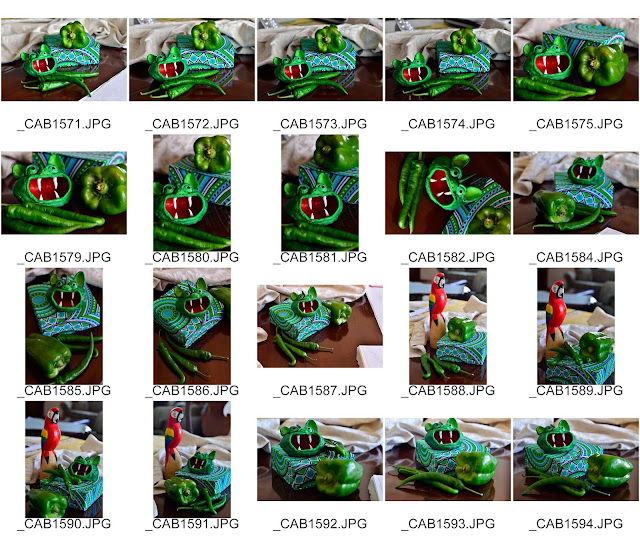
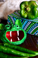
For this exercise, I decided to find objects that had unexpected visual connections. While looking around the house I spotted the little clay gargoyle one of my students created last year during art class. I then tried it juxtaposed with the green pepper and chilli peppers I had bought the day before. I really like the odd similarity in shape and color between the green pepper and the gargoyle. Trying to come up with an aesthetically pleasing composition proved to be quite challenging. I started with sketches, but then decided to take a whole lot of photographs with the camera to make a contact sheet to compare and contrast the pros and cons of each arrangement. I decided to alter the heights of the objects by including a fabric-covered box I have for my tea bags. This fabric is a typical western African print in bright greens, dark blue, and turquoise. I knew that the intricacy of the designs on the fabric would be challenging, but I like the way it provided visual interest and directional forces within the composition.
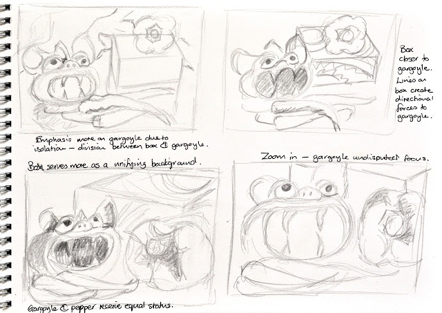

Sketchbook planning

Contact Sheet of possible composition arrangements
Similar view to the
composition I selected
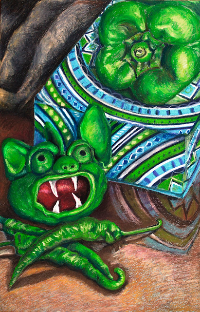
I decided to use oil pastels, as I have not worked with them yet in this course. I knew also that it would challenge me to be able to reproduce intricate designs with a medium which is less precise than other drawing media.

This exercise proved to be enjoyable. I followed the guidance of the course manual in using darker tones first and then building up the lighter tones on top. By doing so, I was able to refine my lines to be quite fine in areas. I love the layered effect made possible by the nature of this media. I think I was able to capture the forms of the peppers and gargoyle convincingly, using the direction of my strokes to emphasize the roundness of the bulging forms.

As I had anticipated, the tea bag box proved to be a challenge. What was difficult was to get the patterns to line up correctly, to create the effect of the corners of the edges of the box, and to be able to get the reflections to appear convincing. I found it helpful to use dry chalk pastels on top of the oil pastel to add contrast and highlights.


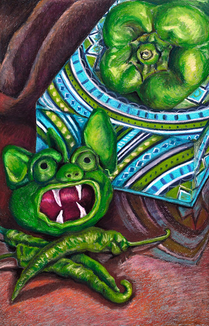
The draped fabric in the back left-hand corner turned out to be far too light for the rest of the composition. The effect of this was that it tended to draw attention away from the main subject. I then tried to reduce the contrast by making it a grey cloth instead of a cream one. The deadness of the grey then also detracted from the warmth of the table in the foreground. I eventually opted to make the fabric a dull brown. I think that this works better with this composition, allowing the focus to be on the still-life objects. Unfortunately, the multiple attempts at creating the fabric in the back corner caused this area to become a bit pasty and difficult to manipulate.
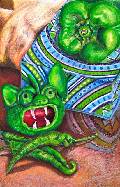


Original pastel work with cream cloth

Composition with grey cloth
Final composition
What aspects of each drawing were successful, and what did you have problems with?

For my ink drawing, I think that I was successful in creating a contrast between the textural quality of the peppers versus the more haptic and energetic fibrous nature of the matting they were sitting on. I was able to create varied lines with varying line weights to invigorate the textures of the items.

In my pastel drawing, the three-dimensional forms of the peppers are fairly convincing. I feel that the layers work well to render this illusion of form. Where I had difficulties was in making the cloth-covered box totally convincing. I also struggled to get the balance between background and foreground detail.


Did you manage to get a sense of depth in your drawings? What elements of the drawings and still life groupings helped to create that sense?

In my ink drawing, I took almost an aerial perspective viewpoint. This meant that the sense of depth is felt in the items themselves, created through overlapping forms and the suggestion of tonal values using weighted lines and hatching. For the pastel drawing, the angles of the box, overlapping forms and one-point perspective help to give a sense of three-dimensionality. Tonal values play a huge part in creating a sense of solidity in the rounded forms of the peppers and gargoyle.

What difficulties were created by being restricted to line or tone?

When using line on its own, you have to create a sense of tonality through using hatching and cross-hatching, as well as weighted lines to attempt to imply form. When using tones, you have to constantly reference back and forward to check that areas of equal tonality are given the same treatment in your artwork.

How did using colour affect your working method?

I found that using colour caused me to be more critical of how the colours interacted with one another. The lighter cream color of the cloth in the left-hand corner drew attention away from my darker tonal valued subject matter. For this reason, I had to darken the hues and tones of the cloth to make it more subdued. I did enjoy finding subtle references to under tones in the modelling of the peppers and the reflections. Being able to use reds and blues in the shadows helped to invigorate these darker areas, instead of just seeing them as black shadows.

Part 2 Project 4 Still life Exercise 1 Still life using line

I am amazed at how long it takes me to brood over composition ideas and to come up with a plan to work with. To get some inspiration, I browsed through Expressive Drawing by Steven Aimone (Aimone, 2009). One work which particularly influenced me was Inside of Devious Tree 1, 1992 by Magdalena Abakanowicz (Aimone, 2009, p.159) This artwork consists of two vertical bars centrally placed with a white rift down the middle. On either side of the rift fibrous assertive lines vigorously twist and entwine to create a dynamic form which appears in flux. On studying this artwork, I fancied creating textural surfaces which also appeared dynamic as if moving out from a central fissure. I then went on to study the work of Kocot and Hatton, 21 September - 29 September 2005, 2005. (Aimone, 2009, p. 129) This entire artwork is made up of two horizontal strips of closely drawn vertically situated lines - some are energetic and undulating, whereas others are more-or-less straight. This creates a restful and yet highly energized matting of two horizontal bands. I read extracts from the chapter on creating equilibrium through using asymmetry and symmetry. From reading these sections, I thought of playing with a design that had elements of symmetry to it in the placement of the subjects, but had other asymmetrical elements to create a slight tension.

Because I absolutely love the drawing, Driftwood, by OCA student, Carol Smith, I found myself looking for similar items to include in my still life. A few weeks ago, I found a section of interwoven fibers of bark from a palm tree. Its linear quality really inspired me and I kept it in a zip-lock bag for future use in a drawing. This morning the Beninoise lady I buy my groceries from gave me a gift of four chilli peppers. When contemplating this composition, I thought of seeing what the internal structure of these peppers looked like. I was delighted with the outcome as the seeds and contrasting chilli pod edge had a decidedly linear quality to it. I then decided to juxtapose the two together; the fibrous palm mat and the cut open chilli pepper.

While playing with composition with my husband’s camera, I noticed that the shape of the fiber had a similar curve to the peppers. I thought that the palm mat would create a highly detailed linear background to the sweeping curves of the pepper. The difference between the intricate circular seeds and plain central strip of the pith of the pepper, would contrast well with the hairy fibrous lines of the matting. I completed a few sketches to see what layout would suite the subject best.


Preliminary Sketches
I tried using differing marker pens and dip pens to see which would create the type of line necessary for the subject. The marker created a line which was too predictable for my liking. The Mombay ink in my fountain pen created a more sinuous line, but could be erratic at times. When washed with water this line gave a more blue hue than the marker or the Energel pen I tried. I found that the Energel pen worked really well for the palm fibers, whereas the fountain pen created a smoother line for the chilli seedpods. The Energel pen also created a more grey wash when I applied a brush of water to it. I decided that it would suite my composition well to use two tones of ink to differentiate the difference in tonal and line quality of the two chosen subjects.
Ink Qualities Explored
Unfortunately, the photographs I have included don’t give full justice to the composition as I was only using them to help me come up with a successful composition, so they are horribly out of focus. By the time I had finished my drawing, my pepper was drying out, and the lighting altered, as I had to photograph it under artificial lighting. However, I think they give an idea of what I was working with.
This exercise had me immersed in the task of trying to use line and slight washes to depict the subtleties and complexities of the lines before me. I so enjoyed this exercise as it challenged me to look and yet to use lines expressively. I would study a line and then try to emulate it with free sweeping gestures. Hard lines I softened by the odd sweep of a watery thin brush.
 
One area where I had to pay particular attention was the region between the two peppers where the shadows cause the lines to become implied, by the negative shapes becoming a darker tone to the actual fibers. I found this area and the areas of matted fibers the areas that I had the most fun drawing.

Final Study
On completing the drawing, my husband and I decided that I needed to work the seeds a little more to help to draw them out. I played with a few black thin lines, but found them too heavy. I then tried to use a thin grey aqua marker marker. This seemed to do the trick. I also added a few more wispy lines I had missed in the bottom section of the matting. Overall, I am satisfied that I have accomplished what I desired to create – a drawing that celebrates the similarities and differences between the palm matting and the inner details of the chilli pods.

Works Cited

Aimone, S., 2009. Expressive Drawing. New York: Lark Crafts, An Imprint of Sterling Publishing Co..

Saturday, October 3, 2015

Part 2 Project 3 Exercise 3 Detail and tone

For this exercise I chose a ginger root as it has intriguing forms similar to driftwood, but was something I had accessible in my home. What was different was finding a way to present it in my composition that would be interesting, as it is a monochromatic form with very stubby self-contained extensions which do not interact with the negative space. To add a bit of interest, I decided to place it on a red and grey tray which has some geometric shapes on it. This created a contrasting color background with understated shapes in the background.
I used a variety of drawing pencils from HB through to 6B for the tonal values, along with watercolour pencils to give the colours needed. Building up the tonal values using only hatching and cross-hatching was indeed time consuming, as I found myself often tempted to just color in the areas instead. What I do like about using this technique was that it seems to emphasize the textural nature of the ginger roots.

Detail of root
A difficulty I encountered was in ensuring the details related spacial to the whole root. I would become fascinated by the detail of the surface texture of an area; only to find that once completed it did not related to the textural detail of the adjoining section. As explained in the brief, I had to go back and forth constantly to ensure that the darkest regions recieved equal dominance throughout the piece.

What I did enjoy was the weird designs that I observed in the root’s texture, allowing the imagination to make connections to morphic beings.

The background proved to be a bit of a challenge. I think the shading in the left-hand side of the painting works, but I am not totally satisfied with the brighter red on the right. I feel its brightness flattens out the composition rather than emphasize its spacial depth.

Ginger root using drawing pencils and pencil crayons


Friday, October 2, 2015

Part 2 Project 3 Reflection

Although I found it the more tricky media to control, I really enjoyed working with inks. I loved working with the layers made possible with the transparent nature of layers. Ink definitely work better than pencils and pencil crayons when try to cover a larger smooth surface in a convincing fashion. Pencil crayons tend to look streaky and textural even when you try hard to apply the graphite evenly. However, pencils and pencil crayons were well suited to depict the intricacies of the textural details on the ginger root. I enjoyed working with the porcupine quill with the Bombay ink to create the linear detail of the stamen – at least I think it is the stamen.