Monday, May 16, 2016

Part 4 Project 2 Exercise 2 A longer study

It always amazes me how long it takes me to get into a project. This exercise had me scouring the internet for photographs, until I eventually found this photograph of a young woman wrapped in a bath towel. I connected with it as it reminded me of times when I went to the Banya, Turkish style baths, in Almaty, Kazakhstan. Unfortunately, as explained previously, I do not have access to live models, other than an obliging family member, and I felt like drawing someone different.

I started out this study with a sketch which sought to explore the proportions of the woman. I found this to be far more challenging than I had anticipated. Her face appeared deceptively smaller than the swathes of toweling, and the broadness of her back and crossed legs. My final sketch did not give the right impression of the proportions or the movement of her pose.


Proportions study

Hodgson, Ian. Angel Part.
I then went back to exploring the works of ian Hodgson. In this work of his Angel Part he successfully uses graphite media with an eraser to striking effect. The eraser becomes a highlighting pencil, drawing sweeping strokes across the graphite of the image. He then emphasizes contours and folds with calligraphic lines created by the irregular strokes from an ink pen or brush. The effect is to emphasize the sensuous nature of the folds and curves. Although the proportions are correct, his aim was to create more of an ethereal sensuality, than a correctly executed pose. I decided to explore some of his technique, to see if I could take my picture beyond a study in proportions, to take the focus off of my struggles to get proportions right.

In my sketchbook I explored how I could create the fluffy, rough texture of the towel as a contrast to the smoothness of the sitter's skin. I used the side of a black conte pastel to lay down a film of speckled black. I then worked my eraser into the chalk to create the highlights of the folds. Then adding water color black pencil and some 6B, I continued to work the folds to allow for the sense of deep undulations of folds, but with highlights that are speckled with the characteristic points of shadow of a towel surface. I used two different ink pens to try out different effects. The one was a store bought ink pen, which created finer, but also pretty regulated and controlled lines. Then I used a feather that I had cut to become a quill pen to try for more loose, unplanned, irregular strokes. I particularly like the spontaneous nature of the quill pen with its broad and delicate lines.

Sketchbook Experimentation with the towel texture.
On an A3-sized piece of white paper, I lightly sketched in the proportions of the woman. Unlike my previous sketches, I found that I could not get her proportions right. Eventually, I tried a completely different approach. I sketched in the spread of the back view of her crossed legs and then worked out from the photograph how many heads should fit into this span. I figured out that it was about four-and-a-half. I then worked out what four-and-a-half would look like and from there figured out the relative size of the head. I then worked up the body from the backside, up to the head. This seemed to do the trick. I was eventually able to get the pose down with the slight twist in the torso.

I then used a black watercolor pencil and a 6B pencil to lightly shade in the tones of the woman's skin, carefully working the facial features. I tried to include lots of white to show the strong side lighting on her. Once her skin was drawn in, I used the technique I had practiced to fill in the folds of the towel.

I retrospect, I think that I have managed to show some of the contrast between her smooth, highlighted flesh and the fluffy texture of the towels wrapped around her. Her pose has a slight sense of movement and expectancy to it. As the viewer, you are forced to fill in some of the visual information, which was what I was trying to achieve.


Woman swathed in toweling.

Illustration

Hodgson, I., Angel Part. Ian Hodgson Gallery. [Online] 70 x 100cm.
Available at:
http://ian-hodgson.co.uk/gallery.html
[Accessed 17 2016 2016].

Sunday, May 8, 2016

Part 4 Project 2 Exercise 1 Quick Studies

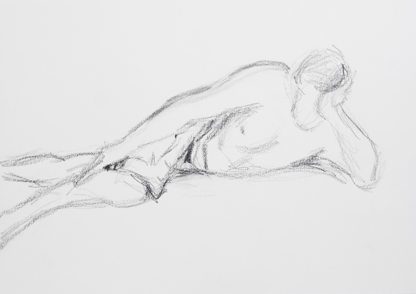
For this set of studies I had my model lying on a bed with his Kindle. I then proceeded to make several gestural drawings of varying poses. Initially I found the foreshortened areas particularly difficult to get into proportion. Arms looked like they were floating instead of resting on the bed and his feet often appeared like flippers. The final drawing of this set of three looked more proportioned, but the torso was a little too long, making my model look like an Avatar.


For my two larger 10-minute drawings, I used the lighting from the side window to try to highlight the musculature. I feel like my final sketch here has a better sense of proportion. The shoulders leading down towards the waist form almost a triangle. Whereas the curvature of the legs and hips form almost a right angled triangle. The arm propping up the head also forms a triangle. So the whole pose can be analyzed into triangular shapes.

After completing these graphite sketches, I decided to try something completely different. I made a quill pen and sketched an overhead view of my model using white crayon and ink washes, strengthened by expressive strokes created with the quill. The marks were very varied, and at times difficult to control, but in many ways this is a more expressive sketch.

I did not quite get the angle of the shoulders right as the right-hand shoulder should no be larger than the left.

What I realized after processing the first photograph, was that I did not have enough shadow around my figure to make him appear to be lying on the bed. I went back and added some more shadows around the torso and head.

Quill pen and ink study with crayon and ink wash.

Final version with additional shadows.


Sunday, April 17, 2016

Part 4 Project 1 Exercise 2 Emphasizing form with cloth

Last night I attempted to complete some gestural sketches of my husband. The whole exercise made it very clear to me that I need to spend a considerable amount of time just sketching, as I am horribly rusty. My poor model looks more like a troll in the first sketch. My foreshortening in the second sketch seems to work, as the feet seem in proportion to the rest of the figure. As my model is not a paid model, I do not feel that I can enforce his sitting absolutely still for long periods of time. So, my third picture indicates various positions in which the arms and legs were positioned during the drawing process.

Gesture Drawing 1

Gesture Drawing 2

Gesture Drawing 2

Hodgson, Ian. Shadowplay, 2013. [Graphite]
After my struggle to sketch my model’s proportions last night, I went onto Axis Web to seek out contemporary artists who sketch figures. While browsing through various artists, I came across Shadowplay, 2013, by Ian Hodgson. What appeals to me about this piece is the mixture of a well-observed graphite drawing from an unusual, foreshortened perspective, with simplified silhouette shadows and light casts, which is then overlaid with a large finger print and tiny holed grid. It is an intriguing mix, which adds layers of psychological depth to the drawing. I found his explanation of his style enlightening:
“My work engages with identity and place exploring the transformative process of journey filtered through memory…The depiction of light in space and on surface plays with the divisions between the physical and psychological, the solid and the ethereal. Heads and bodies feature as representations of internal conflict and resolution regarding my place in the world whilst the recurring fingerprint motif is used to signify the self.”
(Brighton, 2016)
This explains the strangely unsettling psychological dimension to his work. It is not just a well-executed drawing, but also one which hints at the transience of life. With the smudge of a finger, your image can be smeared or eradicated. Your identity, represented by the fingerprints, inalterably changed. Hodgson's ability to blend expressive lines and mark making with meticulously observed drawing is remarkable.

For my final sketch, I chose a photograph of the back view of a women with a drape over her buttocks. Somehow when reading the brief I missed that this should have been a seated figure. But as I feel that I was able to create the sense that there is a living form under the drapery, and the fact that the drapery is very much an integral part of this drawing, I will include this sketch as my study for this exercise.


Graphite and charcoal sketch of woman draped in fabric. 
I do like the lighting on this woman, as it provides the drawing with stark contrasts and enlivens the folds of the fabric.

Works Cited


Brighton, A. I., 2016. Refrain by Ian Hodgson: An exhibition at Naked Eye Gallery. [Online]
Available at:
http://www.artinbrighton.co.uk/exhibitions-and-events/2016/2/12/refrain-an-exhibition-by-ian-hodgson

[Accessed April 17 2016].
Hodgson, I., n.d. Ian Hodgson Gallery. [Online]
Available at:
http://ian-hodgson.co.uk/gallery.html
[Accessed 17 2016 2016].

Sunday, April 10, 2016

Part 4 Project 1 exercise 1 Drawing fabric using line and tone

Before commencing this exercise, I consulted the exercise called A Single Line in Drawing Projects. (Mick Maslen and Jack Southern, 2014) When executing my line drawings, I tried to follow this approach to try to created felt lines. My initial drawing was created with a 6B pencil and the subsequent one with a compressed charcoal pencil.


6 B Pencil sketch. A3 size.


Charcoal Line Sketch. A3 Size.
For the tonal study, I chose to use black ink with the odd wash of thinned down white acrylic.
Tonal Ink study of fabric folds. A2 size.
For my 5-minute studies, I gridded off a sheet of A2 size paper into 12 boxes. I know the exercise called for only 8, but I felt like taking my explorations further. I started rather tentatively in the top right-hand corner and worked towards the left. Slowly as I progressed I found myself loosening up so that by the time I was working on the bottom squares I felt energized and far more capable of expressive lines and tones.

Five minute studies of fabric. Mixed media. Size A2.
An unexpected experimentation, that I actually like, happened in the row second from the bottom, in the center. I decided that the black ink applied in a streaky fashion mimics folds. So I laid a few strokes down to fill the box, and then worked white water-color crayon on top of its. It is an approach which is different from my usual style. I then tried to use the same concept, but to drag the ink in the form of the fabric. This can be seen in the bottom right-hand corner. I then worked a dark colored pencil over the shadows. I also like the effect of having graphite mixed with the odd stroke of watercolor marker, which is then washed with directional strokes of water to soften the marker strokes.

Work Cited

Mick Maslen and Jack Southern, 2014. Drawing Projects an exploration of the language of drawing. London: Black Dog Pulbishing.

Reflections on report for Assignment 3

I was encouraged by my third report, since it showed that I was making progress in being able to be more expressive in my drawing style. I agree with many of the observations that my tutor, Clare Wilson, made regarding my latest work. Her observations show that I am starting to get a sense of what works and what doesn’t. I am starting to experiment beyond my previous learned style.

It is interesting that despite the fact that I felt my tendency to be literal and illustrative was still too prominent in some pieces, such as my study of the ladies in the boat, Wilson saw a “confident use of colour and observational drawing skills. The shadows and reflections across the water in the foreground are particularly effective.” I have always loved reflections, so it was encouraging to see that I was able to capture the reflections in both this artwork and my line study of a townscape in a satisfactory manner.

I was however, disappointed by the fact that my cloud studies did not seem to work. From what I understand, my use of chalk and oil pastels, in combination with watered down acrylic was too cloddish and did not portray the translucence and lightness of clouds. I’ve seemed to be able to portray clouds when they were not the focus of the artwork, such as when I did my drawing of the church and the scene of the women in the boat on the water, but when they are the focus of the artwork, my interpretation is too clumsy. I will need to work on this.

My disappointment caused me to do some more searching into ways in which to portray surfaces. I watched the video interview of Ian McKeever, Mystery to the Viewer, as recommended by Emma in the 5 April 2016 edition of WeAreOCA. (WeAreOCa, 2016) Ian McKeever raised the point that a painting “raises a level of curiosity…because you don’t understand it…You should be seduced into them…but, actually, they shouldn’t give you any answers.” (Ian:McKeever: Mystery to the Viewer, 2014) I have been noticing more and more that drawings which are purely figurative and literal no longer appeal to me. I want to view a drawing which makes me wonder why the artist drew in such a way. Why their choice of subject matter, composition, color scheme etc.? He goes on to say “…bring that mystery to the viewer and that sense of openness, that they might come to the painting and think, Oh I see this for the first time.” (Ian:McKeever: Mystery to the Viewer, 2014) I remember how after studying Georgia O’Keeffe’s paintings, I was challenged to look at flowers anew, to observe their intricate and superlative beauty. This is what I need to strive towards, to make the viewer contemplate something figurative in a new manner, or to create a sense of mystery that intrigues the viewer.

While watching this video I asked myself the following question: How do I make a drawing have a presence? Ian McKeever spoke of investing a painting with a life force, an energy, and to make a painting autonomous. How do I ensure that my artworks appear to have these qualities which will help them to cause the viewer to pause, contemplate, and spend the time to try to fathom out its mystery?


Fig. 1. McKeever, Ian. Advertisement for Alan Cristea Gallery.
Summer Exhibition. 2012.
I found my answer to my contemplation about clouds in the fact that Ian McKeever's work, such as his one used to advertise the Summer Exhibition at the Alan Cristea Gallery, at times seem billowy and cloud-like. However, unlike my pastel interpretations of clouds, they are not thick and cloddish. Rather, they are ethereal, built out of “lots of very thin layers.” (Ian:McKeever: Mystery to the Viewer, 2014)

I want to keep pushing my methods and materials to be able to portray the life-force, or energy of the subject I am drawing. Practicing to apply layers in a way which is subtle, leaving the heavy cloddish interpretation, in order to increase the mystery and intrigue of my own artworks. I wish to also continue my quest to find different means of self-expression, seeking ways to free up my style further.

Illustrations

Fig. 1. McKeever, I., 2012. Summer Exhibition. [Art] (Alan Cristea Gallery- 34 Cork St). Available at: http://www.artslant.com/lon/events/show/228866-summer-exhibition

Works Cited
Ian:McKeever: Mystery to the Viewer. 2014. [Film] Directed by Kasper Bech Dyg. Denmark: Louisiana Chanel.

WeAreOCA, 2016.
Ian McKeever talks about painting. [Online]
Available at:
http://weareoca.com/education/ian-mckeever-talks-about-painting/ [Accessed 9 April 2016].

Sunday, April 3, 2016

Part Four The figure and the face

Fig. 1. Silverwood, Sarah Taylor.
 Snappy Clothes (2014)
Ink on drafting paper and magazine pages.
What I do love about this course is that it is drawing me back into the art world. While teaching Art History to high school students full-time, I had the time and motivation to research artists on a daily basis. Having been back in a regular elementary classroom situation these past three years has hampered the time I have available for research. However, I am finding that progressively my free time involves a pursuit of the study of artists. Just yesterday I was reading about the making of Loving Vincent, Zaha Hadid's Most Iconic Buildings (a photograph tribute to the passing of architect Zaha Hadid), and about a photographer whose photographs of abandoned European buildings appeal to my intrigue with decaying surfaces. Really interesting reading!

While trying to gear myself up for another few hours of drawing, I read the interview In conversation: Sarah Taylor Silverwood featured in WeAreOCA, 7 March, 2016. I then went on to study some more of her works on New Art WM. What I find appealing about her work is that by superimposing two images - a found image from a historical magazine photograph portraying a young woman of the popular culture, superimposed by an ink drawing on draft paper of an elderly woman - she creates a dynamic narrative. As explained by New Art WM, "...carefully constructed drawings, historical references and material from contemporary popular culture mutate into one another." (New Art WM, 2016) As a result, you want to know if the underlying beauty was the old lady in her youth. You are also encouraged to question how she got to look so haggard, disengaged and seemingly hopeless. Her technique puts a whole new level of meaning to what could otherwise be viewed as a simple contour line study of an elderly woman (fig. 1.).


This afternoon, I looked at the suggested reading list and tried to access the video of William Kentridge that is listed in the course. Unfortunately, it was no longere available, But I did find a video interview of his, How to make sense of the world. He said the following:
 "You can see the world as a process of unfolding...We don't have complete information...a walking collage of thoughts and ideas and thinking...somewhere in between is an openness to recognize something as it happens...You have to allow yourself the openness to see what's arriving by chance, through fortune, at the edges." - (How to make sense of the world, 2014) 
Too often I set out with set ideas of what I want to achieve, and how I am going to go about it, not allowing the freedom of happenstance to open the parameters of the final product. This interview was very intriguing and expanded my ideas, as I had only seen William Kentridge's work as static drawings, not as the combination of miming, performance and animation that many of them are. I like the fact that he compares our lives to a "walking collage". This is so true in that what I see as being the reality of a situation and you see are usually two totally different fragments of the same reality. Neither is wholly true, and neither is completely wrong. They are slivers of the reality, a collage of the experience. I guess what I get from this discussion is that I should not be so hard pressed to create a realistic rendition of a figure, or scene, but rather to allow it to be my interpretation and "collage". I need to free myself up to incorporate other fragments of my experience of the figure, or scene, to influence my choice of media, style of interpretation, etc.


Fig. 2. Wooll, Hannah. Uh-huh, 2013.
Another artist who intrigues me is Hannah Wooll. Her enigmatically haunting works are hard to interpret (fig.2.). Her self-analysis helps to explain some of her intent to me:
“My work has always been concerned with imagery that is slightly off kilter, exaggerated or fabricated, subverted from magazine pages, my own photographs, and old master paintings.” (Axisweb, 2016)
“I regard my works as being a still from a story or film, caught up in a moment, the image paused; sometimes melodramatic, sometimes fragments of quiet and uneasy tension.” (Wooll, 2015)
The suspicious expressions and closed form of the poses of many of her female figures, leaves you wondering what it is that disturbs, or frightens them. You end up trying to piece together meaning from the gestures, lighting and facial expressions. There is also a hint that the young women have a shared knowledge about the viewer, one that causes them to treat them with reserve, fragility and distance.

From these different artists, I get a sense that what makes a memorable and engaging figural artwork is one which requires you to make connections. One that requires you to puzzle the connections, stance, or expression, allowing your own impressions to add to the "collage" presented to you.


Illustrations
Figure 1. Silverwood, Sarah Taylor. Snappy Clothes (2014) Ink on drafting paper and magazine pages. New Art WM [Online] Available at: newartwm.org/artist [Accessed 19 March 2016]. The New Art Gallery in Walsall.

Figure 2. Wooll, Hannah. Uh-huh (2013). [Oil on board] 40 x 30 cm [Online] Available at: http://www.hannahwooll.co.uk/recent-works-2013-2016.html [Accessed 3 April 2016].
Works Cited

Axisweb, 2016. Hannah Wooll. [Online]
Available at:
http://www.axisweb.org/p/hannahwooll/workset/212573-i-dont-care-pretty-baby/
[Accessed 3 April 2016].How to make sense of the world. 2014. [Film] USA: Louisiana Chanel.

Joanne, 2016.
In conversation: Sarah Taylor Silverwood. [Online]
Available at:
http://weareoca.com/fine-art/in-conversation-sarah-taylor-silverwood/
[Accessed 19 March 2016].

New Art WM, 2016.
Sarah Taylor Silverwood. [Online]
Available at:
newartwm.org/artist[Accessed 19 March 2016].

Wooll, H., 2015. Artist's Statement. [Online]
Available at: http://www.hannahwooll.co.uk/artists-statement.html [Accessed 3 April 2016].

Thursday, March 31, 2016

Part 3 Final Assignment

Fig. 1. Detail of the wall surface of the porch.
Motivation for Subject:

Across the road from our apartment there is a desperately grimy and derelict porch (see fig.1.). It is the sort of structure that I would never sit under, even during the midday sun, as it stinks of urine and sweat, and its layers of muck are etched into the wall's surface. What I have found absolutely incredulous is that this porch rarely sits totally empty (fig. 2.). Throughout the day, it has a constant stream of people using it in various ways. It might become a temporary shelter for half-a-dozen snoozing gentlemen, lying out the hottest hours of the day on cardboard sheets in its shade. Or, the entire porch becomes covered in parked motorbikes. At other times stacks of brand new patterned mattresses stand to attention ready to be sold.

The most humbling occupants of this porch are the dear women that I have come to befriend, despite the fact that I speak only a smattering of French courtesies. At least three nights out of the week they come at around dusk to set up camp for the night. One woman is in her twenties. She is paralyzed from the waist down and has two withered arms - possibly as a result of polio, a common disease here due to the lack of inoculations.  The other woman is a mother of adorable twin girls. These little bundles with their cute dubious expressions and tentative totterings, are often seen exploring the edges of this porch. To my horror, the one was actually licking the wall the other day. This porch serves as their temporary home until dawn, when they pack up their mosquito nets and bedding, bathe the toddlers using cup-sized packets of water, and sweep the porch clean. Hard to believe that people can actually exist in this manner - and still have a smile of greeting for me every day, wishing me "Bon Journee".

It has been for a few months now that I have desired to draw this porch as it has come to have a strange nostalgic meaning to me. As ugly and inhospitable as it appears to me as a Westerner, it brings much needed shelter and respite for numerous travelers, and serves a multitude of purposes. Like George Shaw, I want to be able to find inspiration in the mundane. These words of his resonate with me:
"I get perturbed by people who have meaningful epiphanies in expensive places – who go to India, Goa, New Zealand, watch a glorious sunset to find themselves. If you can’t find yourself in your own back yard, you’re not going to find yourself in the Serengeti, are you? So for me, it was taking those clichés of epiphany and the sublime and putting them in a place where great thoughts aren’t rumoured to happen."
(Kellaway, 2015)

Due to the fact that my husband and I are international educators, I have travelled the world to places considered exotic, and yet, it is often in the grimy porches that I encounter the challenge to look within, and to allow God to help me to find the strength to turn the "grimy porches" into a haven. For this reason, I decided that I want to embark on capturing this porch in my assignment. In a manner inspired by George Shaw, I wish to capture this humble porch in a way which gives it a bit of credence and yet honest dignity. Capturing all of this in a two hour drawing session will be the ultimate challenge for me, as my style tends to be belabored and intense. Artworks which appeal to me at present are works which have many layers to them. The uppermost layer partially obscuring and, yet also, partially revealing the underlying layers. So, my goal is to depict the layers of grime and weathering, along with the rustic lines of the structure, within the short time frame allowed.

Fig. 3. Wall and roof surface sketchbook practice.
Preparation: I started out by trying to emulate the layers of the roof and wall surfaces in as little time as possible. After experimentation, I discovered that the streaky layers of the edge of the roof can be emulated using a palette knife with a mixture of greys and whites. By scraping the acrylic very flat, it remains workable for markers and other drawing media. Pink marker and white chalk worked particularly well on top of this panel of layers, creating the idea of water seepage (fig 3.). 

I also experimented with the wall surface using a variety of yellows and creams. I liked the effect that I created by drawing into a layer of wet acrylic, scratching away most of the color, and then applying chalk pastels on top of this. Charcoals and drawing pencils work well on top of these layers to create the shady shadows of the interior. The colors of the walls are not this acidic lemon yellow, but rather closer to a burnt amber. So I will need to work on my color palette.

When experimenting with the greens of the foliage in the background, I realized that I am going to have to do the background layer first as no matter how I tried I ended up in destroying the rough texture of the edge of the concrete when applying the background afterwards. I decided that as I have to work fast to fit within the two hour time-frame, I will lay down a layer of green and then work watercolor pencils and crayons on this layer to suggest foliage.

Fig.4. Study of random items shoved into the burglar bars.
One feature of this porch that amazes me is the fact that people leave items of clothing, pots and dishes stuffed into the burglar bars of the windows, or hanging from the air-conditioner casings. I spent sometime trying to figure out how I was going to approach this feature of this unusual porch (fig. 4). I experimented with one of these windows. Once again I laid down a layer of watercolor, in this case brown, and then worked on top of it with markers and watercolor crayons. I think this will create the effect I want.

On investigating the lines of the linear perspective on a print of the photograph I am basing my drawing on, I discovered that it has a number of vanishing points all around a similar position. The little lean-to has its own vanishing point. (See fig. 5.)


Fig.5. Print of porch showing
orthogonals leading to varying vanishing points.
I decided to complete an ink study to try to analyze the dark and lighter areas of this scene. I can't say that this sketch was satisfying, as it seemed clumsy and awkward (fig. 6.). (This sketch got cream paint on it when I used it to help me with my final artwork.) However, what I did discover from this study was the fact that I needed to hone my composition in more, allowing the attention to focus on the shrouded motorbike, and the 'dressed' windows. I also decided to take the attention off of the umbrella shop at the corner.
Fig.6. Sketchbook ink study of tonal values.
As a result of my dissatisfaction with my ink study, I went through a cycle of reconsidering my style and approach to this project. I reconsidered the words from Clare Wilson, my tutor, in her assessment of my previous assignment. The words that jumped out to me were the following:

"Very often less is more in a good drawing and the ability to know when to stop is a skill that increases with practice and with confidence."

"...you should consider ways of focusing on the aspect of a drawing that is most interesting and allow other areas to be less dominant without losing what you want to say about the subject."

"Also look at the variety of mark making in the abstract drawings by Julie Mehretu and the angular and expressive quality of line in the work of Egon Schiele. Claude Heath makes drawings that have an active, energetic quality that might inspire you to explore a more animated approach." (Wilson, 2015)
I still find it hard to focus on my main area of interest, allowing the rest of the drawing to lose focus. I looked at the work of Julie Mehretu to get a fresh breath of inspiration. What intrigues me about Julie Mehretu's work is the way that through abstract textural mark making with inks, acrylic and graphite she is able to suggest visual connections. Your imagination formulates a landscape, cityscape, or sense of time travel. Her images even have an area of focus, which though suggested, remains enigmatic. This is particular evident in Fever graph (algorithm of Serendipity), 2013. It is hard to comprehend the significance of her work when looking at a small photograph of her works on the computer. I do look forward to the day that I can studying her work as it is installed in a gallery.

I read up the description of her aims and style on Marian Goodman Gallery site. I wish I could say that I understood all that this write-up was saying, but what did resonate with me were these words: "It is in this space of the liminal – literally, threshold – the stage of standing on the verge between one’s previous way of structuring identity, time, or community and a new way-- that her new body of work has developed." (Marian Goodman Gallery, 2016) I so long to be able to work beyond my "previous way of structuring identity" in my artworks.


Fig. 7.  Egon Schiele, The Bridge (1913).
One of my decisions regarding how I am going to draw this porch is how I am going to interpret the wall surfaces and layers of grime. In researching further works of Egon Schiele, I came across The Bridge, 1913. (See fig. 7.) His use of earthy beiges and grey tones contrast starkly with his primary colors in the hut and the boat in the distance. His layering of colors is what I want to aim for in this drawing of mine. The green of the distant hillside is a dark non-projecting green, unlike the green of my preliminary exploration. I also like the manner in which he works in a linear fashion on top of his fields of color.

My next step was to do a further mock up of the composition and to try to speed up my technique. This sketch can be seen in Figure 8. At this stage, I caught a glimmer of the potential that this composition could have. I had slowly tightened my focus from the original photograph my husband took, to the cropped in version. I even tried to move one of the pots hanging from the air-conditioner to see if it would add to the composition if it were moved closer in. In the end, I decided that although an intriguing detail, it was not necessary to the composition.
Fig. 8. Preliminary study. Dimensions: A4.
What I liked about the works of Claude Heath is his use of expressive exploratory lines to develop the contours of his 3-dimensional surfaces. In the study above, I tried to combine loose ink lines with the shading and blocks of smeared color fields.

Final Artwork:

I commenced this drawing with a light sketch placing the main lines of the building. I then blocked in the sky in a dusky blue watercolor wash. I then worked over it in an expressive manner to indicate the movement of palms using dark green watercolor mixed with black ink. The final area I blocked in initially was the creamy tone of the wall surfaces (fig.9.).

Fig.9. Washes of color blocked in place.
The rest of the work seemed like a dance. I would have bursts of activity and energy, interspersed by my needing to gulp down glasses full of liquid. I was amazed at how energetic the process was. I have never turned out an artwork of this size in so short a time period - but, it was quite exhilarating! I remember Clare Wilson writing to say that I should have fun with this assignment. Well, I can honestly say that I enjoyed the creative process. It took me a long time to gear up to this project, but I feel that I was able to free myself from my usual tight constraints in many areas. Obviously, I have a long way to go, and I will probably never reach the end of what is possible, but the process of this assignment has been encouraging.

Fig.10. Detail of roof and eaves.
To start with, I used the palette knife to smear in the greys and browns in the mold at the top of the cantilever (Fig.10.). I deliberately left some of the cream to peer through, to give it a layered look. I then used the palette knife with lighter greys to go under the eaves. This was more tricky to apply thinly and in the right shape. I used a palette knife to smear in the general shape of the bricked up doorway, windows and porch floor.

I found myself constantly evaluating which media would work best on the varying surfaces. I started to define the pillars of the porch, using white crayon, graphite, watercolor pencils, etc., to shade them in and give them definition. I then worked on the shading under the eaves using charcoals, graphite and watercolor crayons. For the lip of the roof of the lean-to, I tried to use expressive ink lines to indicate the crisp edges of this roofing material. I also used ink pen to define the edges and shading of the wooden poles that support the roof of the lean-to. I added some shading to these wooden posts using graphite, white watercolor crayon and a thin layer of white acrylic paint.

Fig.11. Barred windows with clothing.
I commenced filling in the porch by starting at the motorbike end and working towards the right. To get the black of the motorbike tyres and the details of the foot pedals etc., I used a black Sharpie, which I then integrated into the rest of the surface using graphite pencils and watercolor crayons on top of the surface.

To try to depict the manufactured nature of the burglar bars above the bricked in door and the metal shutters, I used Sharpie black marker and a fine point permanent marker (fig. 11.). What I particularly enjoyed was working with the rust-brown and black smear I had applied to the area of the two windows, which have the clothing stuck into the bars. The smear was already very expressive in that it had a worn rusted look to it. So, I merely added some suggestions of rectangular shapes, defining the bars, along with a few strokes of thin brown acrylic paint. I then used a combination of grey acrylic paint and watercolor crayons to depict the draped clothing.

After drawing in these detailed areas, I set about changing the tones of the wall surfaces to replicate the grime and grunge which has built up over the years. I used varying graphite pencils, watercolor markers, and water color pencils for this purpose, with the odd wash of thinned down white acrylic. I decided to add in the little stool under the window as a reminder that people come to sit in the shade of this porch.


Fig. 12. Distant corner and foliage.
For the background, I worked very roughly in graphite to indicate two people at the corner opposite the porch. Initially the umbrella was a bright blue, but I realized that is was grabbing too much attention, so I softened it to a muted blue-green. I wanted to show the people in order to contextualize the porch, but did not want them to be the focus, which they are in the photographs (fig.12.). I added some suggestions of leafy fronds on to the dark green background using watercolor pencils. In order to not detract from the building, I did not add any fronds to the greenery above the porch.

Lastly, I reworked the shadows on the porch floor, trying to show the variations in the tones of the grey. I added a few suggestive strokes to the edge of the porch and to the dirt road in front. I eventually erased some of the pencil strokes, as they were too definitive. As the lines of the composition all lead towards the motorbike, I decided that it needed a bit more work. I enhanced the shadows of the cover and emphasized the highlights on the folds by applying light strokes of light green acrylic paint (fig. 13.).


Fig.13. Detail of shrouded motorbike.

By this stage, I was over the two hour limit by about twenty minutes, so I decided that it was time to quit. As I stated before, I have never churned out an A2-sized drawing in such a short period of time. Our examinations at school and during my teacher training were all in the region of eight hour long sessions. So, this has been a stretch for me. But, I can truly say that I feel that I have met my goal - the porch with its suggestion of human occupancy and layers of time, has been captured in my drawing (fig.14.).

Fig. 14. Final Artwork.


Demonstration of Technical and Visual Skills

I know that my awareness of linear and aerial perspective has developed during the course of this unit of study. In the past I would have treated the background with equal clarity, much like I can see in many photographs, but here, I have deliberately tried to throw the background out of the spotlight, by making it lighter and less defined. 

I have played with the composition of this piece quite a bit. Originally I fancied drawing the porch flat on, as can be seen in the first photograph. However, as I was required to include foliage, I decided to rather take a more oblique approach. In retrospect, I realized that I have a hint of three-point perspective going, judging by the angles of the columns.

An area where I do see a weakness is the area under the eaves. This shading is rather generalized and at times a bit confusing. Where is the light that lights the underside of the porch roof coming from? I also feel that this area became a bit overworked and muddy.

Quality of Outcome 

As I explained previously, my normal style of drawing is rather tight and illustrative, so this is an attempt to loosen up my narrative style and allow for a bit more expression. I spent a great deal of time in reflection, trying to ascertain my approach and seeking inspiration from other artists. I feel that I am satisfied with the outcome. I feel that it captures some of the intrigue and mystery of this nasty back alley porch.

Demonstration of Creativity

I think to some extent the creativity of this piece is in the nature of the porch. It is not your typical picturesque building. I have experimented with how to portray its grimy layers using the two hour time limit as my constraint. I think my using of a palette knife to smear in blocks of color served to provide interesting surfaces which appeared irregular and peeling, although flat enough to further develop with mixed media.

I think that a bit of my personal voice comes through. Part of this is in the subject matter. I find shabby peeling surfaces very intriguing. It is as if they contain a history. Who made that smudge? When did they paint the various layers of paint that can be seen through the broken surfaces?

Context Reflection

My one regret throughout this unit on study has been the fact that I am not living in an area conducive to outdoor meaderings and plein aire sketching. I know that when in South Africa, I loved being able to curl up under a tree and sketch the scene before me. This climate and the fact that I am a White female in a very different culture has put limitations on my exploration. However, fortunately, I have large windows looking out from my apartment, the scenes of which feature throughout this unit, and I have a supportive husband who helps me by documenting our trips with his amazing photographs. Given a different environment, my work might well have been quite different, but then...I would not have made a connection with this well-worn porch. So, in the end, I am grateful for what I have been able to work with.

Illustrations

Fig. 7.  Egon Schiele, The Bridge (1913). Available at: http://www.egon-schiele.com[Accessed 31 March, 2016]

Works Cited

Goodman, M., n.d. Marian Goodman Work. [Online]
Available at:
http://mariangoodman.com/artist/julie-mehretu

[Accessed 31 March 2016].
Kellaway, K., 2015. George Shaw, 49: ‘Every second, every ounce of time has to be accounted for’. [Online]
Available at:
http://www.theguardian.com/artanddesign/2015/nov/15/george-shaw-interview-every-second-every-ounce-of-time-has-to-be-accounted-for

[Accessed 30 March 2016].
Marian Goodman Gallery, 2016. Julie Mehretu. [Online]
Available at:
http://archive.mariangoodman.com/exhibitions/2013-05-11_julie-mehretu/

[Accessed 31 March 2016].
Wilson, C., 2015. Formative Feedback, s.l.: Open College of Arts.