Saturday, May 30, 2015

Part 2: Your own environment

Research Point


The still lifes I researched ranged from the trompe l'oeil style of William Michael Harnett (1848 – 1942) to the highly simplified rendition of Poem for a Jug, Blue on White, 1978 by William Scott (Scott, 1978). It is noteworthy to me that the still lives that appealed to me tend to be those that have a strikingly recognizable color scheme, or have subject matter which are depicted in a slightly different way to traditional still lives.

The color schemes which appeal to me are either monochromatic; or are rich in their application of a recognizable complementary, analogous, or triadic color scheme.
I particularly like the work of contemporary artist Alexandra Buhler (Buhler, 2011). Although she often depicts fruit and vegetables, she does it in such a vibrant manner, applying her oil pastels layer upon layer, with vibrant color contrasts and emphasis on the textural qualities of the subject. Her color schemes are often analogous or complementary in nature.­­­­­ The oil pastel work, Still life with Thyme, 2011, uses the warm analogous colors of red/orange through to green/yellow, with accents of the complementary violet in the thyme blossoms (Buhler, 2011). It is a cheery still life, with well-rendered forms and visible pastel strokes to enliven the surface and shadows. Her composition is also interesting as she hones in on the fruit or vegetables, leaving very little negative space around the items.

Another artist, whose still lifes are lively and original, is British artist, Mary Fedden (1915 – 2012). Her use of the shape of objects to become the negative space in the paintings is remarkable. I particularly love the subtle color combination of Still life with African Violets, 1988 (Fedden, 1988). The rich dark olive greens of the background and the deep purple of the violets contrast with the creamy whites and yellow centres of the daffodils, as well as shape of the white fringed tablecloth and vase. Her composition is vibrant due to her use of the repetition of similar yet slightly varying shapes, and the diagonal divide caused by the tablecloth. She really plays with the question of what is foreground or background, positive or negative space.
 
It is interesting to see how the subject matter of still lifes has changed over the years according to what was vogue at the time. During the Baroque era, large overly filled arrangements of exotic looking flowers were very popular, as well as the still life which included everything from the slaughtered calf’s head, to the lifeless pheasant draped over the kitchen table top. Towards the end of the 19th century, everyday personal items became popular in a still life. William Michael Harnett, known for his realistic oil paintings, would often paint masculine looking subject matter, such as old pipes, tools, manuscripts, books and musical instruments. Their placement did not appear contrived in that it seemed he had just taken snapshots of a corner of his workroom or study. His work invited the viewer to reach out and touch the detailed textures he replicated on his canvas. His artwork is described in the online commentary by the Van Gogh Gallery as being “faithful to reality in the smallest detail.” (Van Gogh Gallery, 2002- 2015) He was either admired by his fascinated audience, or disdained by his critics (Van Gogh Gallery, 2002- 2015), but his works live on in the art appreciation textbooks as examples of finely executed studies worthy of notice (Patrick, et al., 2008).

The still life has also gone through phases of being incredible full of numerous seemingly disparate objects to being highly simplified, creating a sense of clarity and purpose. Audrey Flack is an artist who filled her compositions with gaudy feminine trinkets and cosmetics in saturated colors, painted in a photo-realistic style. This can be seen in one of her famous pieces, Marilyn (Vanitas), 1977 (Flack, 1977). A more recent artist, Jacques-Enguerrand Gourgue (1931 - 1996) also fills his composition Still-life with seemingly random, geometrically simplified objects, which compete with each other for their place on the picture plane, due to their placement and varying degrees of color saturation. “By juxtaposing familiar objects in surprising ways, he creates a surrealist style that invites the viewer to meet him on the level of the subconscious, giving free reign to emotion and fantasy.” (Валиулина Т.Н., Гречихин И.Е., © 2005-2015)

Fig. 1. William Scott. Fish Still Life Blue, 1982.
By contrast, an artist such as abstract expressionist William Scott seems to be able to distill the essence of a still life down to a few reduced shapes, which are still poignant in their ability to communicate (fig.1). I particularly appreciate Fish Still Life Blue, 1982 as it leaves as wondering if the fish is actually dead or lying trapped within the encircling confines of ellipse which suggests the plate. (Scott, 1982) Seeing that I have found ellipses such a challenge to draw, this artwork appeals to me in its simplicity and the fact that the ellipse is not realistically rendered.

This brief overview highlights some of the characteristics I have noted as being important in creating a dynamic still life. This research has helped to kindle my interest in still lives. It makes me realize that there are still many different ways of interpreting this traditional drawing genre. It is often the color scheme, or the actual objects depicted, that lift it above banality, offering a fresh perspective on everyday items.


Illustration
Figure 1. Scott, W., 1982. Fish Still Life Blue, 1982. [Art viewed online] (WikiArt.org). At: http://www.wikiart.org/en/william-scott (Accessed on 30.5.15)


Works Cited

Buhler, A., 2011. Still life with Thyme, 2011. [Art viewed online] (Bridgeman Educational Library).
At: http://www.bridgemaneducation.com (Accessed on 30.5.15)
Fedden, M., 1988. Still life with African Violets. [Art] (Bridgeman Educational Library).
At: http://www.bridgemaneducation.com (Accessed on 30.5.15)

Flack, A., 1977. Marilyn (Vanitas), 1977. [Art viewed online].
At: http://www.audreyflack.com (Accessed on 30.5.15)

Patrick, F. L., Preble, D. & Preble, S., 2008. Preble's Artforms. In: 9th Edition ed. New Jersey: Prentice Hall.

Scott, W., 1978. Jug, Blue on White, 1978. [Art viewed online] (Bridgeman Educational Library). At: http://www.bridgemaneducation.com (Accessed on 30.5.15)
Van Gogh Gallery, 2002- 2015. William Michael Harnett. [Online]
Available at: http://www.vangoghgallery.com/artistbios/william_michael_harnett.html
[Accessed 30 May 2015].
Валиулина Т.Н., Гречихин И.Е., © 2005-2015. Единое окно. [Online]
Available at: http://window.edu.ru [Accessed 30 May 2015].
 

Assignment one: A personal still life

Brief:
Create a still life of objects which “have some meaning to for you; objects that interest you, and perhaps say something about you” using a variety of drawing media (Khatir, 2014).

I decided to start this assignment by doing a bit of research of still lives, perusing a cross-section on the internet. There are so many out there; yet so few really grab my attention. Most of them seem to lack originality and enough contrast to grab my attention. However, I did find two still lives that I particularly enjoyed. The one was Still life, Sanfrancisco, 1932 (see fig. 1) by the photographer Ansel Adams (Adams, 1932). Although this is a photograph and not a drawing, I really enjoy his use of contrasting metallic surfaces and the inclusion of items with patterned or textural interest.


Fig 1. Ansel Adams. Still life, San Francisco, 1932.
 

I also enjoyed the charcoal study, Still Life of Pears Halved, by Louise Hervieu (Hervieu, 1878-1954). Such a simple idea and yet the composition is dynamic by virtue of its use of lights and darks (see fig.2). It was interesting to learn from this website that she suffered from a severe hereditary disease, which resulted in her eventually resorting to charcoal as her medium. What I particularly enjoy about this work is the way that she overworked the initial charcoal work using a dark charcoal to add details and strokes which invigorate her picture plane.


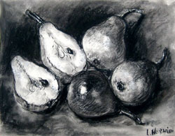
Fig 2. Louise Hervieu. Still Life of Pears Halved . 


To come up with objects which would portray something of my personality, I created a brainstorm to see what ideas would spring to mind in the process. I then played with various arrangements of these objects using thumbnail sketches (see Fig. 3).
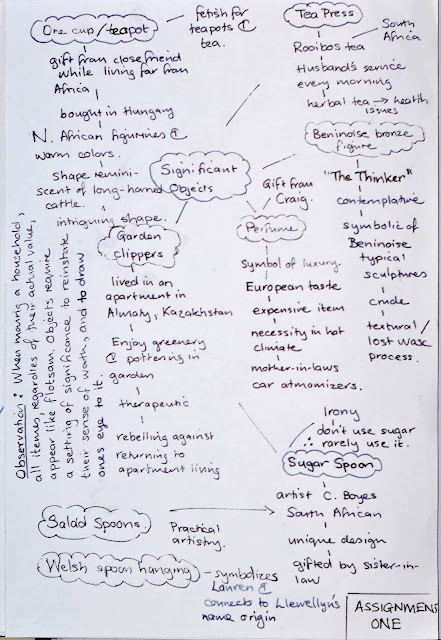
Fig. 3. Brainstorm


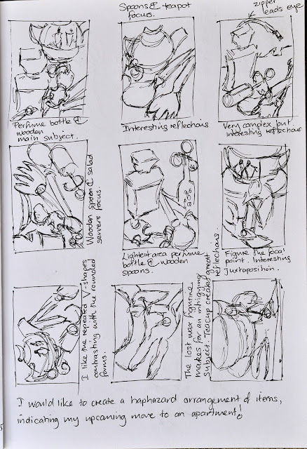
Fig. 4. Thumbnail sketches of a variety of still life objects.

I would have liked to have drawn this assignment on a larger scale than A3, but as I have no access to larger white paper in Cotonou, Benin, I decided to settle for A3 rather than to do another drawing on blue paper stock, painted with a white base coat. It took me a while to get my format size figured in my head as I really do enjoy drawing on a larger scale. However, I was able to make the shift and actually enjoyed the intimacy of detail I was able to get by virtue of my having chosen the A3 format.

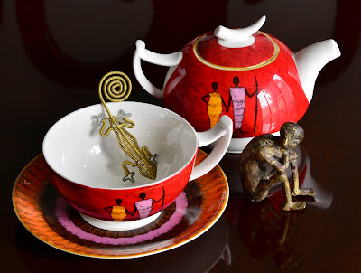
As a South African who has spent most of my adult life living on different continents, I have loved being back in Africa these past two years. The main objects I chose have connections to Africa. My friend gave me the teapot and teacup set after her trip to Hungary. It seemed ironic at the time that she gave me a set with a very African design, which she bought in Hungary, while I was living in Kazakhstan – a continent away from Africa. However, I love this little set and it has become one of my treasured items. I particularly like its finesse and designs in the saucer and on the sides of the teapot and teacup.


To accompany the tea set, I decided to juxtapose the very crude lost wax sculpture my husband bought in Abomey, Benin. Images of an African version of “The Thinker” are to be found throughout this country, carved out of wood. However, this was the only little sculpture that we have seen created from the lost wax process. He reminds me of the humble, emaciated figure of the elderly gentleman who helps us with odd jobs around the house. He has such an endearing and cheerful disposition, despite being homeless and poor.

When I realized that I had such a large white space inside the teacup, I decided to place one of my South African, wire chameleons into this negative space to create interesting shadows and reflections within the space (see figure 5).


Fig. 5. Still life arrangement of dining room table.

A quick gesture drawing helped me to check my composition (see figure 6). As I wanted to capture the expressive quality of the figurine, I did a few blind contour studies of his pose. I also tried to study the contrast of light and dark playing against his form (see figure 7).


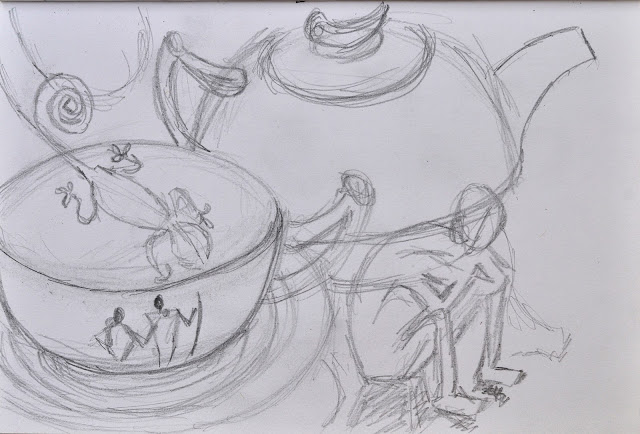
Fig. 6. Gesture drawing.


Fig. 7. Blind Contour Studies and Tonal Study


Reflections


I started at the top of the composition with the shadows of the chair back and then gradually worked downwards, from left to right, to avoid smudging. (This is an issue as I do not have charcoal or pencil fixative, due to its being unavailable in Cotonou – and I can’t fly into the country with aerosols.) I found the teapot relatively easy to shade, but it was the teacup – the most innocent looking item – that created a lot of perspective issues.

I encountered problems with the bowl shapes in my still life inside the drip tray, but diagonal aerial perspective of the teacup gave me a lot of problems. As first, I found myself getting very frustrated with my inability to draw what I could clearly perceive with my eyes. While trying to work with this frustration, I remember reading somewhere that drawing needs to be viewed as “research”, as a means to learn more. So I decided to try to shift gears and to view my block as a chance to research elliptical shapes and their intriguing dichotomy of being simple everyday objects we know so well, and yet are so hard to get right. I realized that the reason it was so challenging for me was precisely because I have grown up seeing these elliptical shapes everywhere I go. Therefore, when drawing the shape, I immediately know if it is inaccurately angled or curved. This forms a roadblock and creates a tension in me. I decided to try to adopt a more playful study of this teacup. I cut out various elliptical shapes by placing half of an ellipse over the one section of my drawing and then opening it up to duplicate the other side. I then used the negative and positive shapes where appropriate to skim down the rim of the cup, creating a more pleasing shape. It was only after I had made all of my alterations to my teacup shape that I realized I should have been documenting the changes. I had not thought of it as photographing my drawings has proved to be quite a lengthy process to get the right lighting and camera settings. I do have the ellipses I played with to try to correct the shape (see figure 8). I am still not totally happy with my teacup, but as my task is to create an expressive drawing, I decided that photo-realism was not the aim of this exercise.
The object I enjoyed drawing the most was actually the figurine. I just love his dejected pose and the rough texture of his unpolished surfaces. I positioned him with his back towards the other items to emphasize his isolations and sense of not being part of the society associated with the items.


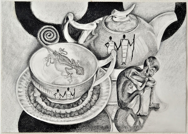
Fig. 8. Final Drawing.


Assessment Criteria


Demonstrations of technical and visual skill


For this artwork, I chose to use A3 size paper with a mixture of media: charcoals; black and white conté; black narrow point ink pen; a black watercolor pencils and a variety of drawing pencils. I feel that I was able to get a wide range of tones and varying textures from these drawing materials. My shading is, I believe, convincing giving a sense of the shine on the ceramic tea set and the reflections on the table. I tried to vary my application of the media as can be seen in the application of ink pen over the shading of the wirework found in the chameleon.
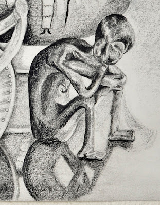
Fig. 9. Figurine and its reflections
I definitely feel as if my piece speaks of visual awareness, especially when noting the attention I pay to the details of the reflections and shadows. I particularly enjoyed working with the bronze figurine and studying the reflections in the tabletop.
Where I did encounter visual problems was in representing the teacup. As I explained in my write up, I had a great deal of problem getting the perspective on the teacup right. I feel as if my struggles have alerted me to the importance of being able to observe elliptical shapes and record them with a steady hand. I must admit that the teacup still bothers me as I still feel as if it remains slightly unresolved.

As far as compositional skills are concerned, throughout this work I tried to increase the contrast of the composition by incorporating the dark sweeping curves of the shadows of the dining room chairs on the table behind the still life. I think this works, but as the curves of the shadows replicate the curves of the handles of the teapot and teacup, it might make the composition a bit ‘hyperactive’. It is as if the chair shadows want to grab the composition and hoist it in the air, but the solidity of the teapot and teacup, as well as the anchor-like counter curves of the figures bent legs, help to counteract this action. In so doing, I believe there is a bit of tension created of opposing forces around the curvature of the figurines back and the negative space created by the teapot and teacup. I tried to visualize this composition with just a regular swathe of black in the background to provide tonal contrast. I think this would have created a more peaceful and serene appearance. Visually this might have been more restful, but as this artwork is supposed to portray something of my character, I think the tension created by the counteracting curves is appropriate. Due to my nature, I rarely feel completely serene and at rest, so an artwork which has a feeling of visual tension is appropriate for me.
 

Quality of Outcome


I trust that my presentation, as seen above, reflects my process and presents it in a coherent manner. I did struggle with the formatting of Blogger. For some weird reason, for the last two photographs it would not allow me to add captions. Whenever I tried to do so, the images jumped to a different position in the document. No matter what I did, I could not stop this from happening. As I do not know HTML coding, I could not go into the formatting to try to correct this from happening. This was annoying, as I wanted to keep my captions following the same format as the beginning of the document. However, I found that I need to eliminate everything from the last photograph that allowed for correct captioning onwards, and then start that section again, copying from my backup Windows document. This sorted out the formatting, allowing my once again to add captions.
 

Demonstration of creativity


I tried very hard with this composition, and the items I chose, to allow this piece to show some experimentation and at the same time to provoke some thought. As I was mulling over the possible items I could have selected, I really liked the irony of the sophisticated and decorative teacup and teapot compendium, and the rough crude spindly shape of the lost wax figurine. By isolating him to the side in the area which remained predominantly white, I sought to emphasize his frailty and malnourished frame. The figures on the tea set, by contrast, depict couples holding hands and appear almost regal in their upright determined stance. They create a visual contrast with the dejected pose of the figurine. I feel my inclusion of the wire chameleon adds a quirky twist to a more somber theme.

Context Reflection


I found that the area where I used the most critical thinking was in trying to get the perspective right on the elliptical shapes. This process involved a lot of trial and error. It was extremely interesting to see how by using the eraser to pull off a think slither of a highlight here, or adding the minutest shadow in another area, could totally change the morphing of the teacup.

Once the tonal values had been drawn into the entire composition, I analyzed the result with my husband, who is also art trained. Together we decided that I needed to consider the artwork as its own identity by adding shadows and darkening areas to ensure that the play of lights and darks across the surface of the artwork served to direct the eye about the composition. I wanted to keep the area around the right side of the figurine essentially white, but this meant that the other areas of white within the composition needed to appear whiter. My teacup and teapot at that stage was a more neutral grey, this caused the white to be less noticeable. By strengthening the tonal values of the teapot and teacup exterior surfaces, the white appeared whiter, allowing the viewer’s eye to be drawn into the composition, and not to be directed off the right-hand side of the page. I think this worked as I feel that the composition holds together better with the rhythm of lights and darks across the surface of the picture plane.


List of Illustrations Requiring Citations

Figure 1. Adams, A., 1932. Still life, San Francisco, 1932. [Photograph] (Weston Gallery). At: http://www.westongallery.com/artists/Ansel_Adams/ansel_adams_ii.html (Accessed on 25.5.15)

Figure 2. Hervieu, L., 1878-1954. Still Life with Pears Halved. [Art: Charcoal] (Fletcher/Copenhaver Fine Art). At: http://fc-fineart.com/mp.php?rqs=394 (Accessed on 25.5.15)

Works Cited

Adams, A., 1932. Still life, San Francisco, 1932. [Art online] (Weston Gallery). (Accessed on 25.5.2015)
Hervieu, L., 1878-1954. Still Life with Pears Halved. [Art online] (Fletcher/Copenhaver Fine Art). (Accessed on 25.5.15)

Khatir, L., 2014. Drawing 1. Barnsley: Open College of the Arts.


Sunday, May 17, 2015

Part 1 Exercise 4 Shadows and reflected light

Our current dining room table is perfect for a study on reflections and their impact on one another as the wood is dark and highly reflective. As I have always enjoyed the shapes of teapots and kettles, I decided to use our stainless steel teakettle and a white ceramic teapot. I initially played with the composition a little to see which positions would maximize the reflective influence of the one object on the other. I decided to combine composition # 2 and # 5 for my final placement of the two objects.

Preliminary Sketches
As I still have an issue finding white, or off-white paper, of the necessary quality, I used the dusky blue paper I bought last week. After watching a video on how to prepare a surface to maximize their absorption of charcoal, I decided to coat the paper in a layer of white paint, as I did in the previous exercise. This time around, I tried to apply finger paint onto a sheet with a brush and then acrylic white onto another sheet. I then compared the effect.

The acrylic was hard to apply evenly as the paint dried so fast that it became lumpy very easily. However, it gave a more even distribution of paint, than the finger paint. The surface seemed rather shiny and slick so I anticipated having trouble applying the charcoal to the surface. This turned out not to be an issue as the charcoal adhered readily to the surface. I did find, however, that you could only erase a certain amount, before it seemed to reach a threshold after which it would not erase at all. I also found that when I tried to do some touch ups today, it was very difficult to do so. I wondered if the shiny nature of the surface would be distracting, but as the project was all about reflective surfaces, I thought that a shiny background might add some interest.
I tried Odilon Redon’s technique of soaking his charcoals in oil to help increase their intensity and to create a slightly differently look (Odilon-Redon.org, 2015). As I did not have linseed oil, I tried olive oil. It worked really well and made the charcoal flow over the surface without much dust. I did not use this technique throughout, as I wanted to provide slight variations in texture.

I have always been captivated by the subtleties seen in reflective surfaces. I found that I thoroughly enjoyed this exercise. I started out approaching it as just another learning exercise, but the more I got absorbed in the drawing process, the more I just relished the chance to sit and draw. As I started the drawing around three o'clock in the afternoon, relying on light from the window to highlight the composition, I found that the lighting became richer and more dynamic as the sun started to sink down, flooding my composition with natural light.
Stainless steel kettle and ceramic teapot
One thing I did notice is how incredibly precisely lined up the reflections were to their original source. I had a spot of trouble getting the kettle’s reflection right and as the surface resistant to total overhauls, had to settle with just smaller adjustments on the right-hand side to make it appear lined up. My putty rubber was a great asset and helped immensely to create the necessary highlights and alterations. Occasionally I used white chalk or conté to help highlight areas which had already had repeated erasings.

What I do love about creating a background layer before applying charcoal, is that the surface is textural and richer than if it had been flat plain white paper. As the saying goes, “Necessity is the mother of invention!" I would never have tried this had I not had problems finding white paper. You can see the effects of the textural quality in my close-ups.
Close-up to show textural nature of the charcoal applied to the painted background
The blue paper peaking through the background provides visual interest to the background


Learning Points

·       A lighter object placed on the shadowed side of a highly reflective stainless steel object shows the reflections of the lighter object more clearly than when the lighter object is placed towards the lighter area of the kettle. The greater the contrast between dark and the lighter object the greater the observance of reflected light in its surface.
·       Reflections on a curved surface show interesting distortions and need careful attention to their details and shape. If the reflection is distorted, the object itself will appear distorted.
·       Reflections on a flat mirror-like surface will completely invert the image with mathematical precision.
·       Working on a textural surface with charcoal and contés is difficult as it is hard to create a smooth glass-like surface, but it allows for textural interest to what could be a dull artwork.
·       I have never enjoyed drawing with charcoal and contés as much as I did in this exercise. What was really rewarding was that the charcoals and contés adhered to the surface with very little dust.
·       Charcoal soaked in olive oil makes a great graphic drawing tool.


Works Cited

Odilon-Redon.org, 2015. Odilon Redon. [Online]
Available at: http://www.odilon-redon.org/
[Accessed 16 May 2015].


Saturday, May 16, 2015

Part 1 Research point study of Odilon Redon


The following research forms part of my studies for the Open College of Arts.

I have always been mystified by Redon's works. I remember first discovering his works whilst living in Kazakhstan. Unfortunately, the art magazine that drew my attention to his work was in Russian, and as my ability to read Russian remained rudimentary, I was never able to read the content. However, I found his symbolist artworks to be enigmatic, conveying a distinctive sense of mystery and emotional impact. Interestingly, as cited by the website Odilon-Redon.org, Redon described his own works in similar terms: "My drawings inspire, and are not to be defined. They place us, as does music, in the ambiguous realm of the undetermined." (Odilon-Redon.org, 2002-2015)

Reading the following quote that is cited to have been written in his A Soi-meme (To Myself), I was struck by his process:

I have often, as an exercise and as a sustenance, painted before an object down to the smallest accidents of its visual appearance; but the day left me sad and with an unsatiated thirst. The next day I let the other source run, that of imagination, through the recollection of the forms and I was then reassured and appeased. (cited by Odilon-Redon.org, 2002-2015)

Mere realism and the depiction of what was before him apparently left him empty, yet when he allowed the power of reflection to motivate his expression, he felt "appeased". I did notice how many floral arrangements and portraits he did of the same subject matter. After studying these subjects so many times, I fully believe he could paint without needing to see the subject in front of him.

According to a research paper produced by Harriet K. Stratis, technical investigation of Redon’s Noirs reveal that he used the intrinsic tonal blackness of varying graphic media to provide varying degrees of blacks and greys, each with varying degrees of warmth, or coolness. The “cool, blue-black tone and velvety surface quality” of black pastel was often used as fine accent lines to contrast with the warmer, browner tones of vine or compressed charcoal (Stratis, 1995).

I also learned that he would soak his charcoals in linseed oil to ensure that when he applied them the charcoal affixed to the surface of the paper. Later he would apply a spray or liquid fixative to the reverse of the artwork to ensure its stability and longevity (Stratis, 1995). As I am unable to get modern spray on fixative in Benin, and bringing spray canisters via air transport is illegal, I will need to experiment with fixatives to see if I can stabilize my drawings from the verso side of my drawings.

The variety of ways in which he manipulated his charcoal media is what strikes me as adding to the atmospheric impact of his tonal ranges. His techniques included laying an initial fine layer of charcoal as his base upon which he would work. Harriet K. Stratis states:

He turned a rectangular stick on its side for broad tonal applications, and wetted a rounded stick with a pointed tip for linear applications. His intermittent use of fixative allowed him to expand his methods of subtraction to include incising with a pointed tool, scraping with a hard-bristled brush, and lifting of media with a sponge or his hands. (Stratis, 1995)

After spraying his work with fixative, evidently he would rework the surface with stumping, erasing, gouging with sharp instruments, and even redistribute the charcoal with his fingers, applying ground up charcoal to textural areas in the foreground. The degree to which he exposed the initial color of the paper seems to be instrumental in creating the contrast between heavily worked areas and the lighter toned areas used to determine the background or the highlights on the subject and foreground.

Fig. 1. Odilon Redon. Tree, c. 1875
His skillful application of zones of intense dark tones, as opposed to lighter gray areas, and golden white, creates directional forces. As can be seen in Tree, c. 1875 (fig.1), these seem to draw one’s eye to an indefinable focal point, such as a hollow in a tree or the shadowed area behind the tree (Redon, 1875). This visual attraction to the indefinable and illusive areas of his artworks helps to increase the emotive impact of his pieces. It also creates a somber rhythm across the surface of the page, causing one to sense an eerie cadence to the piece. I look forward to the day that I am able to view his works in person, as they are no doubt more enigmatic and powerful when viewed in person.


Works Cited

Odilon-Redon.org, 2002-2015. Odilon Redon Biography. [Online]
Available at: http://www.odilon-redon.org/
[Accessed 14 May 2015].
 
Stratis, H. K., 1995. A Technical Investigation of Odilon Redon's Pastels and Noirs. [Online]
Available at: http://cool.conservation-us.org/coolaic/sg/bpg/annual/v14/bp14-08.html
[Accessed 16 May 2015].


Illustration

Figure 1. Redon, O., 1875. Trees, c. 19. [Charcoal Drawing] (The Art Institute of Chicago.). Available at: http://cool.conservation-us.org/coolaic/sg/bpg/annual/v14/bp14-08.html
[Accessed 16 May 2015].
 

Saturday, May 9, 2015

Part 1 Exercise 3 Creating shadows using lines and marks

Exercise using four different media
In the above exercise, I found the sketch that gives the best impression of the smooth, manufactured plastic surface of the mouse is the top right exercise created using a black ballpoint. However, I loved the flow and feeling of working with the cartridge ink pen. It has more expressive potential in that the quicker the movement, the thinner the line; whereas, more labored strokes turn out thicker. I enjoyed using the stick with dip ink in the fourth example as an expressive alternative. However, it was harder to control the movement and proportions as many "happy accidents" occurred. I need to play with different sticks to see how they work differently. I need look out for reeds and feathers to try different writing implements.
 
While watching the movie Turner last night, I noticed that the artists was portrayed as sketching with his hand holding the very end of the pencil. While experimenting with hatching and cross-hatching, I eventually tried to hold my pen at the end, like the actor did, and found that my strokes came quicker and I actually had greater freedom with them.

Yesterday, my husband and I were each given a bunch of tropical flowers as part of Teacher Appreciation. As it was my daughter's graduation - half a world away - it was special to be given flowers on this special day. So, for the "objects" to draw, I chose to record my impressions of these flowers.

As I cannot get A1 and A2-size white paper in Benin with of a thick enough tooth to hold charcoal and conté, I prepared two large pieces of green blotting card with a layer of white finger paint. I often use finger-painted papers as collage papers for my elementary classes, so I thought to experiment with creating my own white background. I deliberately did not try to make it totally uniform in the spread of the white paint as I thought it would add to the express nature of the sketches. So with this in mind, I used this card as my background for an 8B pencil sketch of the bunch of flowers.

I thoroughly enjoyed working this sketch. As I was trying to get a loose impression of their forms, I did not do a preliminary sketch. As a result, the sketch is not picture perfect, but I feel like I was able to capture something of their essence. Where I did struggle was to show the intrinsic tonal difference between the red flamboyant and the lighter toned frangipani. With such an organic subject, I don't know how to get the intricate shades and folds, as well as to depict the intrinsic tonal value as being quite different.

Tropical flowers
Form depicted through marks and lines.
Media 8B pencil on blotting paper coated in  white finger paint


Detail on the main flower
Learning Points
  • Implied lines are created when dark tonal areas meet lighter tonal areas.
  • I need to learn how to create a sense of intrinsic tonality in colored flowers, without the use of color.
  • When drawing organically complicated subjects, it helps to let go and enjoy the expressive quality of the items being drawn and not feel compelled to the rigidity of realism.
  • White figure-paint makes a very nice surface to work on, you can even erase pencil marks without removing the paint.
  • I love working with organic forms better than man-made forms.
  • I need to keep experimenting with different ways of holding my implements in order to get different effects. 
So far, I think the exercise that made me most aware of how form is impacted by primary light sources and reflected sources was in the drawing of the seedpods on the shiny coffee table. It was especially difficult to determine the light source and the intensity of the various lawyers of shadows as our lamp light is not bright enough to illuminate the seedpods as well as my paper at night time. As our living room has multiple lights, it made for complex shadow ands highlights.

Sunday, May 3, 2015

Part 1 Exercise 2 Observing shadow using blocks of tone

One of my biggest frustrations at present is my lack of supplies. I wanted to sign up for the Drawing 1 course last August. Just before I could do so, my daughter had a medical emergency which resulted in her having numerous operations, four days in ICU and almost a month in hospital. As the medical insurance she was on was an international medical insurance, which did not pay anything until four months after her expenses, we soon depleted our savings. So once she was out of hospital, and I was getting ready to return to Benin, I really could not afford to buy supplies. I eventually went into an art store and bought what I thought might be the basics of what I would need, for the least amount of money. Now I am sitting in Benin, where supplies are hard to come by, without all of the possibilities I know would aid my process.

However, I did put in an order with Amazon, which I will be able to receive when I am back in South Africa this June. One of the books I ordered was Drawing Projects an exploration of the language of drawing by Mick Maslen and Jack Southern. I merely went through the suggested reading list and picked a book which looked helpful, and still in my budget range. I was so delighted to read the book report by Rebecca Fairley as she gave this book a glowing report. (Fairley 2015) I am looking forward to what this book has to teach me.

For this exercise, I chose to draw some twisted seedpods my husband picked up during our walk to school. I have always loved natural objects and these seedpods have such interesting markings and form.

Seedpods with lighting from the lamp slightly above


I found the beginning part of this exercise frustrating; as I do not have good quality, A1 sized paper. The largest paper I could find was the thin Post-it-note Poster paper I use in my classroom. It does not have a significant tooth, so the conté and charcoal would not grip properly to the surface. In frustration, I eventually got ahold of a side of a cardboard box and started drawing on that. This worked somewhat better, although it does not look too glamorous.

Initial sketch

Second conté and charcoal sketch
Desperation rules - cardboard to the rescue


As I became more engrossed in this activity, I became more aware of the amazing shadows that the seedpods cast onto the shiny dark table they were placed on. The shadows themselves were not uniform, but indicated the patterns created by the thinned areas where seeds used to be. It was very hard in the drawing to indicate that my shading of these areas were in fact shadows, as they were so dark compared to the lighter tones of the seedpods, making them appear more like the objects than the seedpods. 


Final sketch
Detail
Further cross-section of detail

Because of my desire to explore the subtleties of the tonal values, I chose for my final exercise to go back to the Post-it-note poster paper and try using a combination of my darkest drawing pencil, which is a water-color black pencil, and a charcoal pencil. This resulted in my being able to control the values and details of the shading to a greater degree. I feel that this drawing at least portrayed some of the amazing intricacies of the shadows formed by these seedpods.


When photographing the details of this final sketch, I realized how powerful the drawing could be as an abstract. with the focus zoomed into the main interplay of seedpods and shadows. This has potential to develop into a further project some time.

When looking at the four sketches as a set. The one executed on the cardboard box is definitely the most expressive. Here I used white conté to indicate the highlights and tried to use the natural color of the box as one of the mid-range tones. However, the final drawing does explore the intricacies better. I do not like the composition of my final sketch. I think the placement of the seedpods could have been better thought through. But, I do feel that I stretched myself and explored the wonderful range of tones available in this simple collection of seedpods.


Learning Points
  • Paper quality really effects the way the charcoal and conte respond to the paper. It is almost impossible to get mid-range tones with shiny paper.
  • Shadows are amazingly complex, requiring just as much observation as the object itself.
  • Try to keep the lines expressive and the tonal values fresh.
  • Try to create a marriage between expression and technical observations.
  • Don't pick up a cardboard box drawing with conté and charcoal over a beige carpet.