Saturday, November 19, 2016

Sketchbook studies of dandelion leaves

For this sketch I once again stuck down a layer of tissue paper to the right- hand side of my page, and washed a background wash of lime green across the page. Using mixed media of inks, watercolor paints and pencils, charcoal pencils and acrylics, I applied layers into the background, trying to emulate the many layers visible in the negative space. I then worked the foreground, trying to strike a contrast by using lighter tones and more saturated colors in the foreground. I used quite a bit of pure white, straight from the tube, as well as black acrylic, which does have the effect of deadening the effect of the modelling. It also emphasizes the linearity of the crisp lines of the dandelions, making this a confusing and overpowering feature.

Figure 1. Initial full-page study
I decided that I wanted to increase the depth in the picture plane by using a different color and tonal value for my initial wash. For the background, I chose a teal blue, and for the foreground a light lime green. The effect of this is quite evident in the way the foreground projects more than the background. I also made the background full of numerous layers of shapes created with washes of watercolor paints, inks and acrylics, whereas the foreground was simpler in form and rather concentrated on hue and tonal differences.

After completing this sketch, I felt like I was slowly taking steps in the right direction. One though I had was to add some interest to the foreground by sticking down some maps of Montenegro as an additional layer of comment.


Figure 2. Second full-page study.

Dandelion plant studies

For these studies I washed a page in my watercolor sketchbook with a light yellow green. I created a grid of six boxes in which I hoped to work six different ways of working.

The first box was created using watercolors, inks and acrylics. I tried to create different washes of strokes to create a sense of depth. The overall effect created a surface fractured pattern, but not a convincing sense of depth.

In the second box, on the right hand side I left the original wash of yellow-green exposed and worked watercolor pencil on top of it. I tried to work the background in a slightly less defined manner. I also used chalk pastel in areas to create darker tones. In areas there is a greater sense of depth than in the previous box.

In the third top right hand box I used chalk pastels in the background to try to create an out of focus feel. I used an eraser to pick out the lighter leaves in the background. I think this effect could work, but the foreground leaves were not contrasting enough in definition and color.

For the bottom left hand box I tried to adopt a slightly looser interpretation of the background greenery. Then I left the original wash color unworked in areas of the foreground leaves to try to create a difference between the foreground and the background.

By the middle box I was getting tired and a bit lacking in ideas. I tried to create a more decorative and less realistic approach to the same section of leaves. I use water colors in washes to create the various hues.

For my final box I applied tissue paper with the word "opposite" printed on it and tried an 'opposite' approach. I kept my strokes gestural and loose.

Out of all of the studies, I preferred the depth and layered effect of the bottom left-hand corner sketch. I will try to develop this way of working in my next larger, full-page sketch.


Fig. 1 Small area studies.
My friend and colleague, Mirjana Maresenic Vujovic, commented on my use of neat black and white in these sketches. She feels that my use of these neat colors has the effect of flattening the images and deadening them. She suggested that I add tinges of other colors to my white before application and that I try to create my own blacks, to ensure that they are deep and strong in intensity.

Continued exploration of bark

As is my custom, I started my day by looking through The Weekender magazine published by WeAreOCA. I was really excited when I watched the video clip on the work of Georgina Emmett (Georgina Emmett, Painting 1 – Bryan Eccleshall , 2016). Here was a fellow student who was working with the negative shapes caused by the shadows of trees. I liked Bryan Eccleshall's comment that "the shadows cast by the objects are like objects themselves". (Georgina Emmett, Painting 1 – Bryan Eccleshall , 2016). What excites me is that she has managed to play with the stained glassed window effect of silhouetted trees against a deep vibrant background in a way which is rich a texturally invigorating. This gives me the courage to try to explore to a greater extent my own fascination with negative shape and the play between surface details and the intrinsic depth of the scene behind the foreground subject.

For this next sketchbook study, I laid down a dark brown and black ink wash  with intermittent scratched areas. I also prepared a page with crayon rubbings and ink washes created by rubbing a crayon against an squashed aluminum drink can. This created a textural surface which replicates the rough texture of the bark I was drawing. I then stuck this down to the left-hand side of the sketchbook page.

I chose a section of a piece of bark. I tried to push the way I worked this study to become more layered than in my previous studies, and to push more towards abstraction. What I found hard about working on top of the affixed paper which had the rubbings was to be able to integrate this paper so that it blended in with the working of the rest of the watercolor paper. I also found that the paper buckled a bit which at times did not work in with the form of the images I was working into its surface.

Fig. 1 Bark Study - mixed media.
Despite the fact that I tried hard to create a three dimensional effect with the modeling of form of the bark, my overall image seems a flatter than I had wanted. I held my picture from a distance and found that the forms were not totally convincing. My husband suggested that I needed to work on adjusting the lighting on the bark to emphasize the forms. I had thought that I had enough of a contrast from the lighting coming in from the window on the left, but as it is dark inside, I also had overhead lighting. I think this contributed to the feeling of flatness.

What I will need to work on is in getting an accurate sketch down first before working in areas. As I had not done this, my bark morphed as it went, which did cause areas of the study to lose its form and to distort beyond being able to understand its form.

As both of the previous studies were dark in overall form, I am going to try to do a study of the leaves of thistles concentrating on lightening my palette and also concentrating on working details into negative spaces. 

Saturday, November 5, 2016

Exploration of ideas for final assignment

Last weekend, I commenced my work period by completing a series of thumbnail sketches of the miniature cacti gardens we found in the highlands of Montenegro.


Fig. 1. Thumbnail sketches of mini succulent gardens.
I was trying to visualize how I would organize the placement of the succulents of the page. I then created a larger 10 inch by 14 inch sketch of an area of succulents. I used a grid to help get the proportions right. I experimented in different sections with varying media. By the end of me initial study period, I felt discouraged as the colors were too contrasting and I did not find that the photographs upon which I was basing my sketches allowed me the minute details that I really wanted to have captured in order to give me a rich visual record for exploration.


Fig. 2. Succulent study using varying media in sections. 

This lead me to believe that it would be better for me to revert to working with my original thistle idea. I washed the surface of the sketchbook with strokes of charcoal grey. I stuck a museum ticket pass as a connection to the history of this region, and some tissue paper onto the surface of the sketchbook. Next, I tried a zoomed in section of the stem and seeds of a thistle plant, experimenting with various media. What I did not like was how the acidic lemon used in the thistle tufts created a disturbing class with the predominantly blue greys of the rest of the thistles.


Fig. 3. Sketchbook study of section of thistles

At this stage, I decided to make my study more about the negative space in between the spines of the thistles, rather than the thistles themselves. I like the detail of the shapes of the negative spaces, but at this stage, I felt that this idea was too simplistic as I had done a similar exercise with my seven and eight-year-old class at my previous school (Fig.4.). So, instead, I reverted to studying the bark that I had collected and to allow my imagination to further develop these studies into a more abstract approach to the subject matter.


Fig. 4. Negative space study in sketchbook
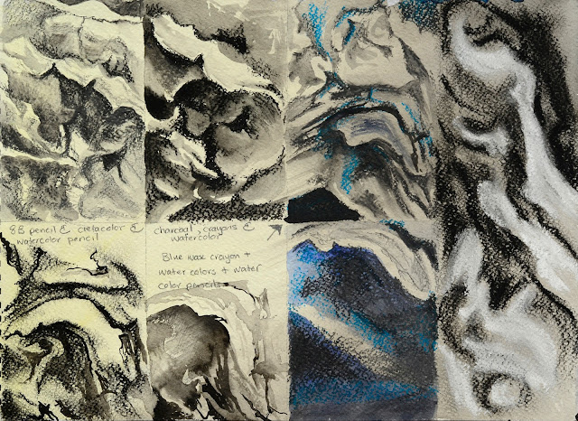
To allow me to experiment, and circumvent a road block in my creativity, I decided to revert to an exercise at the beginning of the previous assignment whereby I had to complete a grid of studies of the folds of fabric. In this study, I gridded off my sketchbook page and complete small studies of areas of the bark in front of me using varying media. To ensure that the page was not white to start with, I created a creamy yellow wash over the entire surface. As I progressed with these studies I found that I was able to loosen up my approach to the bark and towards the right of the page, I started to create studies that were more vibrant in their use of layers and interpretation.

Fig. 5. Gridded studies of bark - sketchbook
For my next sketch, I created a dark, uneven blue wash over the entire surface of the page in my sketchbook, concentrating the wash where the surface would be predominantly dark in the shades. Using mixed media, I built up layers to create the texture of bark, drawing into the wet acrylic washes with drawing pencils. and working white water color pencil onto the predominantly dark surfaces in the shadows.

Fig. 6. Close up study of a piece of bark.
I think that this style of working has potential. I would like to experiment with warmer tones, instead of the blues as the wood I am working with is essentially warm in tone. This study looks more like a study of bones due to its hue range.

!7 November, 2016

I discussed this sketch with Montenegrin artist, Mirjana Maresenic Vujovic, and she particularly liked the fact that the original blue wash still peaks through the dark bachground. She pointed out how crucial this tiny splash of intense blue is to the balance of the whole composition. Her feeling is that this sketch has potential to be developed into a large, abstract study.