Sunday, February 28, 2016

Part 3 Project 4 Perspective Exercise 3 Aerial or Atmospheric Perspective

I started out this exercise by doing a liquid watercolor and watercolor pencil sketch of the scene from our lounge window across the roofs of the surrounding buildings. On completing this sketch, I realized that the building in the background were still not light enough to get a full feeling of infinite space. I did feel, however, that the detail of the foliage did manage to draw ones attention to the foreground. Your eye tends to travel around the quadrilateral formed by the coconuts the palm in the foreground, the palm in the middle ground and the darker building in the background.

I have always marveled at the tonal variations that the Chinese literati managed to achieve in their intricate landscape paintings. Although they did not follow the Western conventions of perspective, they achieve infinitesimal landscapes using aerial perspective. “The painting combines in a wonderful way grandeur of conception, serenity of mood, sensitivity in the handling of distance through subtle grades of ink tone, and a human dimension in the delicate details of village life…” (China Online Museum, n.d.) Their use of washes of ink, using handmade, natural hair brushes to maximize the textural quality of the ink application, is truly inspirational.


Fig 1. Guo Xi. Old Trees, Level Distance ca.1080
Referring back to works of Guo Xi, such as Old Trees, Level Distance ca.1080, I spent some time experimenting with brushstrokes, particularly trying to get brushstrokes that would suggest vegetation layers and clouds (fig.1). (Xi, 1080) The Chinese literati painters tended to just suggest clouds and mist by the omission of any ink. What I found difficult that to get a soft line which was cloudlike; it seemed to help to paint with my brush on its side. However, the paintbrush absorbed more ink where it joins the staff, meaning that this area left a slightly darker ridge. I eventually tried to applying the tops of clouds with my brush upside. By doing so, the darker ridge was better placed. The funny thing was that whilst working on my final study, my paintbrush dropped onto my artwork, rolling across the page causing marks which were more wispy and cloudlike than I had managed to achieve. I then played around with this idea and eventually was able to add some faint touches into the clouds giving them a bit of form.

Photograph I took of the outer lying areas of Madrid.
In Old Trees, Level Distance ca. 1080, I saw that Guo Xi had created a general tonal description of his trees and rocks, but then he worked on top of this with a more detailed darker layer. I experimented with this in my sketchbook studies. I also tried to use my brush with only a limited amount ink on it in order to get the implied lines that literati painters often used in their interpretation of hillsides and rocky outcrops.


My final sketch in my sketchbook is of a Spanish village with its cathedral breaking the skyline (see Fig.1). Ironically, as far as I remember, I took this photograph from the Madrid Palace in the glory days of the building bubble, when Spain had a thriving building industry. The buildings under construction line the middle ground. I feel that this sketch has started to have a better sense of depth with my use of interspersing darker and lighter bands of hillside. I was able to get my cathedral to stand apart by its position in the lower left-hand corner of the composition, set apart by being the lightest building in the scene.


Sketchbook study 1
Sketchbook study of ink application
Sketchbook study of clouds


Sketchbook study of aerial perspective
To further this study, I went on to draw an A3 ink study of this same scene. I had previously discovered that my three different bottles of black ink each create a different intensity of black. So I used the more brownie-black ink in the far distant space, sky, and base color for my foreground bushes. I used the Pelican black ink for my middle ground and the darkest detail as it is a more intense, pure black.
Sketchbook study of scene

It always amazes me how different papers react to ink. So when I started working with my 180 g/m² thicker grade, I had to adjust my handling of the ink. This paper was far more absorbent than my sketchbook paper, resulting in it being harder to create the subtle transitions of one strip of hillside on top of the next. I also discovered that once I place the ink, there is no going back and blotting it to make it lighter. The ink gets absorbed and is there regardless of how you try to tweak it. This was different from my previous experience with working with wet-on-wet application techniques previously.

Once I had applied all of my layers, I had to go back and rework the cathedral in a number of different ways. I had to try to draw more attention to it by darkening the surrounding area and lightening the dome. The dome itself needed correcting, as it was too squat for a traditional orthodox cathedral dome. I did these corrections using liquid white and black watercolor on top of the original roof shape and surrounding buildings. I also lightened the balconies in the building to the left of the cathedral to prevent them from drawing your eye away from the focal point, the cathedral.


Unlike my previous landscapes studies which have at times taken a long time, this ink painting was more spontaneous and I completed it within a few hours. Previous to doing this art course, I was not in the habit of doing sketchbook studies before embarking on a work. I now see the benefit of practicing beforehand. It means that you iron out the technical issues, such as perspective, composition, the media you will use, and method of application, meaning that once you start your final study, you are freer to be expressive and enjoy responding to what the artwork actually requires to pull it together.

Final Aerial Perspective study
Works Cited

China Online Museum, n.d. Chinese Painting. [Online]
Available at: http://www.comuseum.com/painting/landscape-painting/
[Accessed 5 March 2016].
Xi, G., 1080. Old Trees, Level Distance, ca. 1080. [Art] (Metropolitan Museum of Art NY). Available at: https://commons.wikimedia.org/wiki/File:Guo_Xi._Old_Trees,_Level_Distance,_ca._1080._Handscroll,_34,9x104,8._Metropolitan_Museum_of_Art_N-Y.jpg [Accessed 5 March 2016].

Saturday, February 27, 2016

Part 3 Project 4 Exercise 2 Two-point or angular perspective

Johnston, Craig (2006) Spanish Cathedral
[photograph].
What I find the most challenging about two-point perspective is establishing where the two points are. Invariably they are so far off of your drawing page that it is hard to line up your orthogonals to such a remote point. Once I had drawn my initial sketch of the tower of this little Catholic cathedral in Spain, which we visited some years ago, I tried to match up my orthogonals. In order to do so, I had to extend my vanishing points right off the page as can be seen by this photograph. The photograph alone was hard to take as I had to stand on my work table and extend my arms way above my head, almost reaching the ceiling, in order to get the full sweep of the orthogonals reaching towards the two exterior vanishing points. Fun!
Extended work surface to aid in the analysis of orthogonals.
What I am forgetting is that this is actually three-point angular perspective as I am looking up at the tower. This throws in new perspective lines. I then went and tried extending my vanishing orthogonals to the vanishing point above the tower only to discover that the vanishing point was not above the pinnacle of the tower as I had faultily presumed, but to the right of it, by quite a margin. This was really enlightening. I eventually found that this was rather unsatisfactory on my own drawing, so I made a print out of the original photograph.

I studied the lines of the orthogonals reaching above the tower. This lead me to realize that there was not a single vanishing point as I had anticipated. This seems rather strange, but there were at least four different spots where lines of orthogonals met. Maybe this is because some of the walls deliberately were designed to lean slightly inwards, providing a natural buttress against collapse. The pinnacle of the tower was also hard to analyze as it is slanted to a pyramidal point in the middle, so follows its own alignment completely.

I then extended the lines to the left and to the right of the angular perspective. What I discovered was that the steeper the angle and the closer the vanishing point is to the actual side of the building, the more accurate the lines of the orthogonals are to all pointing to the same vanishing point.However, the further away the vanishing point is to the side of the building, the more inaccurate the lines of the orthogonals. The slightest variation in angle means that by the time the lines reaches anywhere near the vanishing point, they are off by quite a bit.
Analysis of cathedral using three-point perspective
It is also interesting that I had assumed that the vanishing points on either side of the building would both culminate at a horizon line that was parallel to the picture plane. What I discovered was that this was not so. Obviously, my husband when taking the photograph angled the camera to make a more interesting shot, hence the vanishing points on the left were higher than the vanishing points to the right. I also found that the tower and the main nave of the church both had their own vanishing points to the right of the building. I had assumed that their vanishing points would concur, but this was not so when I analyzed it in the photocopy.

This whole exercise was very interesting. It goes to show that portraying a building as simple as this Medieval cathedral is not as easy as it appears. No wonder Van Gogh chose to rather focus on the emotive feelings that the building conveyed, deliberately distorting its lines. I wonder if true three-point perspective only exist in the constructs of architectural drawings and computer imaging. But, it does help to make one more aware of the general patterns and alignment of orthogonals.

Just for inspiration I watched a video by Mark Crilley, How to draw background (two-point perspective). I was interested to see that he drew some of the Graphic novels that my students enjoy reading. I also looked at some of the drawings by Ralph McQuarrie that were used in designing Star Wars sets. These drawings were truly remarkable. I remember watching with awe the sketching of images used for the sets of The Lord of the Rings and how amazing the perspective was in most of these extremely remarkable sketches by Alan Lee.

At this point I embarked on trying to draw an A3-size drawing of the cathedral. I had no idea that it was going to be incredibly complex. Not only does it have three-point perspective, but the photograph was taken with a wide-angle lens which causes the lines towards the peripheries to become angled even further than usual. I must admit that half way through my drawing, I started to wonder if I would ever be able to get the perspective to look convincing.


Sketch midway through drawing
I found the chapel really difficult to get the angles right as the vanishing points are different from the bell tower and the lines are slightly exaggerated by the camera angle. I found that working with ruler to help align the brick work really helped me to keep the masonry straight. Periodically, I would have to erase whole sections as my angle had slightly altered in the process of drawing the masonry.

The stone masonry details around the door were the most challenging as I find drawing curves at oblique angles rather difficult. The cornices around the cathedral portal and the bell tower were also difficult to make convincing.

Once I was finished with my main groundwork, I had to determine what I wanted to emphasize and figure out how to make it the focus. On completion of the initial drawing, The circular window of the cathedral apse was drawing all of the attention. This was because it was in the foreground and the area around it was lightest.

My husband and I tried to determine what I could do to make the bell tower my desired focal point, and get it the attention I wanted. We decided that I needed to darken the side of the apse quite considerably and then darken the details in the bell tower. At this stage in the drawing, there was also not enough of a contrast between the dark and light areas, meaning that it lost impact. To add some atmospheric drama, my husband suggested that I tried to include some clouds to improve the background, which until this point was stark white paper. I did this using three different pictures of sky taken around the same period of time. 

Final Drawing of Spanish Cathedral
It was really interesting to see how by darkening the bell tower and the wall of the apse, and including cloud effects, I was able to draw attention away from the apse, and direct the viewers eye towards the bell tower. I was able to change the focus from the foreground to the middle ground, and then by adding clouds, effectively added a background. I really feel that tweaking this drawing has helped me to see how effective shifting shading and lighting can be in altering the focal point. I also feel that I have helped to take this drawing from a technical exercise to a more brooding, pensive drawing.


Sunday, February 21, 2016

Part 3 Project 4 Perspective Exercise 1 Parallel perspective - an interior view

During the past two weeks, I have been working with my upper elementary grades on one point perspective. Some of the drawings to be found online, especially on the Deviant Art site, are insanely complicated.
Initial sketch

I found it interesting that my greatest problem with drawing parallel perspective was judging the relative dimensions of the door. In both of my sketches the door dimensions are just off enough to throw the placement of the furniture inside the room slightly. For the most part, I was able to judge the angle of the orthogonals fairly well, except when is came to the edges of the carpet and the lines of the twin cabinets inside the room. In both sketches, I struggled to get the angles right and the cabinets don't look as tall as they actually are in real life. My second sketch is better, but still not perfect.

Second sketch

Where I had difficulties was in drawing my horizontals straight. In each drawing my horizontals were tipping up towards the right. I know that I have had a lot of trouble with my judging of horizontals since getting multifocals. This is especially noticeable when trying to hang a picture. I used to be able to judge very accurately whether something was horizontal or not, now not so easily.

I definitely found that using a ruler took the guess work out of things, and enabled me to get a far more pleasing perspective. I remember learning about one-point perspective when trying to present it to my high school classes, and being fascinated with how mathematical it can become, especially when working out the placement of tiling that extends parallel to the picture plane. I once tried to teach this to my students, and got them horribly confused.


Fig. 1. Giacometti, Alberto.
[View of the garden of Villa Natacha,
Saint-Jean-Cap-Ferret] 1951.
When it comes to interior sketches, among my favorites are the sensitive, loose drawings of Alberto Giacometti. I searched through the images to be found on Fondation Alberto et Jeanette Giacometti for images with parallel perspective and found this one called, [View of the garden of Villa Natacha, Saint-Jean-Cap-Ferrat] (see Fig. 1). What I love about it is the exploratory manner in which he has sensed the one-point perspective. Living in a country surrounded by palm trees, I can also relate to the frondy nature of his palm tree.

Just looking through Alberto Giacometti's sketches makes me realize how much I am losing out on by not being able to devote so much time to exploratory sketches. His sketches are inspirational.

List of Illustrations

Figure 1. Giacometti, Alberto (1951) [View of the garden of Villa Natacha, Saint-Jean-Cap-Ferret]. [Lithographic pencil on transfer paper]. 19,64 x 12,79 in. Private Collection. © Giacometti Estate (Fondation Giacometti, Paris and ADAGP, Paris) 2016.

Saturday, February 20, 2016

Part 3 Project 3 Composition Exercise 2 Foreground, middle ground and background


Fig. 1. Johnston, Craig. Ganvie Trip, 2015.
For this exercise I returned once again to the photographs my husband took on our trip to Ganvie, the Venice of Africa (see Fig.1). I chose a photograph that had a definite foreground, middle ground and background. As the original photograph is panoramic, I played around a bit in Photoshop to see if I could tweak the composition a bit to tighten it up and to emphasize the spatial depth.


Cropped version of photograph.
What looked right to me was to have the woman, with her back turned to the viewer, at the second third vertical and the prow of the second boat just about around the first third. I moved some of the men over a bit so that they fitted into the shot and helped to highlight the background. Because of the two boats on the extreme left, the picture actually has four levels to it.

Sketchbook study of water reflections.
Every since studying Claude Monet's Water Lily series as a teenager, water reflections have fascinated me. The reflections in this shot area crucial part of the interest of this painting, so, in anticipation of drawing the reflections I made a page of studies in my sketchbook. Initially I thought that the top right-hand technique would work well as it is rather dynamic. However, once the picture was underway, the technique which was better suited to the project was the bottom left-hand side one. This worked with a rubbing of charcoal smeared on the paper, and then the white highlighted ripples were picked out from the grey with an eraser. I then worked a combination of watercolor crayons, graphite pencil and watercolor pencils in layers into the darker areas of the reflections. In order to keep the yellow reflection from the petrol drum pure, I erased the graphite and drew these in with watercolor crayons. I really enjoyed working with the reflections and could envision a massive canvas created purely from the details of the reflections, in an Op art and minimalist style. An idea for a future project!

Fig. 2. Cezanne,Paul. Les Terrassiers, circa 1883.
The first thing I worked on after completing my initial sketch, was the background reedy bank with the three figures. I studied a work by Cezanne, Les Terrassiers, to get a feel for how to minimize details in figure as the distance between the foreground and the background increases ( see Fig.1). As photographs tend to be able to capture a lot of information, I wanted to minimize some details in the middle and background to increase the sense of spatial depth. The mend were reduced to basically silhouettes with a slight indication of color in some of their clothing items. I used directional strokes of graphite and beige watercolor pencils to indicate the banks.

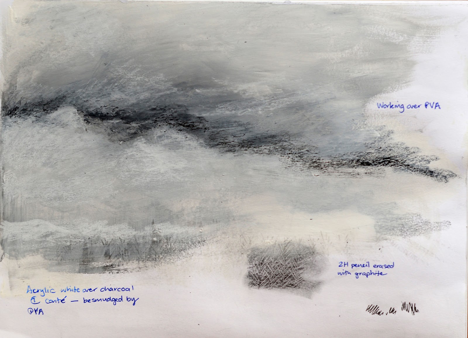
As I had completed a similar sky in my previous drawing, and I enjoy working from the top down when using mixed media that smudges, I started to work this area next. It proved a little more challenging than I had imagined. I thought that seeing I had already used the same technique in the previous shot that this would be a walk in the park, but it wasn't. I struggled to work the sky by artificial light as the acrylic washes of my initial wash were shiny. However, I then washed over a layer of PVA and then worked on with a different brand of acrylic which was less reflective. I ended up in doing numerous layers until I decided to just push on. What I found hard was the stark contrast between the darker areas of cloud and the white zones. When the two are next to each other it is easy for it to have rather a hard appearance. My husband likened it to waves on a sea, rather than it being fluffy and with slightly blended edges. Once I had everything else completed, I once again worked on the sky until I was satisfied with it.

Middle ground study.
Unfortunately, the drawing from the following
page has damaged this page.
I then worked at how to interpret the middle ground. I completed a study in my sketchbook for this purpose. I chose to make the man in the front of the speed boat a black guy to ensure that the picture was not about racial typecasting. I made these men featureless with just a suggestion of tonal values to indicate light source. As the prow of the boat is directed towards the viewer, this is the area that got most of the attention. I used a mixture of watercolor pencils and graphite on this area. Initially the waves under the boat were lighter, but on completion of the painting it seemed to need some more detail to hold the boat in position.

Foreground sketchbook study.
I practiced sections of the foreground boat in my sketchbook, especially working on the two women. I find simplifying features a real challenge. This is particularly difficult when they are in such dark shadow. What I found interesting was that the slightest change of the position of a shadow or stroke totally changed the look of the women. So, in my final drawing the woman who is paddling looks like a different woman from my preliminary sketch.

I used crayon resist and watercolors in the blue skirt of the first woman, and watercolor crayons and watercolors on the second woman.

I tried to not be completely illustrative in the foreground, although this tends to be my favored tendency. For this reason, I tried to stylize sections and not be fastidious in getting it to look super realistic. Initially the first woman on the left was a whole lot lighter. I decided to leave her like that until the whole picture was finished to ensure that I got a balance of what was really required in the drawing.

I loved working on the reflections, although they were still challenging. I wanted to show the highly decorative natured of the reflections on the rippled surface. I wanted this to be the area that helps to frame and hold your attention in the foreground.

I decided that I wanted to take some tips from the artists that I have studied and to not include too much detail in the water on the left-hand side and middle ground. I wanted the viewer to have to interpret this zone for themselves and to provide a counter-balance to the weight of the details in the foreground. I think that this works.


Initial drawing.
After taking all of the necessary photographs, I decided to rework the woman whose back view becomes the focal point of the picture. I actually really like the fact that this woman is the focal point and yet she is faceless. I decided that she needed more detail in her headdress and her clothing needed stronger highlights and shadow to help to strengthen her position as the focal point.

My husband observed that there is a tension between the triangle created by the women in the foreground and the two men in the boat. In retrospect, I think the prow of the boat helps to frame this middle ground zone, but I think that it is too dark for the painting. It detracts attention from the foreground, creating an unnecessary tension between the two. In order to increase pictorial depth I needed to have used more muted tones in the hull ensuring that the first boat with the woman remains the detailed and more dominant section.

Final drawing.


How did you simplify and select?

In both artworks, I tried to minimize the use of pattern in some areas of the drawing, whereas I intentionally drew attention to it in the areas I wanted to draw people's attention. In my last drawing, by making the women's clothing less detailed and patterned than in the original photograph. I strove to merely allude to patterns, as this is an intrinsic part of the nature of the fabric used in this region of the world. However, as the crisscross pattern of the fish traps is part of the only decorative and detailed feature of the fisherman's shack scene, I strove to emphasize the patterns here. This does have the effect of shrinking deep space as it is the middle ground that is getting the attention.

How did you create a sense of distance and form?

On further reflection of the past two exercises, I think that the first picture of the fisherman's shack on the river is more limited in its sense of spatial depth than this last one. By emphasizing the pattern of the fish traps, it serves to provide a middle zone which catches your attention. The foreground is merely suggest by the loose pencil marks washed over with a wash of white acrylic. The sky is one of the main features of this artwork.

In this past artwork, the attention is no longer on the solely on the sky and water, but includes the detail created by having figures in each zone. I feel that the figures in the middle ground are portrayed in a manner which suggests depth of space, but I needed to make the boat less prominent and more muted. When I place a piece of tracing paper over the boat, it suddenly has the effect of minimizing its details, pushing it further into the middle ground. I could have made the men in the background as pale as the figures in the small boats to the right of the drawing. This would have further pushed them into deep space. I feel that I have gained a greater appreciation for the tricks of aerial perspective, but I still have a way to go in being able to fully achieve it. I tend to be drawn by the details that a photograph can achieve and need to ensure that I continuously interpret this image source as merely a tool, allowing for greater personal interpretation and experimentation.


In both artworks, form was suggested by increasing the contrast between highlighted areas and shadows. This was particular evident on the back of the first woman in the foreground of the above drawing.

Depth was also created through the use of diminishing scale and horizontal placement in relation to the picture plane.

Were you able to use light and shade successfully?

I think I was able to use light and shade successfully in the clouds, boats and water reflection. Light and shade were particularly important in creating the dark foreboding, grey sky, with its bright areas of the sun's penetration into the clouds lower on the horizon. Light and shade was an intrinsic part of the foreground in the reflections on the water. Without the strong contrast between the rippled reflections, there would not be the sense of rhythm and emphasis that forms part of this region. 

What additional preliminary work would have been helpful towards a larger study?

I definitely feel that I need to practice striving for greater simplification in the middle ground, allowing colours to become desaturated, and details less pronounced. I also would benefit from studying how to allow figures in the background to become even more simplified, with just mere suggestions of forms and colours. I would also suggest continuing to study the complex patterns and tones found in reflections, and complexity of layers within cloud formations.


List of Illustrations


Figure 1. Johnston, Craig. Trip to Ganvie [photograph] 2015.

Figure 2. Cezanne, Paul. Les Terrassier. Circa 1883 [oil] 14.6 x 25 cm. Mellon Collection.

Sunday, February 14, 2016

Part 3 Project 3 Research Point

Tacita Dean’s chalkboard mountain ranges in her series Fatigues, 2013, are exquisite in their power of suggestion and her ability to execute the craggy forms of the mountains in contrast with the glacial snowy slopes. It is amazing how by focusing just on the tips of the mountains and indicating the wispy clouds forming from the melting snow, she has created an image with such implied depth. The foreground is implied as being the area in the deepest shadow. The crags of the overlapping mountain peaks then seem to form the mid-and background. The layering of cross-hatching and directional white chalk strokes alludes to depth. Her use of strong light on the mountain peaks, where the peaks facing towards the right-hand side of the drawing are in direct sunlight, contrasts with the leeward side of the slopes which are in deep shadow. The blackness of the area above the mountains also alludes to the idea of special-depth.

Fig.1. Dean, Tacita (2015) H540.
I perused several website in search of further images of Tacita Dean’s works. One artwork that appeals to me is H540, 2015, which depicts billowing cloud formations in chalk on four Masonite boards (see Fig.1.). (Frith Street Gallery, 2016) Having studied the depiction of clouds, I hold this artwork in high regard. She has indicated the three levels, foreground, middle ground and background, by having the clouds in the foreground a dark grey, the clouds in the middle ground as very light wispy tints, and the background is implied by sheer black.

When thinking of Seurat, I immediately associate him with the fastidious dots of pointillism. I was intrigued to see that he has some works which are similar to Tacita Dean in their approach to depth portrayal. I really did not expect this comparison. When studying The Mower, an oil painting Seurat executed in a manner that resounds with a Van Gogh artwork in its thick paint application, he uses a very rich dark zone to indicate the far distant space, in a manner similar to Dean (see Fig.2). (The Metropolitan Museum of Art, 2016) He also uses varying tonal zones to divide his space. His foreground is lighter in general tone, and his middle ground starts with mid-range tonal values, but then the heads of the stalks are almost the same tonal value as the foreground. This does create an almost undulating ripple effect in the spacial arrangement. In contrast to Dean, however, his bands are horizontal like strata; whereas Dean’s spacial division is more diagonal and organic relating to the nature of her subject matter, in the case of the works I studied, clouds and mountains. Seurat also relies on color to against the dark brown and white contrasts brought in the figure of the mower and his scythe.

Fig.2. Seurat, Georges (1881-1882) The Mower.
Due to the nature of the mishmash of buildings that surround me in Cotonou, I decided to look for artists who use diagonal zigzagging compositions, as any view from my apartment includes numerous strong diagonal lines. In Expressive Drawing, I came across Elsie Bates Freund’s Dock at Hydra, Greece, 1960. (Aimone, 2009) As I could not find an image of this work online, I took a photograph from Expressive Drawing of the work found on page 132, for the purpose of my anaylsis (Fig.3). This work of hers is built up of a strong zigzagging diagonals which extend from the bottom right-hand corner to the left, back towards the right mid picture plane zone, and then back towards the top left corner. In this case, the diminishing scale of the boats and people helps to create a sense of aerial perspective. However, on closer inspection, it still has a definite foreground, middle ground, and background. The foreground comprises the cutoff views of the roofs which frame the bottom third of the artwork. The middle ground is dominated by the larger fishing boat at the dock. A tall building to the right of this middle ground zone, set back slightly from the foreground roofs, frames this whole area, drawing attention to it by providing directional forces. Then the people and the smaller boats form the background. Interesting enough, the blank corner area, this cups the top right corner, acts as infinite space in its missing details.

I appreciated the analysis of Fairfield Porter’s work Snow Landscape as found in Expressive Drawing (fig.4). In his analysis, Aimone points out that this drawing "combines horizontal movement of verticals” with “the zigzag movements in the Freund drawing.” (Aimone, 2009) I would agree with his observation that the “several interrelated horizontal rhythms of vertical bars are easy to discern. "The rocking rhythm is more subtly felt underneath…” (Aimone, 2009) Once again, Porter has implied a foreground of snow by leaving this zone white, apart from the few vertical strokes of resilient grass stalks poking defiantly through the snow, and a lone skeletal silhouette of a tree. The white mid-ground is left with only a pathway to indicate its existence. A horizontal band of loosely implied buildings with the emphasis being on the vertical placement of doors, porches and surrounding bush, forms the horizon line. I suppose, the surrounding bush is really the final background layer of this sketch.

Fig.4. Porter, Fairfield (1963) Snow Landscape.

This research on how foreground, middle ground, and background can be implied through the use of tonal differences, compositional placement, and attention to detail has been very interesting. It is not an area that I have paid much attention to previously, and I hope that it will assist me in creating artworks which are able to portray a greater sense of space.


Illustration

Figure 1. Dean, Tacita (2015) H540, 2015 [chalk on Masonite board] 244 x 488 cm (each) At: London: Frith Street Gallery. Available at: http://www.frithstreetgallery.com/shows/works/h540

Figure 2. Seurat, George (1881-1882) The Mower [oil on wood] 6 1/2 x 9 7/8 in. (16.5 x 25.1 cm) At: New York: The Metropolitan Museum of Art: Robert Lehman Collection, 1975. Available at: http://www.metmuseum.org/collection/the-collection-online/search/459116

Figure 3. Freund, Elsie Bates (1960) Dock at Hydra, Greece, 1960 [watercolor on paper] 22.9 x 29.8 cm Photographed from: Aimone, Steven, 2009. Expressive Drawing. New York: Lark Crafts: p. 132.

Figure 4. Porter, Fairfield (1963) Snow Landscape [lithograph] 8.50 x 13 inches At: Ashville: Ashville Art Museum: Permanent collection.Available at: http://www.ashevilleart.org/artists/fairfieldporter/

Works Cited

Aimone, S., 2009. Expressive Drawing. New York: Lark Crafts.

Frith Street Gallery, 2016. Tacita Dean. [Online]
Available at: http://www.frithstreetgallery.com/shows/works/h540
[Accessed 14 February 2016].

The Metropolitan Museum of Art, 2016. The Collection Online. [Online]
Available at: http://www.metmuseum.org/collection/the-collection-online/search/459116
[Accessed 14 February 2016].

Part 3 Project 3 Composition Exercise 1 Developing your studies

As my previous studies were mostly urban environment based, and I am soon to tackle townscapes, I decided to use some photographs my husband took when we went on a boat trip to the Venice of Africa, Ganvie. The cloud formations during that day’s outing lent a lot to the atmosphere of the trip. The scene I chose was of a small, crude fishing shack set above the water, with the palm-leaf fish trap forming a band behind it. I particularly loved the reduced color scheme and the pattern caused by the palm-leaves of the fish trap.

I started out by experimenting with how to create the textural, patterned band of the fish trap. By drawing hard with a 2H pencil and then erasing the graphite, I was able to brush graphite over the indentations, along with ochre chalk pastel to create my desired effect: white crisscross stalks against a swathe of dusky ochre.

Over the past twenty-four hours, I have been looking at various pages in
Expressive Drawing by Steven Aimone. I desire for my drawings to become multi-layered and dynamic, as described in this book. The idea of flux as described on pages thirty-six through forty-one really appealed to me. As Aimone states, “...Erase, cover up, or partially cover up lines and marks as you draw them. Add some marks while taking others out…I refer to this as asserting and obliterating…” (Aimone, 2009) I decided to experiment with cloud formations, using the materials suggested on page forty: white acrylic paint, chalks, charcoals, pencils, and watercolor pencils.

Sketchbook practice at cloud formation
As suggested, I started out laying down my initial layers of graphic media. I then swathed the whole area in white acrylic. Initially I used full strength acrylic, but found it to be not translucent enough – it almost totally obliterated what I had already laid down. I then switched to white wall paint, but found that it smeared the graphic media too much making it rather muddy. So, I diluted the acrylic for the purpose of creating the cloud formations. I thoroughly enjoyed playing with layers of acrylic and then reworking graphic media back into the cloud formations, only to partially obliterate them again. In the end, I feel as if I was able to create an intricate web of media to illustrate the shadows and highlights in the cloud formations. I plan to continue to experiment with this mode of working, as it helps to invigorate the surface of the picture plane.

To ensure that I had an idea of how I was going to apply my media, I did a mock-up of my sketch in my sketchbook. Then I focused on how I was going to create a sense of depth using the three bands available to me: water, fish trap, and clouds. I also have an area which eludes to a further distant region, that is the very right-hand side of the fish trap, where the trap ends, and the water continues behind it. I wanted to use a touch of atmospheric perspective there to elude to distance.

Sketchbook mockup
To create depth in the clouds, I made the foreground clouds considerably darker than the clouds in the mid-ground and background. The clouds on the horizon, edging the fish trap, I tried to keep relatively white to create a sense of distance. I reworked the surface of the cloud many times until I felt that they were layered enough to give a sense of how clouds are really made up of layers and layers of moisture laden air. Using the flux concept was a rather inaccurate technique of working, but made for a looser, more intuitive approach than what I am used to.

I tried to create a sense of depth in the water by applying loose sweeping graphite strokes to indicate layers of rippling water. I then washed these strokes with a thin layer of acrylic paint to soften their appearance and to help unite this area with the general treatment of the sky. Pencil strokes in the shadow of the hut and boats I tried to show with greater emphasis. The water closest to the fish trap, cutout log boats, and fisherman’s hit had dark reflections to help give this area depth.

In stark contrast to the treatment of the sky and clouds, I used watercolor paints and watercolor pencils to create my focal point, the fisherman’s hut and boats. I tried to simplify the shapes slightly to create a greater contrast with the remainder of the painting.

Detail showing layering effects and fish trap pattern

In general, I think that I am starting to get an idea of how to work with clouds, as well as creating a sense of depth through multiple layers of media application. I would like to think that the research that I undertook this morning influenced my composition. I think that I have been able to focus attention on the fisherman’s shack through the direction of the cloud formation, the patterned swathe of the fish trap and the reflections in the water.

Final drawing of Ganvie fisherman's shack

By cropping the picture to give a detailed shot to show technique, I realized that by using a different composition of the same scene I would create a totally different mood. In the landscape format version of my actual original, you get a sense of foreboding in the cloud formations and the insignificance of the shack. Whereas, in the portrait format cropped image, there is more of a sense of deliberate isolation, as if the shack has turned its back on the world. Interesting!

Works Cited

Aimone, S., 2009. Expressive Drawing. Ontario: Lark Crafts.

Saturday, February 13, 2016

Part 3 Project 2 Landscape Exercise 3 360° studies

Choosing an "expansive landscape where you have an open view in all directions" is extremely challenging when living in the center of Cotonou, Benin - a bustling, concrete jungle. As we do not have a car to take my out into the countryside, and everything within walking distance is just as congested and overpoweringly urban, I decided that I needed to just do the best I could with my immediate environment. As we live on the third floor, at least we do have a slightly expansive view - if not altogether pretty. Our apartment has windows, or balconies on three sides, so I chose to use these viewpoints for my sketches.

It was quite a challenge in that it is extremely hot and humid outside, and the smell of the wind wafting from the dock yard three blocks away was nauseatingly fishy. However, once I got concentrating, I was able to put those distractions aside.

The scape that I have available includes lots of derelict half-finished buildings. So two of my viewpoints had the haunting shells of building exoskeletons. In some ways, I want to include them as they help to contextualize the city in which I am presently residing.

View includes derelict incomplete construction.
View towards the harbor with the cranes on the horizon.
View from the laundry window
I decided to keep my sketches simple and to just use a watercolor black pencil. I love the softness of the lead and the fact that I can use the pencil on its side and it gives an effective broad stroke.
View across mishmash of roofs


Part Three Outdoors Project 2 Landscape Research Point p.88

I remember studying works of varying Renaissance landscape artists at The Kunsthistorisches Museum (Art History Museum) in Vienna. I was amazed at how their artworks were divided into set bands to depict atmospheric perspective, dictated by a recipe color scheme: Foregrounds were in brown and amber tones; mid-grounds were in muted and forest greens; and the far distant horizon in dusky blue tones. Standing in a gallery surrounded by works by numerous artists, all following the same recipe really hit home to me how the style of the time dictate the way scenes were portrayed. Landscape depiction has certainly taken many turns since these earlier works.

Fig. 1. Doig, Peter (1990) Grasshopper. [oil on canvas].
Looking at the Grasshopper
by Peter Doig online, reminded me of this experience (Fig.1.). However, in his case he has used a similar color scheme but modernized the appearance of this forlorn scene. He has done this by abstracting the top band of the sky, with “thin veils of vivid blue masked with successive layers of dragged and dabbed paint. The middle band contains the land, a small settlement isolated in the desert of an arid landscape, the telegraph poles and lines the only clue to the connection with the developed world. Infused with a rich warmth of light, this is a nameless landscape in the middle of a barren land, of no specific time.” (Saatchi Gallery , 2016) The scene itself is reminiscent of small settlements in the middle of South Africa’s Karoo. 
Fig. 2. Doig, Peter (1997)
Reflection (What Does Your Soul Look Like?)
[Etching on paper].

What I find appealing about his print series
Reflection (What Does Your Soul Look Like?), 1997, is that he has contrasted large solid tonal areas with filigree-like details of the ripples in the reflective puddle and the reflections of the bark of the trees (Fig.2). (Tate Museum, 2016) I also love the fact that he has implied a person standing on the edge of the puddle, but has not sought to depict them literally.

From my limited perspective of viewing artworks via the internet, John Virtue seems to be an inspirational artist with whose work I resonate. I absolutely love the large scale of his canvases and his use of pure black and white. His abstraction of the London landscape in the series he created for The National Gallery is particularly appealing because it strips the landscape of color and renders it in haunting honesty of form and tonal values. His works remind me of the early photographs taken by daguerreotypes. His artworks refer to their landscape subject, but with the power of abstract expressionism. I appreciated the inclusion of John Virtue’s intention in the write up on The National Gallery website which stated:

The colour would be a cul-de-sac, the colour would be a blind, the colour would immediately refer back to Claude, would refer back to Turner, would refer back to Constable. The very things that would suck you into a way of painting that is not only referential - it is almost subjugated by that tradition. (The National Gallery, 2016)
Working with elementary students, I often use Sharpies to create artworks, so it was amazing to discover the huge installation artwork created mainly with Sharpies. The video I watched filmed by Jason Read “documents the production stages of Aleksandra Mir’s exhibition at Drawing Room, 27 May 2014 - 19 July 2014.” (Aleksandra Mir, 2014) What fascinated me is the way that they used dried out and damaged Sharpies to create textural and tonal areas. I tend to throw out my blunt and drying out Sharpies. They also used what looked like insulation tape to help screen out the lines of the architecture while they were shading and adding texture to areas. Then once removed they were able to retain the integrity of the lines. The sheer scale of the project is quite inspirational.

All of this leaves me with the challenge to know my landscape and to seek ways of capturing some of its intrinsic essence in a manner which involves processing the information and details into an image which is not hackneyed, but vibrates with bold areas of solid fields of color and areas of intense texture and detail. This will be interesting to try to attain to, given my traditionally tight style, bound by slavish realism.


List of Illustrations

Doig, Peter (1990) Grasshopper. [oil on canvas] 200 X 250 cm At: London: Saatchi Gallery.

Diog, Peter (1997) Reflection (What Does Your Soul Look Like?). [Etching on paper] Support: 557 x 455 mm At: London: Tate.

Works Cited

Aleksandra Mir. 2014. [Film] London: The Drawing Room.

Saatchi Gallery , 2016.
Peter Doig Grasshopper. [Online]
Available at:
http://www.saatchigallery.com/artists/artpages/doig_Grasshopper.htm
[Accessed 13 February 2016].

Tate Museum, 2016.
Peter Doig Reflection (What Does Your Soul Look Like?), 1997. [Online]
Available at:
http://www.tate.org.uk/art/artworks/doig-reflection-what-does-your-soul-look-like-p11544
[Accessed 13 February 2016].

The National Gallery, 2016.
John Virtue in the studio. [Online]
Available at:
http://www.nationalgallery.org.uk/artist-john-virtue/studio/blwh.htm
[Accessed 13 February 2016].