Saturday, July 9, 2016

Part 4 Project 4 Exercise 1 Structure

This exercise correlated with our being able to view the Body World Expo held in Johannesburg. It was so fascinating being able to study the musculature, tendons and bone structure of the human body. If I had not had my family along with me, I would have loved to have done sketches of the exhibits, but as I could not keep them in the exhibition for hours on end, I had to be satisfied with just study the bodies the best I could. What I found particularly interesting was how small the finger and toe bones were in relation to the overall size of the human figure. The rest of the bulk of fingers and toes are made up of muscles, tendons, and nerves. Truly fascinating!

It was also interesting to see how the muscles wrapped around the skeletal form in bulbous bundles of muscle fibres, anchored by tendons.

What was particularly horrific was to see the cross-section of an obese person. The layers of fat literally coated all of the internal organs, displacing them, creating a totally different internal structure to that of a normally proportioned adult. It also helped me to be able to see how different a muscularly well-built individual has far more defined musculature than a person who is carrying extra weight.

I found that it took a while to feel as if I was getting the structure of the feet properly portrayed. My final sketches were of my own foot and that of my 10-year old niece. Her foot enabled me to study the underneath structure of the foot. I think I managed to get the proportions of the toes correct.


Fig. 1 Feet Studies 1

Fig. 2 Feet Studies 2
My first sketch of my hand ended up appearing deformed, so I recommenced the sketch. What I found interesting was how wrinkled my hands appear when studying them up close. I then executed three overlapping contour drawings of my hand to try to force my eye to slow down and take in the contours. (fig. 4) I then did two pen drawings of my hand on top of one another. The hand holding the scissors was far better proportioned than my previous sketches.(Fig. 5) Unfortunately, I find it very difficult to buy a sketchbook in South Africa that does not allow colors to seep through the pages. When I did my first stomach study, the ink from this sketch seeped through, marking the hand drawings.


Fig. 4. Hand studies 1 - contour drawing

Fig. 5. Hand Studies 2

Fig. 6. Hand Studies 3

Fig. 7. Knees

As my mom has just had a knee replacement, I find the structure of the knee quite interesting. In studying the knees I sketched, it was interesting to see how much of the underneath structure is evident in the shadows and tonal values found around the kneecap. You can also clearly see how the muscles bunch out from their attachment on the skeletal structure. (Fig. 7)

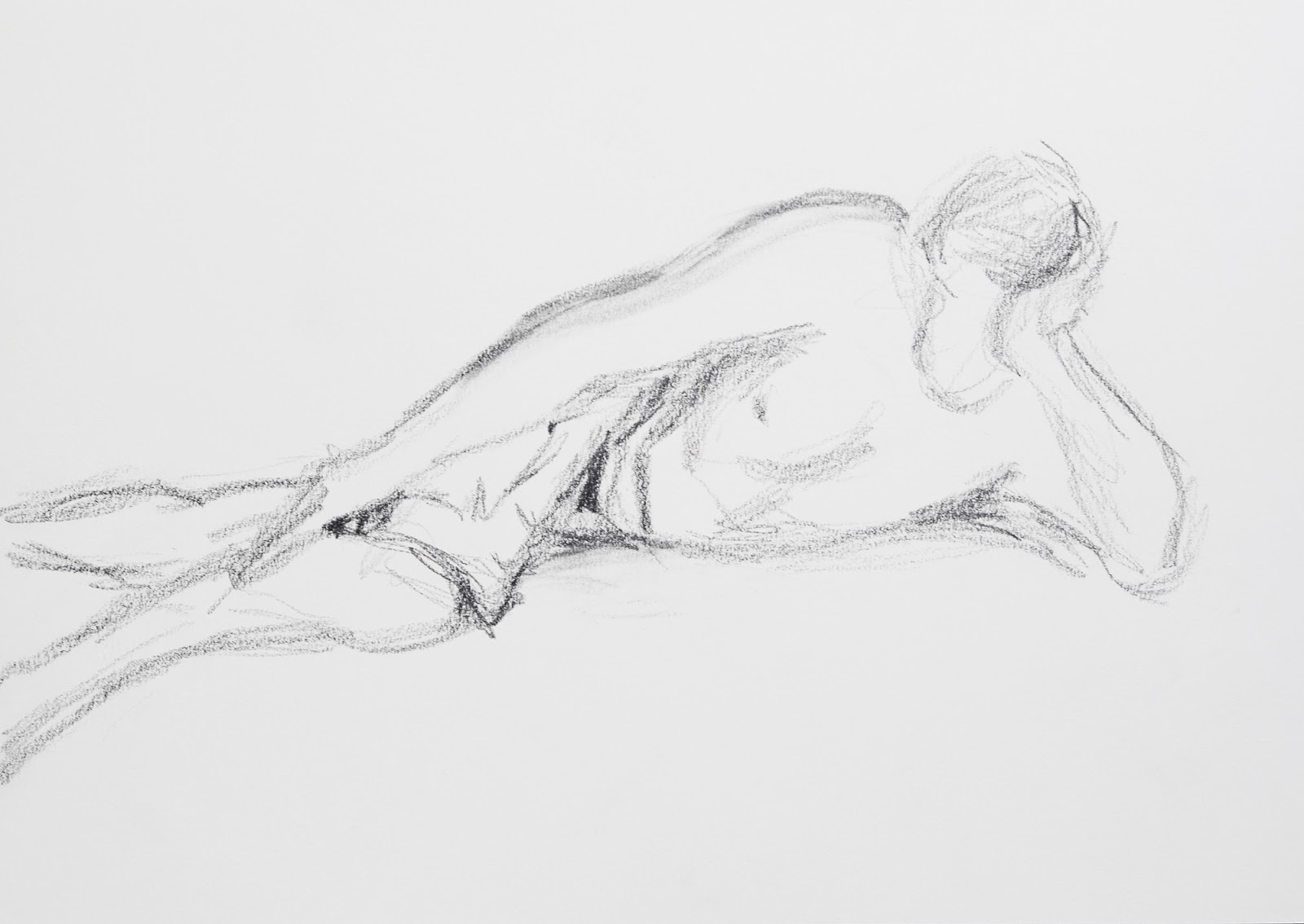
As a result of it being the middle of winter in South Africa, and houses are not heated, I did not fancy drawing my own hips and stomach. So for the purpose of this body area, I chose some online photographs.

Stomachs and hips were more challenging to draw than I would have imagined. I found it difficult to get the woman’s hip to stomach proportions to look right. I did enjoy the way the inks reacted to the paper. The jeans were especially interesting to draw. I used watercolor fine markers with washes of water and details added after the paper dried. I used watercolor pencil for the guy’s stomach and torso. I found it interesting to see how different the musculature of the woman’s stomach was from that of the man’s. The woman’s stomach formed a more circular inverted bowl shape, whereas the muscles of the guy formed almost a V-shape as it pulled toward the groin area.

Fig. 8. Male Hips

Fig. 9. Female Hip Study

I tired to sketch the neck and arms of a man using loose 6B pencil strokes. I tried to focus on the shapes of the shadows and tonal values. It was interesting to see how the skin of the man’s left-hand side seems to ripple, despite his being well built.


Fig. 10 Torso study

I think this exercise has helped me to observe subtle changes in tone and the shifting angle of planes to analyze the shape of the areas I studied. The human form is extremely complex. Studying sections of it, in conjunction with my visit to Body World, has heightened my awareness to its intricacies

Tuesday, July 5, 2016

Part 4 Project 3 Exercise 3 Stance

I started out this exercise with very tentative sketches of random models I found on the internet. After watching Michelle Whiting's commentary on the work of Averil Wootton in WeAreOCA, 17 May, 2016, I felt inspired by her gestural rendering of the woods. Her work has a vitality and freshness about it. I love the descriptive power of her charcoal and paint sketches. This motivates me to continue to push against the super tight style that often locks me in.

For this exercise, I decided to draw myself in varying poses in front of a full-length mirror. As it is the middle of winter in Cape Town and the house is freezing cold, I was not prepared to strip down, so drew myself fully clothed. I found it hard to understand what was meant about the axis line, as the description in the course materials does not go with the illustration. I discussed this with my daughter who has also completed life-drawing lessons and we could not really figure it out. I eventually interpreted it as a plumb line running from the centre of the head. However, as I progressed with the sketches I eventually found it more helpful to work out the main direction of movement of the varying sections of my body in comparison to the perpendicular.


My initial sketches were awkward with my tending to draw my head and torso too big in comparison to my legs. What made it a little complex is that a full-length mirror does cause a degree of distortion. My fourth sketch was particularly difficult to execute. You can see how many times I tried to rework the legs, and yet they still do not look right. I then tried a similar pose. This time, I focused on first sketching in lines to show the direction of the main movement within my pose. I then tried to figure out the relative proportions, and then used this as the framework around which I sketched in the gestural drawing. I copied this technique in the final pose, and I feel that I have been able to capture the slouched pose and the elongation of my legs stretched in front of me. I feel that I am finally getting the stance and the angles of the varying axes right.


Saturday, July 2, 2016

Part 4 Project 3 Exercise 2 Essential Elements

Fig. 1
I started out this exercise with very tentative sketches of random models I found on the internet using drawing pencils (Fig. 1 & 2). Although I think I got the proportions right and indicated to some extent the difference in the tonal values, I found them rather dead in character. The seated model has a twist in her pose and is viewed obliquely from above the left shoulder.


Fig. 2

As my initial two sketches did not appeal to me, I spent some time flipping through websites for inspiration. After watching Michelle Whiting's commentary on the work of Averil Wootton in WeAreOCA, 17 May 2016, I felt inspired by her gestural rendering of the woods. Her work has a vitality and freshness about it. I love the descriptive power of her charcoal and paint sketches. This motivated me to continue to push against the super tight style that often locks me in, and to draw my next four sketches on an A2 scale.


I really struggled with the proportions of the male model I selected online. My first sketch started out with a head-size that was too large, resulting in me not being able to fit the full figure in the picture plane. (Fig. 3)

Fig. 3.
My second attempt was better proportioned, but the foreshortened right arm was not wide enough in comparison to the musculature of the left arm.(Fig. 4)


Fig. 4
For the last two sketches in this exercise, I smeared charcoal shavings over the paper and then used the erased highlights as the lightest tones, and worked charcoal and conté to create the darker tones. (Fig.5&6) These drawings felt more dynamic. I did a lot of measuring and checking of the proportions, yet the pose still feels awkward, and the hips seem too small.

Fig. 5.
In the final pose, there was a slight twisting of the upper torso towards the figure’s right, with the bent arm and tilt of the head emphasizing this movement. His hips seemed to be slightly twisted in the opposite direction. I think I manage to get this movement into my sketch.

Fig. 6

Monday, May 16, 2016

Part 4 Project 3 Exercise 1 Basic Shapes

Despite scanning the internet for suitable poses on some of the Life Drawing websites, I decided that I would rather just get my husband to take varying shots of me for the purpose of this exercise. Drawing yourself is always a challenge as you already have preconceived ideas about your body's proportions, but I tried to discredit this prior knowledge and just look. I positioned myself on our coffee table with a slight shift in my torso and the angle of my gaze was upwards. I knew that this would create some challenging drawing, which it did!

Once again I ran into the same problem with the sizing of the head. I think that this is because each of the poses I had were taken from slightly down below and there was foreshortening happening in each position.

I chose to just stick to using a 4B pencil as my media, as I wanted to concentrate of the proportions and shapes, and not so much on technique. In the first sketch the main areas where there were foreshortening were in the outwardly turned elbow, the sole of the foot jutting towards the viewer at an angle, and flattened leg. I found getting the proportions of the buttocks quite hard, causing me to keep shifting the baseline further down. I like the movement of this pose as there is a flow from the top of the head down the sweep of the back and then your eye does almost an '&' sign across the folded legs and back up the resting arm. Very little of the face can be seen, meaning that there is a greater emphasis on getting the shadows right.

Initial Sketch

In this second sketch, I encountered a lot more curves and counter-curves. This actually proved harder to draw as there was less opportunity to line up the shapes with the parallels of the sides of the page. I am really dissatisfied with the face, as it does not look curved enough. I worked on it quite a bit and eventually decided that this exercise was not about getting the portrait to look great - so, I quit adjusting it. What was also hard about this sketch is that the lighting was from front on, meaning that the figure appears flatter than in the other views. The foreshortening that was the most marked in this sketch was the forearm wrapping around the raised knee. This reduced the forearm to an elliptical shape.

Second Sketch
For my final sketch in this series, I chose another shot with side-lighting. From this angle the twist in the torso and arms is really evident. Once again, this adds to the twisting movement around the form, adding some interest to the pose. The head is tilted in the opposite direction to the movement of the shoulders. I am happy with the foreshortening in the foot tucked under the crossed leg. The knee is a little less convincing  as I think it might have some shadows in the wrong place. 

This sketch gave me a lot of troubles with the proportion of the head. I found that I drew the head too big for the foreshortened angle. I redrew the head with its facial features a number of times, until I shrank it to the correct size. On checking the proportions, using the head as the reference point, I finally think I have it correctly sized.

Final Sketch

Part 4 Research Point Foreshortening

Mantegna  (Pinacoteca di Brera)
The Lamentation over the Dead Christ..
Foreshortening is one of the most challenging aspects of proportion that figure drawing holds. It is the ability to create the "optical illusion that an object appears shorter than it actually is when angled towards the viewer." (Encyclopedia of Fine Arts) I found the discussion on this website about the difference between an artist's use of foreshortening and a photographer's use very interesting. I never thought of the fact that artists actually underplay foreshortening to some extent, as seen in the fact that the feet of Jesus in The Lamentation by Mantegna, is a "slightly less aggressive assault on the viewer's eye and ...the truncated image [is incorporated] more harmoniously into the overall composition." (Encyclopedia of Fine Arts) In contrast, in photography, the feet would have been correctly proportioned to the extent that the feet would have dominated the foreground, obscuring the truncated torso.

Work Cited

Encyclopedia of Fine Art, n.d. Foreshortening. [Online]
Available at:
http://www.visual-arts-cork.com/painting/foreshortening.htm
[Accessed 16 May 2016].

Part 4 Project 2 Exercise 2 A longer study

It always amazes me how long it takes me to get into a project. This exercise had me scouring the internet for photographs, until I eventually found this photograph of a young woman wrapped in a bath towel. I connected with it as it reminded me of times when I went to the Banya, Turkish style baths, in Almaty, Kazakhstan. Unfortunately, as explained previously, I do not have access to live models, other than an obliging family member, and I felt like drawing someone different.

I started out this study with a sketch which sought to explore the proportions of the woman. I found this to be far more challenging than I had anticipated. Her face appeared deceptively smaller than the swathes of toweling, and the broadness of her back and crossed legs. My final sketch did not give the right impression of the proportions or the movement of her pose.


Proportions study

Hodgson, Ian. Angel Part.
I then went back to exploring the works of ian Hodgson. In this work of his Angel Part he successfully uses graphite media with an eraser to striking effect. The eraser becomes a highlighting pencil, drawing sweeping strokes across the graphite of the image. He then emphasizes contours and folds with calligraphic lines created by the irregular strokes from an ink pen or brush. The effect is to emphasize the sensuous nature of the folds and curves. Although the proportions are correct, his aim was to create more of an ethereal sensuality, than a correctly executed pose. I decided to explore some of his technique, to see if I could take my picture beyond a study in proportions, to take the focus off of my struggles to get proportions right.

In my sketchbook I explored how I could create the fluffy, rough texture of the towel as a contrast to the smoothness of the sitter's skin. I used the side of a black conte pastel to lay down a film of speckled black. I then worked my eraser into the chalk to create the highlights of the folds. Then adding water color black pencil and some 6B, I continued to work the folds to allow for the sense of deep undulations of folds, but with highlights that are speckled with the characteristic points of shadow of a towel surface. I used two different ink pens to try out different effects. The one was a store bought ink pen, which created finer, but also pretty regulated and controlled lines. Then I used a feather that I had cut to become a quill pen to try for more loose, unplanned, irregular strokes. I particularly like the spontaneous nature of the quill pen with its broad and delicate lines.

Sketchbook Experimentation with the towel texture.
On an A3-sized piece of white paper, I lightly sketched in the proportions of the woman. Unlike my previous sketches, I found that I could not get her proportions right. Eventually, I tried a completely different approach. I sketched in the spread of the back view of her crossed legs and then worked out from the photograph how many heads should fit into this span. I figured out that it was about four-and-a-half. I then worked out what four-and-a-half would look like and from there figured out the relative size of the head. I then worked up the body from the backside, up to the head. This seemed to do the trick. I was eventually able to get the pose down with the slight twist in the torso.

I then used a black watercolor pencil and a 6B pencil to lightly shade in the tones of the woman's skin, carefully working the facial features. I tried to include lots of white to show the strong side lighting on her. Once her skin was drawn in, I used the technique I had practiced to fill in the folds of the towel.

I retrospect, I think that I have managed to show some of the contrast between her smooth, highlighted flesh and the fluffy texture of the towels wrapped around her. Her pose has a slight sense of movement and expectancy to it. As the viewer, you are forced to fill in some of the visual information, which was what I was trying to achieve.


Woman swathed in toweling.

Illustration

Hodgson, I., Angel Part. Ian Hodgson Gallery. [Online] 70 x 100cm.
Available at:
http://ian-hodgson.co.uk/gallery.html
[Accessed 17 2016 2016].

Sunday, May 8, 2016

Part 4 Project 2 Exercise 1 Quick Studies

For this set of studies I had my model lying on a bed with his Kindle. I then proceeded to make several gestural drawings of varying poses. Initially I found the foreshortened areas particularly difficult to get into proportion. Arms looked like they were floating instead of resting on the bed and his feet often appeared like flippers. The final drawing of this set of three looked more proportioned, but the torso was a little too long, making my model look like an Avatar.


For my two larger 10-minute drawings, I used the lighting from the side window to try to highlight the musculature. I feel like my final sketch here has a better sense of proportion. The shoulders leading down towards the waist form almost a triangle. Whereas the curvature of the legs and hips form almost a right angled triangle. The arm propping up the head also forms a triangle. So the whole pose can be analyzed into triangular shapes.

After completing these graphite sketches, I decided to try something completely different. I made a quill pen and sketched an overhead view of my model using white crayon and ink washes, strengthened by expressive strokes created with the quill. The marks were very varied, and at times difficult to control, but in many ways this is a more expressive sketch.

I did not quite get the angle of the shoulders right as the right-hand shoulder should no be larger than the left.

What I realized after processing the first photograph, was that I did not have enough shadow around my figure to make him appear to be lying on the bed. I went back and added some more shadows around the torso and head.

Quill pen and ink study with crayon and ink wash.

Final version with additional shadows.