Friday, July 22, 2016

Part 4 Project 6 Exercise 1 The Facial Features

To initiate this exercise I watched a tutorial Drawing the Figure in Motion with Robert Liberace, 2009. What I found interesting was how Liberace's knowledge of muscular form helped to inform his drawing. In places he over-emphasized the form of various muscle groups to ensure that his drawing showed the dynamics of the movement. It wasn't specifically related to faces, but as I worked I tried to seek out the muscles of the face to interpret the shape of the forms and shadows.

As I keep seeking for a more gestural, expressive style, I read up about Gestural Tone in Drawing Projects. The description drew attention to "exotropic tone", tone outside the figure/object, and "endotropic tone", tone found inside the figure/form. (p. 168 Mick Maslen and Jack Southern, 2014.) In the exercise it talks about discovering the edges of boundaries of objects by putting tones in the shape of those tonal areas working the negative space simultaneously from large shapes to smaller shapes.

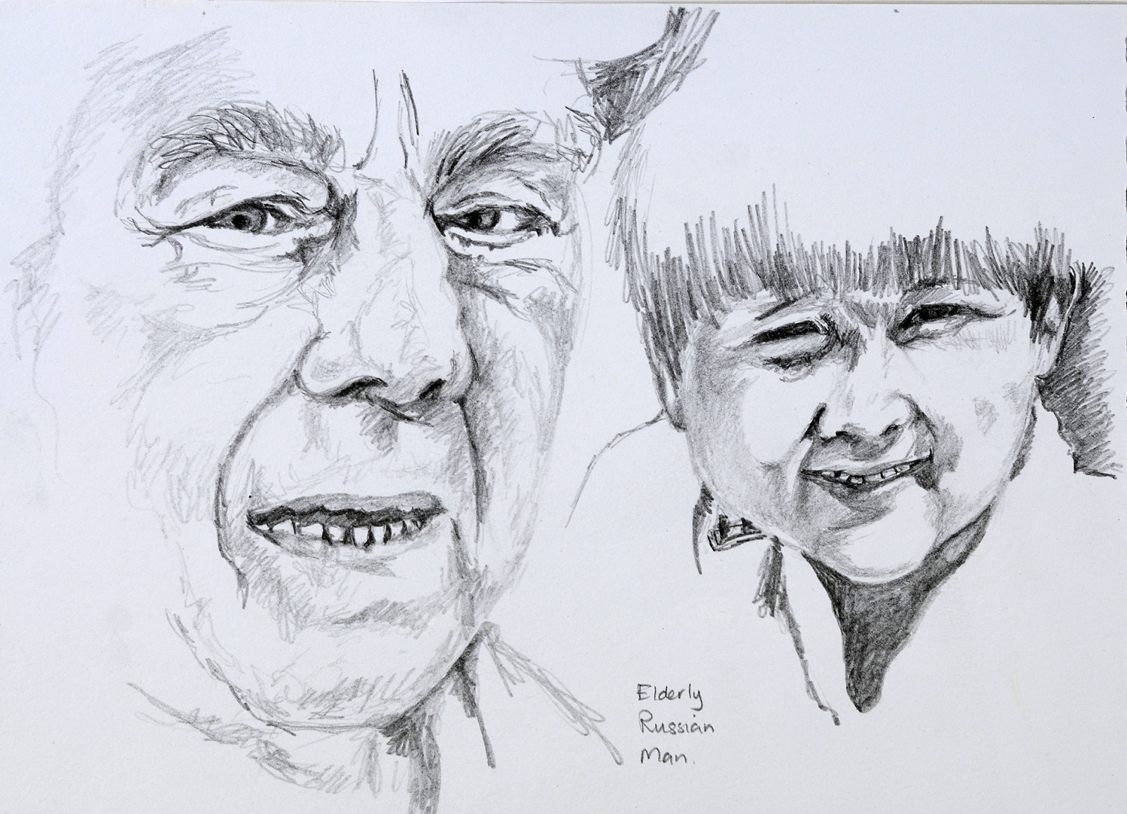
I started exploring features by drawing the eye of a young woman, the eyes of a 6-month-old baby, and a young man. In each of these drawings I started with a 2B pencil seeking to rely less on contour lines and more on planes of tones, hatched in with directional strokes. I then strengthened the darker areas with a 6B pencil. I found the main difference between drawing the eyes of the child and those of the young man was the fact that the space between the eyes of a baby is shallow and less defined by shadows, whereas the adult's nose forms a very sharp ridge of shadows where the bridge of the nose forms between the eyes. The shadows around the eyes are also less pronounced. The circular shape of the eyeball of the man is very evident in the circular shape of the shadow beneath his eye.

Fig. 1 Eyes Studies
I then tried a more linear approach with the Russian old man. I love the bulbous features of elderly Russian men. Their wrinkles and bushy eyebrows etc., lend themselves to a loose linear approach. I tried to allow my pencil to enjoy the loose contours of his face. I feel as if I was able to go beyond my more typical tight illustrative style.


Fig. 2 Facial features in portraiture

I then decided to see how different the features of a young Kazakh boy would be by comparison. On the same page in my sketchbook I explored the features of a boy I have photographed. Once again I tried to explore planes of tones and keep a loose style. I sought out the endotropic and expotropic forms as I modelled his face.

The house where I am working has a National Geographic magazine, Tomb Raiders with a young Matsigenka girl, Yoina Mameria Nontsotega, photographed in it (James, June 2016). As we visited a number of Amazonian Indian tribes during our years in Venezuela, I was drawn to her photograph. I decided to sketch her in my sketchbook using watercolor crayons, watercolor black pencil, and washes of water. I enjoy the sketchy interpretation that resulted as there is limited control over this media, due to the thickness of the crayon and the fluidity of the washes. I would like to explore this medium more.

I started drawing her from the area of the nose and then worked outwards. My resulting image has over-emphasized her eyes - particularly the right one. Her nose is actually far more refined in the photograph. So there are things that would be tweaked if I were to develop this into a final work. What I might do is to use her as the basis of my portrait drawn from memory.


Fig. 3 Whole head study
On the whole I have thoroughly enjoyed this exercise. It has been fun practicing allowing my pencil to dance across the page dictated by the planes and contours of the features.

Works Cited

Drawing the Figure in Motion with Robert Liberace, 2009, video, YouTube, viewed 19 July 2016.

James, C. H., June 2016.
Photograph of Yoina Mameria Nontsotega. [Photograph] (National Geographic Magazine).

Mick Maslen and Jack Southern, 2014.
Drawing Projects. London: Black Dog Publishing.

Wednesday, July 20, 2016

Part 4 Project 6 Research: Portraiture

Over the past month, I have helped my mother-in-law pack up 53 years of her life into boxes, to move into a smaller house. Over the weeks, we have discovered interesting historical finds stashed hidden in the backs of cupboards. A few finds belonged to my husband’s grandfather. Until this time, the small photograph with three medals hanging in the back study had no meaning to me. Now I know this historical character to be William Johnston a Canadian World War 1 hero. The significance of this small photograph has helped to put a face to the legendary tales of heroism I have heard over the years. It is interesting how this portrait now has a whole new sense of meaning to me. 


Elizabeth Peyton

I found reading up about Elizabeth Peyton very interesting. In the same way, that having an image to connect with the stories of my husband’s grandfather, helped me to enter into the world of William Johnston, Peyton’s exposure to literature on Napoleon and Ludwig II drove her to explore how to depict these characters based on the descriptions of others. “Reading about Napoleon made me think how people make history. They are the way the world moves, and they contain their time. It shows in their faces. I’d always made pictures of people, even when I was a little, little person. The urge was there—I just didn’t know why. When I did that first drawing of Napoleon, I realized this is something I have to do and want to do.” (The New Yorker, 2006)

What I found interesting about Elizabeth Peyton’s style is the way in which she uses broad strokes to delineate sections of her portraits. She is able to describe the features of a person using the fewest possible strokes, yet the portraits still show individuality and character. This is particularly noticeable in her portrait of one of my favorite artists,
Georgia O’Keeffe after Stieglitz 1918 (Peyton, 2006). Peyton uses only a few strokes to denote the shadows on O’Keeffe’s face and neck, but retains fine detailed drawing for her refined facial features, “zooming in on some facial detail.” (The New Yorker, 2006) This article describes her work as, “Peyton’s work carries her own signature, with its bold, large-scale brushstrokes on small surfaces.” (The New Yorker, 2006)


Chuck Close

Reading articles about Elizabeth Peyton lead me to read about Chuck Close. His style is completely different from Peyton’s. It is interesting to see his total change in style from his pre-paralysis super-realistic portraits (Close, 2014-2016) to the abstracted color-saturated works of the 1990s. 
Fig. 1. Chuck Close. Big Self-Portrait, 1967-1968.
The sheer size of his Big Self-Portrait, 1967 – 1968 is remarkable. (Fig.1.) His ability to get such a fine likeness with an airbrush, on such a huge scale is quite absorbing. My daughter, who recently studied Graphic Design in Idaho, told me that these works are the ones which she recognizes from the recent Art History books she studied for her courses.

However, I particularly like his later experimentations in styles of portrayal. His wet paper pulp works were coded, almost like paint-by-numbers – an activity which was part of my childhood. Each number was assigned a different tonal value of paper pulp. It is when viewed from a distance that the image comes into focus. His use of a metal grid to create a more organic approach to his portrait,
Georgia, 1984, is quite intriguing. (Close, 1984) I finally understand why I had a compulsory evening art class in handmade papermaking when I was studying art in 1989. We were never shown artworks created by using handmade papers. As our course was in the middle of Cape Town’s winter, and the papers refused to air dry, leaving our creations moldy and smelly, I never returned to handmade papermaking. Now, I can see why it was an attraction during that era.

Fig. 2. Chuck Close. Eric, 1990.

Close’s exploration into an enlarged form of pointillism is particularly stunning. Close starts with a simplified grid of undercoat colors, upon which he slowly builds up complementary and harmonious colors to create the illusion of tonal values and hue changes when viewed from afar. This can be seen in the photographs of his work technique for his painting,
Eric, 1990 (Close, 1990). (Fig. 2) Unfortunately, I am only viewing his work online, using the zoom to get an idea of what areas appear in reality, but the effect of his technique seems to cause you to desire to look deeper into the image, as if it is out of focus. Each little square of his canvas ends up in having at least three or more colors which together create a hue and tonal value. How he goes from a regular photograph to this interpretation is a mystery to me.


Graham Little

It was interesting to see the very different style of Graham Little. His works are modelled to smooth perfection as the colored pencils and gouache subtly model the forms of fashion models from bygone years. His figures, however, are not glitzy and characterless, rather they display a quiet sense of contemplation and mystery.


David Datuna and Alex Gufeng

While studying the technique of Chuck Close I was reminded of the installation of
Steve Jobs– Ayn Rand by David Datuna, in collaboration with Alex Gufeng. Datuna uses a similar “pixilated” style with layers that together create an image which comes into focus and is interpreted by the viewer when seen from afar. However, Datuna created his base image out of a “collage of recurring shaded portraits” of Ayn Rand. The Mironova Gallery, of Kyiv, Ukraine, is quoted as saying, that a “cascading wall of approximately one thousand optical lenses” then superimposes this background. (Taylor, 2011) These lenses are both positive and negative, described as showing the polarity of opinions that people hold on the impact that the late Steve Jobs has had on contemporary society. 


It is amazing how just three artists encompass entirely different ways of working with portraiture. It just goes to show that the human face holds great potential for different means of portrayal and interpretation, ensuring that portraiture never grows old fashioned. A philosophy purported by Elizabeth Peyton. (Peyton, 2006
)


Works Cited


Close, C., 1984. Georgia. [Art] (Pace Prints, and Pace Gallery).

Close, C., 1990.
Eric. [Art] (Pace Prints, and Pace Gallery).

Close, C., 2014-2016.
Big Self-Portrait, 1967 - 1968. [Art] (Official Chuck Close Website).

Peyton, E., 2006.
Georgia O'Keeffe after Stieglitz 1918. [Art].

Peyton, E., 2012.
Nick. [Art] (Artnet.com).

Taylor, A., 2011.
PHOTOS: Ukrainian Gallery Shows Steve Jobs Portrait Made Up Of Hundreds Of Tiny Ayn Rands. [Online]
Available at: http://www.businessinsider.com/david-datuna-steve-jobs-ayn-rand-2011-11
[Accessed 20 July 2016].

The New Yorker, 2006.
The Artist of the Portrait. [Online]
Available at: http://www.newyorker.com/magazine/2008/10/06/the-artist-of-the-portrait
[Accessed 20 July 2016].

Sunday, July 17, 2016

Part 4 Project 4 Structure Exercise 2 Three Figure Drawings

For these three poses, I decided to use photographs of my daughter and her closest friend from university.

I tackled drawing the lying down pose first in my sketchbook trying to get a feel for the overall proportions. I fancied working big, so picked an A2 format for my final sketch. I smeared charcoal over the surface of the paper concentrating the darker smear in the area of the background that is darkest and the area of the figures chest which is in shadow. Using a 6B I lightly sketched in the general position and stance of the pose.


Fig. 1 Preliminary Sketch for lying down figure
Areas which needed tweaking were the position of the head and arms in relations to the angle of the feet. As I started with the feet and legs, I used the size of the feet to work out the relative positioning and proportions of the rest of the figure. There is still evidence of my needing to move the head and shoulders closer to the feet a few times before I was satisfied with their placement.
I used my eraser to pull of the highlights and worked the shadows in 6B pencil. I did not feel it necessary to add details to the foreground as I felt that this would make the sketch a bit cluttered and over-bearing. As cautioned in Drawing Projects “for is important to try and create an opportunity for the eye, whilst exploring the drawing, to discover, and make the metaphorical equivalent of ‘eye-mouth’ contact with it. Out of focus, and in focus areas of a drawing can be created, by giving more, or less attentions to selected parts of the drawing.”  (Mick Maslen and Jack Southern, 2014) I tried to do this in this sketch, not providing 100% of the information available.


Fig. 2 A2-size pencil and charcoal study
After this initial sketch, I read the WeAreOCA article on Susan Askew (Cowan, 21 June 2016). I absolutely love her use of mixed media and blue uni-ball pen. Once again, I am inspired to try to push beyond the confines of what I know. It is hard to determine at what stage this is appropriate when I am still trying to get my figural proportions.

I decided for this sketch to use mixed media: watercolor fine markers, watercolor pencils and various graphite pencils. I experimented a bit with working the markers in my sketchbook. I particularly liked combining the more permanent sharpie blue marker in the shirt with the water-based media. My first sketch did not turn out as I had hoped, so I cut this down and included it in my sketchbook. The final sketch I did has the pose interpreted correctly, but overall, I find this a rather forced and stilted drawing. My pencil sketch has a bit more personality and life to it
.

Fig. 2 Preliminary Sketch
Fig. 4. Preliminary Sketch


Fig. 5 Final large study of seated figure
After this I tried to do some preliminary sketches of my daughter in a twisted standing pose. These sketches really did not convey the stance or movement in the gesture.


Fig. 6 Walking pose
As I felt dissatisfied with my ability to get vitality into my poses. I read on a fellow student's blog that she uses Croquis Café to simulate the life drawing experience. I have never really drawn nudes before, but decided to put my prudishness aside and to give it a try. I really love the structure of these drawing sessions. The one-minute poses forced me to concentrate on the main stance of the pose. Initially I was more caught up with the contours of the model, which surprisingly caused the pose to look unnatural and awkward. The more I tried to work with the time restrictions, the more I was able to focus on the main feeling of the stance and to get a better sense of the figure in space. I have often taught gesture drawings, but have often been stuck to contours.


After completing a session, I went back and repeated the exact same poses with the same time frames - a benefit of working with a computer life-drawing session. On my second time through, I was able to get more information down within the time frame and the figures are starting to look more feminine and curvaceous.


The following morning I once again complete a whole drawing session. With each session it seems to get better. I am not convinced that this is something I need to do on a regular basis if I am going to be able to get to the place where I am satisfied with the energy and marking making that captures the expression of the pose.


Monday, July 11, 2016

Part 4 Project 4 Structure Research Point

As it is hard for me to know what contemporary artists are currently depicting the underlying structure of the body, I researched the artists mentioned in WeAreOCA, 4 July 2016, in the article “Facing the World | Self-Portraits Rembrandt to Ai WeiweiI”. (Joanne, 4 July 2016)

Although I did not find work by Alison Watt relating to the human figure, I found her execution of drapery folds very appealing. After studying folds in the initial exercises in this section, I found her huge installations comprising of canvases painted with oils to look photographic in their detail, to be quite challenging. I would absolutely love to be able to see these in real life, and not online.

An artist, whose depiction of the human anatomy is quite disturbing, is the Scottish artist, Ken Currie.
The Anatomy Lesson (fig. 2) harks back to Rembrandt’s picture of a similar title,

Figure 1. Rembrandt, 
The Anatomy Lesson of Dr. Nicolaes Tulp,
signed and dated ‘Rembrandt ft. 1632’.
The Anatomy lesson of Dr Nicolaes Tulp. (fig.1) The main stark difference in Currie’s rendition of this age-old theme is that his subject is a seated figure of an elderly woman, who despite her gaunt facial features and thin arms has emphasized hips, breasts, and stomach. The onlookers are not the eager students of Dr. Tulp, but rather ghoulish, grumpy old men who are peering at her form with disparaging looks. Currie’s attention to the detail of the pulling of her skin around her arms and hips conveys the idea of the hardness of her life and the aging of her body. The harsh scar up her torso gives the idea that her organs have been examined by an autopsy, yet her facial expression indicates that she might still be living. It is a very somber piece. When reading up about him in Susan Mansfield’s interview it is interesting that he is quoted as saying, “Even as student, I had a complete abhorrence of the life room, I couldn’t stand this idea of doing mechanical recording of a figure in front of me, it felt like a complete abnegation of the ability to think, to use your imagination.” (Mansfield) His contempt for life drawings can be seen in this portion of the polypytych as the onlookers dehumanize their vulnerable female sitter.
Figure. 2. Anatomy Lesson
(polyptych, right panel),
Ken Currie (b.1960


Another main difference is the focus of the artwork. In Rembrandt’s painting the “viewer’s attention is focused on Tulp, who demonstrates how the muscles of the arm are attached. The corpse’s arm has been laid open for the purpose.” (Museum Het Rembrandthuis) However, in Ken Currie’s artwork the viewer’s attention is drawn to the hollow expression of the female figure and then the cross that forms between her sagging breasts and the long incision running down her torso.

I looked at further works of Currie and found more meaty depictions of the interior structure of the body. These artworks hark back to the images of Francis Bacon. It is interesting that despite the fact that I spent a few hours studying the plastinate bodies of real humans in the exhibition Body World, his depiction of the internal workings of the body are disturbing. He emphasizes the degradation and flaying of body to open its structure to the viewer’s eyes. The bodies in his Tragic Forms series appear tortured and brutalized. (Artsy.net)

Another artist mentioned by the WeAreOCA article, Tracey Emin, also demands attention in her nude self-portraits. In her case, the raw, in-your-face sexuality of her figures totally puts me off. However, as an Expressionist artist, but I think that is exactly what she is trying to evoke in her viewer. She seems to want to portray that she, as a female, has been over-sexualized and dehumanized by the fact that she is not seen for anything other than as a sex object. (Artnet)


Figure 3. Hands Spread on Knees, 1985. John Coplans.
As I enjoy drawing hands, and knees have always fascinated me, due to my being teased for my freckly knees as a child, I found the photographic study Hands on Knees, 1985, by John Coplans particularly appealing. (artnet.com) (fig.3) What makes it appealing is its emphasis on the differences in textures and tones. The hands grip the knees, causing the blood vessels to bulge and the skin around the knees to become more wrinkled than normal. This emphasizes the texture of the aging man’s hairy skin.

This research has led me to see how important the understanding of the structure of the human anatomy can be in the creation of expressive artworks that go beyond merely depicting the visual appearance of the anatomy. In each of these artworks mentioned, the viewer is left with strong feelings towards the body being depicted, communicated in the attention to particular details of the anatomy and in a style which demands your attention.


Works Cited

artnet.com, n.d. Carl Solway Gallery. [Online]
[Accessed 11 July 2016].

Artnet, n.d.
Tracy Emin. [Online]
[Accessed 11 July 2016].

Artsy.net, n.d.
Ken Curie. [Online]
[Accessed 1 July 2016].
Joanne, 4 July 2016. Facing the World | Self-Portraits Rembrandt to Ai Weiwei. WeAreOCA

Mansfield, S., 2013.
Interview Ken Currie on the Terror of Mortality. [Online]
[Accessed 11 July 2016].

Museum Het Rembrandthuis, n.d.
The Anatomy lesson of Dr Nicolaes Tulp. [Online]
[Accessed 11 July 2016
].
Illustrations

Figure 1. Rembrandt Van Rijn. The Anatomy Lesson of Dr Nicolaes Tulp. [Art] (Museum Het Rembrandthuis). 

Figure 2. Currie, K., n.d.
Anatomy Lesson (polyptych, right panel). [Art] (Middlesbrough Institure of Modern Art).

Figure 3. Coplans, J., 1985. Hands Spread on Knees. [Art].

Saturday, July 9, 2016

Part 4 Project 4 Exercise 1 Structure

This exercise correlated with our being able to view the Body World Expo held in Johannesburg. It was so fascinating being able to study the musculature, tendons and bone structure of the human body. If I had not had my family along with me, I would have loved to have done sketches of the exhibits, but as I could not keep them in the exhibition for hours on end, I had to be satisfied with just study the bodies the best I could. What I found particularly interesting was how small the finger and toe bones were in relation to the overall size of the human figure. The rest of the bulk of fingers and toes are made up of muscles, tendons, and nerves. Truly fascinating!

It was also interesting to see how the muscles wrapped around the skeletal form in bulbous bundles of muscle fibres, anchored by tendons.

What was particularly horrific was to see the cross-section of an obese person. The layers of fat literally coated all of the internal organs, displacing them, creating a totally different internal structure to that of a normally proportioned adult. It also helped me to be able to see how different a muscularly well-built individual has far more defined musculature than a person who is carrying extra weight.

I found that it took a while to feel as if I was getting the structure of the feet properly portrayed. My final sketches were of my own foot and that of my 10-year old niece. Her foot enabled me to study the underneath structure of the foot. I think I managed to get the proportions of the toes correct.


Fig. 1 Feet Studies 1

Fig. 2 Feet Studies 2
My first sketch of my hand ended up appearing deformed, so I recommenced the sketch. What I found interesting was how wrinkled my hands appear when studying them up close. I then executed three overlapping contour drawings of my hand to try to force my eye to slow down and take in the contours. (fig. 4) I then did two pen drawings of my hand on top of one another. The hand holding the scissors was far better proportioned than my previous sketches.(Fig. 5) Unfortunately, I find it very difficult to buy a sketchbook in South Africa that does not allow colors to seep through the pages. When I did my first stomach study, the ink from this sketch seeped through, marking the hand drawings.


Fig. 4. Hand studies 1 - contour drawing

Fig. 5. Hand Studies 2

Fig. 6. Hand Studies 3

Fig. 7. Knees

As my mom has just had a knee replacement, I find the structure of the knee quite interesting. In studying the knees I sketched, it was interesting to see how much of the underneath structure is evident in the shadows and tonal values found around the kneecap. You can also clearly see how the muscles bunch out from their attachment on the skeletal structure. (Fig. 7)

As a result of it being the middle of winter in South Africa, and houses are not heated, I did not fancy drawing my own hips and stomach. So for the purpose of this body area, I chose some online photographs.

Stomachs and hips were more challenging to draw than I would have imagined. I found it difficult to get the woman’s hip to stomach proportions to look right. I did enjoy the way the inks reacted to the paper. The jeans were especially interesting to draw. I used watercolor fine markers with washes of water and details added after the paper dried. I used watercolor pencil for the guy’s stomach and torso. I found it interesting to see how different the musculature of the woman’s stomach was from that of the man’s. The woman’s stomach formed a more circular inverted bowl shape, whereas the muscles of the guy formed almost a V-shape as it pulled toward the groin area.

Fig. 8. Male Hips

Fig. 9. Female Hip Study

I tired to sketch the neck and arms of a man using loose 6B pencil strokes. I tried to focus on the shapes of the shadows and tonal values. It was interesting to see how the skin of the man’s left-hand side seems to ripple, despite his being well built.


Fig. 10 Torso study

I think this exercise has helped me to observe subtle changes in tone and the shifting angle of planes to analyze the shape of the areas I studied. The human form is extremely complex. Studying sections of it, in conjunction with my visit to Body World, has heightened my awareness to its intricacies

Tuesday, July 5, 2016

Part 4 Project 3 Exercise 3 Stance

I started out this exercise with very tentative sketches of random models I found on the internet. After watching Michelle Whiting's commentary on the work of Averil Wootton in WeAreOCA, 17 May, 2016, I felt inspired by her gestural rendering of the woods. Her work has a vitality and freshness about it. I love the descriptive power of her charcoal and paint sketches. This motivates me to continue to push against the super tight style that often locks me in.

For this exercise, I decided to draw myself in varying poses in front of a full-length mirror. As it is the middle of winter in Cape Town and the house is freezing cold, I was not prepared to strip down, so drew myself fully clothed. I found it hard to understand what was meant about the axis line, as the description in the course materials does not go with the illustration. I discussed this with my daughter who has also completed life-drawing lessons and we could not really figure it out. I eventually interpreted it as a plumb line running from the centre of the head. However, as I progressed with the sketches I eventually found it more helpful to work out the main direction of movement of the varying sections of my body in comparison to the perpendicular.


My initial sketches were awkward with my tending to draw my head and torso too big in comparison to my legs. What made it a little complex is that a full-length mirror does cause a degree of distortion. My fourth sketch was particularly difficult to execute. You can see how many times I tried to rework the legs, and yet they still do not look right. I then tried a similar pose. This time, I focused on first sketching in lines to show the direction of the main movement within my pose. I then tried to figure out the relative proportions, and then used this as the framework around which I sketched in the gestural drawing. I copied this technique in the final pose, and I feel that I have been able to capture the slouched pose and the elongation of my legs stretched in front of me. I feel that I am finally getting the stance and the angles of the varying axes right.


Saturday, July 2, 2016

Part 4 Project 3 Exercise 2 Essential Elements

Fig. 1
I started out this exercise with very tentative sketches of random models I found on the internet using drawing pencils (Fig. 1 & 2). Although I think I got the proportions right and indicated to some extent the difference in the tonal values, I found them rather dead in character. The seated model has a twist in her pose and is viewed obliquely from above the left shoulder.


Fig. 2

As my initial two sketches did not appeal to me, I spent some time flipping through websites for inspiration. After watching Michelle Whiting's commentary on the work of Averil Wootton in WeAreOCA, 17 May 2016, I felt inspired by her gestural rendering of the woods. Her work has a vitality and freshness about it. I love the descriptive power of her charcoal and paint sketches. This motivated me to continue to push against the super tight style that often locks me in, and to draw my next four sketches on an A2 scale.


I really struggled with the proportions of the male model I selected online. My first sketch started out with a head-size that was too large, resulting in me not being able to fit the full figure in the picture plane. (Fig. 3)

Fig. 3.
My second attempt was better proportioned, but the foreshortened right arm was not wide enough in comparison to the musculature of the left arm.(Fig. 4)


Fig. 4
For the last two sketches in this exercise, I smeared charcoal shavings over the paper and then used the erased highlights as the lightest tones, and worked charcoal and contĂ© to create the darker tones. (Fig.5&6) These drawings felt more dynamic. I did a lot of measuring and checking of the proportions, yet the pose still feels awkward, and the hips seem too small.

Fig. 5.
In the final pose, there was a slight twisting of the upper torso towards the figure’s right, with the bent arm and tilt of the head emphasizing this movement. His hips seemed to be slightly twisted in the opposite direction. I think I manage to get this movement into my sketch.

Fig. 6