 |
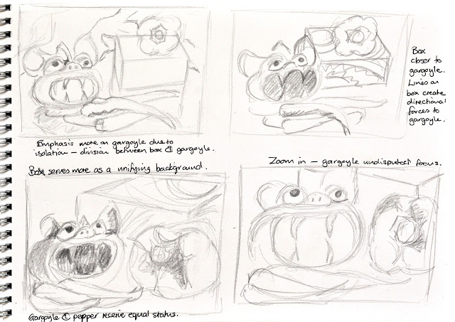
| Sketchbook planning |
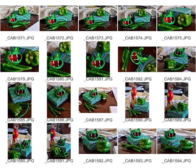 |
| Contact Sheet of possible composition arrangements |
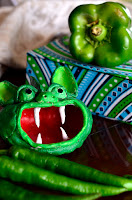 |
| Similar view to the composition I selected |
This exercise proved to be enjoyable. I followed the guidance of the course manual in using darker tones first and then building up the lighter tones on top. By doing so, I was able to refine my lines to be quite fine in areas. I love the layered effect made possible by the nature of this media. I think I was able to capture the forms of the peppers and gargoyle convincingly, using the direction of my strokes to emphasize the roundness of the bulging forms.
As I had anticipated, the tea bag box proved to be a challenge. What was difficult was to get the patterns to line up correctly, to create the effect of the corners of the edges of the box, and to be able to get the reflections to appear convincing. I found it helpful to use dry chalk pastels on top of the oil pastel to add contrast and highlights.
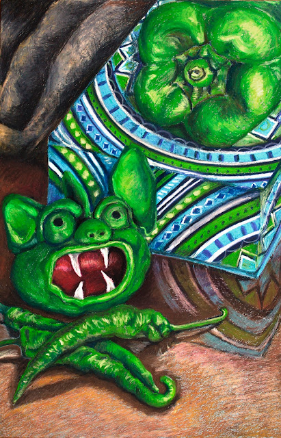
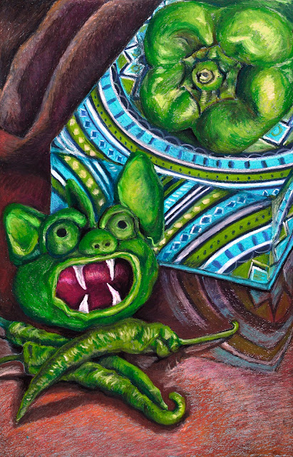
The draped fabric in the back left-hand corner turned out to be far too light for the rest of the composition. The effect of this was that it tended to draw attention away from the main subject. I then tried to reduce the contrast by making it a grey cloth instead of a cream one. The deadness of the grey then also detracted from the warmth of the table in the foreground. I eventually opted to make the fabric a dull brown. I think that this works better with this composition, allowing the focus to be on the still-life objects. Unfortunately, the multiple attempts at creating the fabric in the back corner caused this area to become a bit pasty and difficult to manipulate.
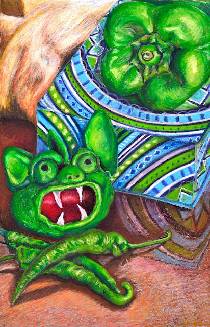 |
| Original pastel work with cream cloth |
 |
| Composition with grey cloth |
 |
| Final composition |
What aspects of each drawing were successful, and what did you have problems with?
For my ink drawing, I think that I was successful in creating a contrast between the textural quality of the peppers versus the more haptic and energetic fibrous nature of the matting they were sitting on. I was able to create varied lines with varying line weights to invigorate the textures of the items.
In my pastel drawing, the three-dimensional forms of the peppers are fairly convincing. I feel that the layers work well to render this illusion of form. Where I had difficulties was in making the cloth-covered box totally convincing. I also struggled to get the balance between background and foreground detail.
Did you manage to get a sense of depth in your drawings? What elements of the drawings and still life groupings helped to create that sense?
In my ink drawing, I took almost an aerial perspective viewpoint. This meant that the sense of depth is felt in the items themselves, created through overlapping forms and the suggestion of tonal values using weighted lines and hatching. For the pastel drawing, the angles of the box, overlapping forms and one-point perspective help to give a sense of three-dimensionality. Tonal values play a huge part in creating a sense of solidity in the rounded forms of the peppers and gargoyle.
What difficulties were created by being restricted to line or tone?
When using line on its own, you have to create a sense of tonality through using hatching and cross-hatching, as well as weighted lines to attempt to imply form. When using tones, you have to constantly reference back and forward to check that areas of equal tonality are given the same treatment in your artwork.
How did using colour affect your working method?
I found that using colour caused me to be more critical of how the colours interacted with one another. The lighter cream color of the cloth in the left-hand corner drew attention away from my darker tonal valued subject matter. For this reason, I had to darken the hues and tones of the cloth to make it more subdued. I did enjoy finding subtle references to under tones in the modelling of the peppers and the reflections. Being able to use reds and blues in the shadows helped to invigorate these darker areas, instead of just seeing them as black shadows.
No comments:
Post a Comment