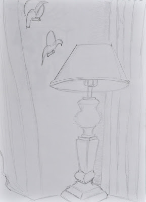
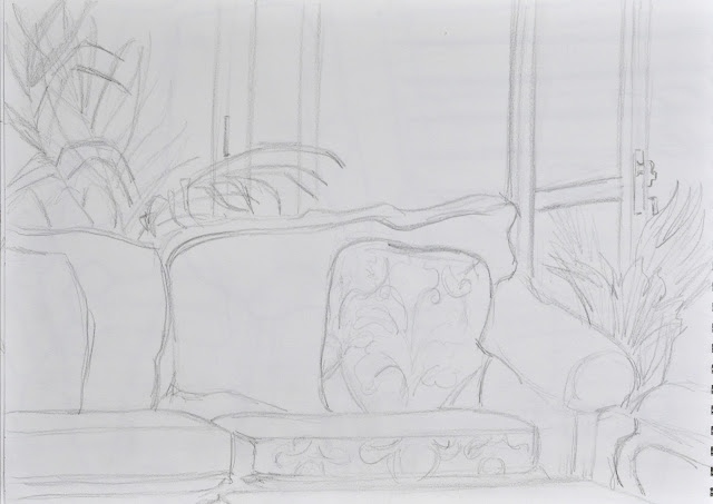
As our house is a rather small apartment, I found that I would start with an item in my viewing frame, start drawing it, but within a few strokes, I would have totally honed in on that item. This meant that the picture became more about the lamp and table, for example, and not about the corner of the room. It was only after a few different views and many attempts that I started to be able to take in more of the corner with my sketch.


Using some of the tips I gained from the online search, I tried to strengthen the perspective on my following sketches. I find two-point perspective particularly difficult as invariably the two points of your perspective in an interior shot are extending right off of your page. So, you don’t have an easy mathematical reference point. You have to try to imagine where the two points are. The dresser with the mirror leaning on top of it was particularly hard to draw as the dresser and the mirror interacted with one another and yet had differing angles. I was looking down on it too, which was adding to the three-point perspective feeling.
The item that was the most complex to sketch was the display cabinet. I decided to draw it from close-up as we have a large diningroom table which would otherwise obscure my view. What I realized while drawing this cabinet was that the is a conflict that happens between drawing using eye-balled perspective and proportions, and trying to get the angles right using two-point perspective. Using two-point perspective techniques helped me to work out the angles of the shelves and cupboard edges etc., but halfway through I realized that my cabinet was probably not quite tall enough in my drawing. This meant that the middle shelf should have been viewed from slightly below the middled glass shelf, whereas in my drawing, in order to get the proportions to look right, I had to draw it from slightly above. What was also interesting was how complex the reflections in the mirror and side panels are. The leaves of the palm seemed to be reflected in numerous panes across its surface.
Works Cited
2-B-2 Architecture, 2015. Sketchbook. [Online]
Available at: http://www.coroflot.com/bondarenko/Sketchbook
[Accessed 30 October 2015].
The Coraline Theme, 2013. Sketching to Generate Ideas. [Online]
Available at: http://sippdrawing.com/category/perspective-drawing/
[Accessed 30 October 2015].
WonderHowTo.com, 2010. How to Draw a building and stairwell with complex levels. [Online]
Available at: http://drawing.wonderhowto.com/how-to/draw-building-and-stairwell-with-complex-levels-375211/
[Accessed 30 October 2015].
Available at: http://drawing.wonderhowto.com/how-to/draw-building-and-stairwell-with-complex-levels-375211/
[Accessed 30 October 2015].


No comments:
Post a Comment