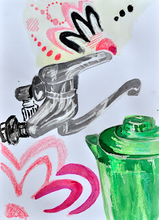
I started with a crayon continuous line drawing which had quite a lot of freedom to it. I then moved on to drawing the scene in oil pastel, and finally with ink and brush. I found that the warm-up exercises did help me to analyse the compositional lines. They also gave me the idea that it was probably wise to start the drawing with items closer to my viewpoint, such as the tap, in order to figure out the placement of the items in the background, rather than with the green jug, as I had been doing.
 |
| Oil pastel continuous line study |
 |
| Crayon contour line study |
 |
| Ink and brush contour line study |
 |
| Sketchbook trials |
I enjoyed working on the green jug and the tap as I used crayon resist to highlight the reflective quality of the surfaces. I used washes of watercolor paint and Bombay ink over the crayon to create the layered effects of the reflections. Initially, I used watercolor crayons to create the patterns in the fabric, but they ended up in looking too scruffy and ill-defined. I then brushed over the designs with Bombay ink and was pleased with the overall result.
One area I might go back and work is the area of the sink. I think if I colored the sink in cream – the same as the curtain, it might help the foreground to gain a bit more definition.
I think the directional forces created by the dark windowsill and window frame, the shadows along the sink, and the vertical dark strip created by the cover of the electrical cabling help to hold the focus of the composition on the back right-hand corner. I did not intend for the green jug to be slightly cut-off at the right-hand side of the picture plane, but I think it works as it means that your eye is lead back into the artwork, instead of coming to rest on it as a restive focal point. The pink on the bottle cap and slight reflections on the surface of the tap spout, also create a triangular movement within the central area of the composition.
I added some oil pastel shading as my final touches to emphasize the shadows and to help to visually link some of the disparate sections, such as the back tiling and the details on the tap.
 |
| Final mixed media study of kitchen sink |
No comments:
Post a Comment